RichTextEditor Toolbar Styling
Through the provided flexible styling API you can completely customize the lоок & feel of the RichTextEditor Toolbar and its toolbar items, so that the toolbar matches the style of your app.
RadRichTextEditorToolbar exposes the following styling properties:
- ItemSpacing(double): Specifies the extra spacing between items horizontal direction. The default value is 4.
- BackgroundColor: Defines the background color of the toolbar;
- BorderThickness and BorderColor: Set the toolbar border styling;
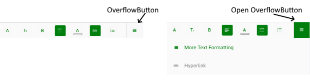
To customize the OverflowButton used to open additional menu area, use the following properties of RadRichTextEditorToolbar:
- OverflowButtonText
- OverflowButtonTextColor
- OverflowButtonBorderColor
- OverflowButtonBorderThickness
- OverflowButtonFontFamily
- OverflowButtonTemplate(DataTemplate): Specifies the template of the overflow button;
- OpenOverflowButtonTextColor: Specifies the text color of the overflow button when it is tapped and the additional menu area is shown;
- OpenOverflowButtonBackgroundColor: Sets the background color of the overflow button when it is tapped and the menu area is shown.
- OverflowPopupBackgroundColor: Defines the background color of the menu area that is shown when the overflow button is tapped;
Here is a screenshot showing styled OverflowButton:
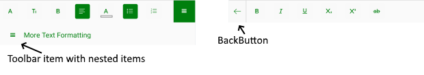
RadRichTextEditorToolbar provides the option to create a RichTextEditorToolbarItem with nested toolbar items - in this case tapping on the RichTextEditorToolbarItem will replace the current toolbar items with its nested toolbar items. In addition, there is a BackButton added on the left to provide easy access to the main toolbar. You can customize the BackButton through the following properties of the RichTextEditorToolbar:
- BackButtonFontFamily
- BackButtonTextColor
- BackButtonText
Check below an example of toolbar item with nested items and BackButton:
RichTextEditor Toolbar Items Styling
RichTextEditorToolbarItem exposes the following styling properties:
- TextColor, CheckedColor, SelectedColor: Define the toolbar item text color according to the item state;
- BackgroundColor, CheckedBackgroundColor and SelectedBackgroundColor: Define the toolbar item background color according to the item state;
- Font settings - FontSize, FontFamily and FontAttributes;
You can also customize the PickerToolbarItems used in the toolbar such as ColorPickerToolbarItem, FontFamilyToolbarItem, etc. PickerToolbarItem provides the following styling properties:
- ItemStyle and SelectedItemStyle: Modify the picker items' style in regular and selected state, accordingly. You would need to use telerikDataControls:NonVirtualizedItemsControlItemContainer as the TargetType of the ItemStyle properties;
- PopupContentSyle and PopupContentHeight: Allow you to customize the popup that is displayed when tapping on a PickerToolbarItem. The TargetType of PopupContentSyle should be telerikRichTextEditor:PopupContentView.
In addition, hyperlink toolbar items provide customization options, such as:
- PopupContentStyle: Defines the style of the popup for creating/editing hyperlinks. The target type of this Style should be telerikRichTextEditor:HyperlinkPopupContentView;
- PopupOutsideBackgroundColor: Sets the background behind the popup, so that it is clear the content outside is currently inactive.
When creating a Style for the AddHyperlinkToolbarItem, you should set as target type telerikRichTextEditor:InsertHyperlinkToolbarItem - this is needed as AddHyperlinkToolbarItem contains nested toolbar items, all of the derive from InsertHyperlinkToolbarItem and in this way the style will affect the nested items as well.
Example
You will need to declare Styles in the ResourceDictionary of the page and set TargetType properties to be of type telerikRichTextEditor:RadRichTextEditorToolbar for the toolbar and telerikRichTextEditor:RichTextEditorToolbarItem - for the items.
In order to apply the style to all toolbar items you should set the Style.ApplyToDerivedTypes property to True. In this way each style with target type
RichTextEditorToolbarItemwill affect the predefined toolbar items.
The example below uses Telerik Font Icons as Text for some of the toolbar items - this requires to include into the application the Telerik Font ttf file and use it as a reference to the FontFamily properties. For detailed instructions on this check Telerik Font Icons topic.
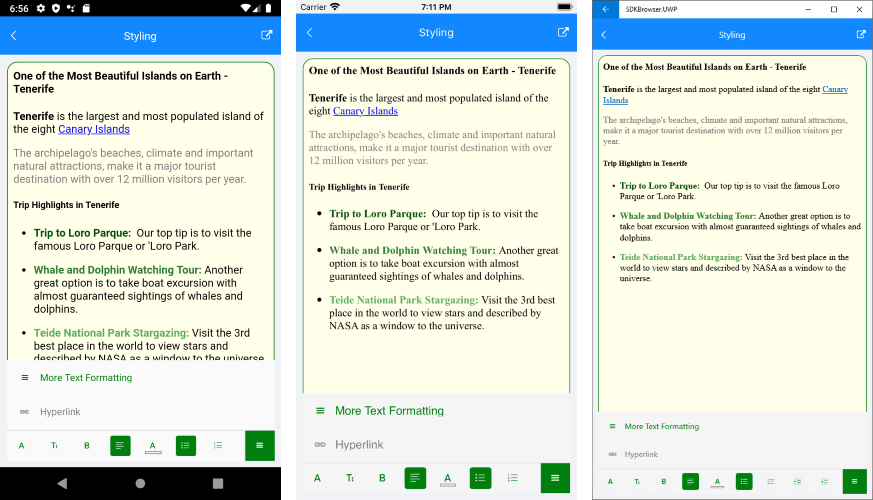
The example below shows how you can customize the RichTextEditorToolbar as well as the RichTextEditorToolbarItems.
First, let's add the RichTextEditorToolbar definition:
<telerikRichTextEditor:RadRichTextEditorToolbar RichTextEditor="{x:Reference richTextEditor}"
Grid.Row="1"
AutoGenerateItems="False">
<telerikRichTextEditor:FontFamilyToolbarItem />
<telerikRichTextEditor:FontSizeToolbarItem />
<telerikRichTextEditor:BoldToolbarItem />
<telerikRichTextEditor:AlignLeftToolbarItem />
<telerikRichTextEditor:TextColorToolbarItem />
<telerikRichTextEditor:BulletingToolbarItem />
<telerikRichTextEditor:NumberingToolbarItem />
<telerikRichTextEditor:IndentToolbarItem />
<telerikRichTextEditor:OutdentToolbarItem />
<telerikRichTextEditor:TextFormattingToolbarItem />
<telerikRichTextEditor:ClearFormattingToolbarItem />
<telerikRichTextEditor:RichTextEditorToolbarItem IsOverflowItem="true"
Text=""
FontFamily="{StaticResource IconsFont}"
Description="More Text Formatting">
<telerikRichTextEditor:RichTextEditorToolbarItem.Items>
<telerikRichTextEditor:BoldToolbarItem HorizontalOptions="Start"/>
<telerikRichTextEditor:ItalicToolbarItem HorizontalOptions="Start" />
<telerikRichTextEditor:UnderlineToolbarItem HorizontalOptions="Start" />
<telerikRichTextEditor:SubscriptToolbarItem HorizontalOptions="Start" />
<telerikRichTextEditor:SuperscriptToolbarItem HorizontalOptions="Start" />
<telerikRichTextEditor:StrikethroughToolbarItem HorizontalOptions="Start" />
</telerikRichTextEditor:RichTextEditorToolbarItem.Items>
</telerikRichTextEditor:RichTextEditorToolbarItem>
<telerikRichTextEditor:AddHyperlinkToolbarItem IsOverflowItem="True"/>
</telerikRichTextEditor:RadRichTextEditorToolbar>
Then add the Styles in the Resources of the page :
<ResourceDictionary>
<OnPlatform x:TypeArguments="x:String" x:Key="IconsFont">
<On Platform="iOS">telerikfontexamples</On>
<On Platform="Android">Fonts/telerikfontexamples.ttf#telerikfontexamples</On>
<On Platform="UWP">/Assets/Fonts/telerikfontexamples.ttf#telerikfontexamples</On>
</OnPlatform>
<Color x:Key="ToolbarColor">#007F0E</Color>
<Style TargetType="telerikRichTextEditor:RichTextEditorToolbarItem" x:Key="RichTextEditorToolbarItemStyle">
<Setter Property="TextColor" Value="{StaticResource ToolbarColor}"/>
<Setter Property="SelectedBackgroundColor" Value="{StaticResource ToolbarColor}"/>
<Setter Property="SelectedColor" Value="White"/>
<Setter Property="CheckedBackgroundColor" Value="{StaticResource ToolbarColor}"/>
<Setter Property="CheckedColor" Value="White"/>
</Style>
<Style TargetType="telerikRichTextEditor:PickerToolbarItem" BasedOn="{StaticResource RichTextEditorToolbarItemStyle}" ApplyToDerivedTypes="True">
<Setter Property="ItemStyle">
<Setter.Value>
<Style TargetType="telerikDataControls:NonVirtualizedItemsControlItemContainer">
<Setter Property="TextColor" Value="{StaticResource ToolbarColor}"/>
</Style>
</Setter.Value>
</Setter>
</Style>
<Style TargetType="telerikRichTextEditor:RichTextEditorToolbarItem" BasedOn="{StaticResource RichTextEditorToolbarItemStyle}" ApplyToDerivedTypes="True"/>
<Style TargetType="telerikRichTextEditor:RadRichTextEditorToolbar">
<Setter Property="OverflowButtonTextColor" Value="{StaticResource ToolbarColor}"/>
<Setter Property="OpenOverflowButtonTextColor" Value="White"/>
<Setter Property="OpenOverflowButtonBackgroundColor" Value="{StaticResource ToolbarColor}"/>
<Setter Property="OverflowButtonFontFamily" Value="{StaticResource IconsFont}"/>
<Setter Property="OverflowButtonText" Value=""/>
<Setter Property="BackButtonTextColor" Value="{StaticResource ToolbarColor}"/>
</Style>
<Style TargetType="Button" x:Key="HyperlinkPopupContentViewButtonStyle">
<Setter Property="TextColor" Value="{StaticResource ToolbarColor}"/>
</Style>
<Style TargetType="telerikRichTextEditor:HyperlinkPopupContentView" x:Key="HyperlinkPopupContentViewStyle">
<Setter Property="OkButtonStyle" Value="{StaticResource HyperlinkPopupContentViewButtonStyle}"/>
<Setter Property="CancelButtonStyle" Value="{StaticResource HyperlinkPopupContentViewButtonStyle}"/>
<Setter Property="CornerRadius" Value="15"/>
<Setter Property="BorderColor" Value="{StaticResource ToolbarColor}"/>
<Setter Property="BorderThickness" Value="1"/>
</Style>
<Style TargetType="telerikRichTextEditor:InsertHyperlinkToolbarItem" BasedOn="{StaticResource RichTextEditorToolbarItemStyle}" ApplyToDerivedTypes="True">
<Setter Property="PopupContentStyle" Value="{StaticResource HyperlinkPopupContentViewStyle}"/>
</Style>
</ResourceDictionary>
In addition to this, you need to add the following namespace:
xmlns:telerikRichTextEditor="clr-namespace:Telerik.XamarinForms.RichTextEditor;assembly=Telerik.XamarinForms.RichTextEditor"
xmlns:telerikDataControls="clr-namespace:Telerik.XamarinForms.DataControls;assembly=Telerik.XamarinForms.DataControls"
This is the result: