Indicators
The gauge indicators are elements that display data related values in a different manner.
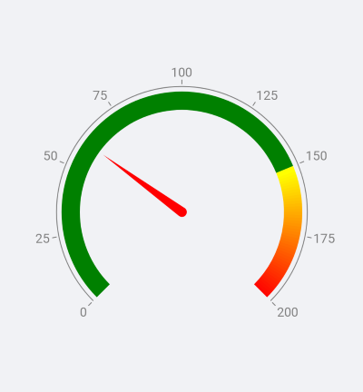
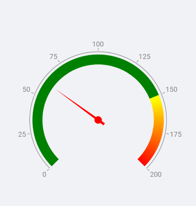
Needle Indicator
The GaugeNeedleIndicator is part of the radial gauge. It presents a single value set by the Value property. The needle is intended to visually liken an actual gauge needle. The center of rotation of the needle coincides with the center of the gauge and is directed towards where the value on the gauge axis is. How far the tip of the needle gets is determined by its Position and Offset properties.
Custom Needle Indicator
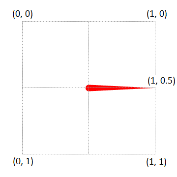
You can use a custom shape for the needle by taking advantage of the Shape property. In order to achieve the desired output you need to set up the geometry that describes the needle you want. The gauge expects that these conditions are met when a shape geometry is set:
- The coordinates are relative values between 0 and 1.
- The rotation pivot point is (0.5, 0.5).
- The needle's orientation is from (0.5, 0.5) to (1, 0.5).
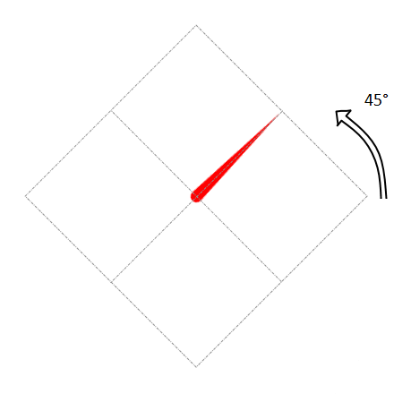
When the gauge draws the needle, the geometry is scaled to the size it will be displayed with. This size is a result of the diameter of the axis arc, the needle's position and offset. It is then rotated so that the needle points at the value. In the example below, the angle of rotation is 45 and in this case coincides with the needle's value.
Here is an example of a custom needle shape:
<telerikCommon:RadPathGeometry x:Key="Needle3">
    <telerikCommon:RadPathFigure StartPoint="0.533, 0.51">
        <telerikCommon:RadLineSegment Point="1, 0.5" />
        <telerikCommon:RadLineSegment Point="0.533, 0.49" />
        <telerikCommon:RadArcSegment Center="0.5, 0.5"
                                     Size="0.07, 0.07"
                                     StartAngle="20"
                                     SweepAngle="142" />
        <telerikCommon:RadLineSegment Point="0.43, 0.488" />
        <telerikCommon:RadLineSegment Point="0.43, 0.512" />
        <telerikCommon:RadArcSegment Center="0.5, 0.5"
                                     Size="0.07, 0.07"
                                     StartAngle="200"
                                     SweepAngle="142" />
    </telerikCommon:RadPathFigure>
</telerikCommon:RadPathGeometry>
A sample Custom Needels example can be found in the Gauge/Customizations folder of the SDK Samples Browser application.
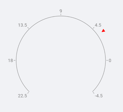
Shape Indicator
The GaugeShapeIndicator has the following properties:
- Value: Defines a single value of the shape indicator.
- Size: Defines the size of the shape indicator.
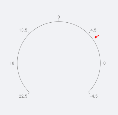
The shape indicator is essentially a square box and is drawn so that its center coincides with the point defined by the Position and Offset properties. The shape is rotated around its center so that the default arrow shape always points towards the axis line.
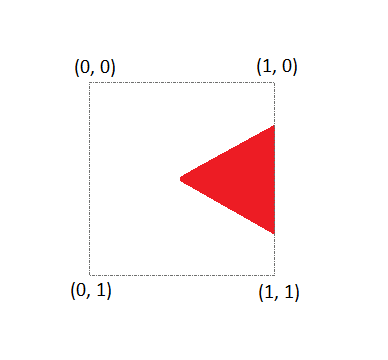
Custom Shape Indicator
You can use a custom shape for the GaugeShapeIndicator by taking advantage of the Shape property. In order to achieve the desired output, you need to understand how to set up the geometry that describes the shape you want. The gauge expects that these conditions are met when a shape geometry is set:
- The coordinates are in relative values between 0 and 1.
- The rotation pivot point is (0.5, 0.5).
- The shape's orientation is from (1, 0.5) to (0.5, 0.5).
When the gauge draws the shape, the geometry is scaled to the size it will be displayed with. Then it is moved to the point defined by the Position and Offset properties. It is then rotated so that the shape points at the axis line. In the example below, the indicator's value is 3.5 and the angle of rotation is 35 degrees.
Here is an example of a custom shape:
<telerikCommon:RadPathGeometry x:Key="Shape1">
    <telerikCommon:RadPathFigure StartPoint="0, 0.5">
        <telerikCommon:RadLineSegment Point="1, 0.3" />
        <telerikCommon:RadLineSegment Point="1, 0.7" />
    </telerikCommon:RadPathFigure>
</telerikCommon:RadPathGeometry>
A sample Custom Shapes example can be found in the Gauge/Customizations folder of the SDK Samples Browser application.
Bar Indicator
The GaugeBarIndicator presents a single value set by the Value property. The bar indicator is drawn alongside the axis line (parallel to it) and is drawn from the axis origin value.
<telerikGauges:GaugeBarIndicator Fill="Green"
                                 StartThickness="0"
                                 Offset="15"
                                 Value="75" />
In addition, the BarIndicator has the following properties:
- StartThickness(double): Specifies the start tickness of the bar indicator.
- EndThickness(double): Specifies the end thickness of the bar indicator
- StartCap(of type Telerik.XamarinForms.DataVisualization.Gauges.GaugeBarIndicatorCap enumeration): Defines the start cap of the bar indicator.
- EndCap(of type Telerik.XamarinForms.DataVisualization.Gauges.GaugeBarIndicatorCap enumeration): Defines the end cap of the bar indicator. The available options from GaugeBarIndicatorCap enumeration are: Flat, Oval, ConcaveOval. The default value for start and end caps is Flat.
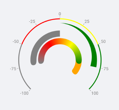
Range Bar Indicator
The GaugeBarIndicator presents a value range set by the From and To properties.
<telerikGauges:GaugeRangeBarIndicator FromCap="Oval"
                                      ToCap="Oval"
                                      Offset="65"
                                      From="-75"
                                      To="75">
    <telerikGauges:GaugeRangeBarIndicator.GradientStops>
        <telerikCommon:RadGradientStop Offset="-75" Color="Gray" />
        <telerikCommon:RadGradientStop Offset="-25" Color="Red" />
        <telerikCommon:RadGradientStop Offset="25" Color="Yellow" />
        <telerikCommon:RadGradientStop Offset="75" Color="Green" />
    </telerikGauges:GaugeRangeBarIndicator.GradientStops>
</telerikGauges:GaugeRangeBarIndicator>
In addition, the RangeBarIndicator has the following properties:
- FromThickness(double): Specifies the start tickness of the range bar indicator.
- ToThickness(double): Specifies the end thickness of the range bar indicator
- FromCap(of type Telerik.XamarinForms.DataVisualization.Gauges.GaugeBarIndicatorCap enumeration): Defines the start cap of the bar indicator.
- ToCap(of type Telerik.XamarinForms.DataVisualization.Gauges.GaugeBarIndicatorCap enumeration): Defines the end cap of the bar indicator. The available options from GaugeBarIndicatorCap enumeration are: Flat, Oval, ConcaveOval. The default value is Flat.
You could find example with Gauge Bar Indicators inside the Gauge/Features folder of the SDK Samples Browser application.
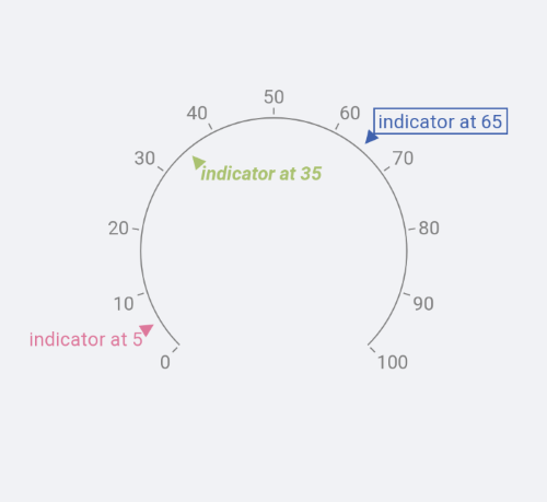
Text Indicator
The GaugeTextIndicator gives you the possibility to present a text on a specific value.
<telerikGauges:GaugeTextIndicator HorizontalTextPlacement="Right"
                                  Stroke="#FF4062AD"
                                  StrokeThickness="1"
                                  Text="indicator at 65"
                                  TextColor="#FF4062AD"
                                  TextMargin="4"
                                  VerticalTextPlacement="Top"
                                  Offset="15"
                                  Value="65" />
You could find example with Gauge Text Indicators inside the Gauge/Features folder of the SDK Samples Browser application.