Office2016 Theme
The Office2016 Theme delivers a flat modern UI represented by a single color variation, designed to be easily customized.
Jump to the following topics to learn about the specifics of the theme's palette and features.
- Default Theme Colors
- Default Theme Brushes
- Changing Palette Colors
- Changing Font Properties
- Changing FocusThickness
- Changing Corner Radius
- Using Glyphs
- Changing Opacity
Default Theme Colors
The Office2016 has one color variation, but it is designed to be easily modified via the exposed colors in the theme palette. The default values of the brushes in the theme are listed below:
| Color name | Hex code | |
|---|---|---|
| MainColor | #FFFFFFFF | |
| PrimaryColor | #FFE6E6E6 | |
| ComplementaryColor | #FFE1E1E1 | |
| AlternativeColor | #FFF1F1F1 | |
| BasicColor | #FFABABAB | |
| MarkerColor | #FF444444 | |
| MarkerInvertedColor | #FFF9F9F9 | |
| IconColor | #FF444444 | |
| ValidationColor | #FFE81123 | |
| AccentColor | #FF2A579A | |
| AccentMouseOverColor | #FF3E6DB6 | |
| AccentPressedColor | #FF19478A | |
| AccentFocusedColor | #FF88C3FF | |
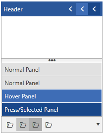
| MouseOverColor | #FFC5C5C5 | |
| PressedColor | #FFAEAEAE | |
| SelectedColor | #FFEBEBEB | |
| ReadOnlyBackgroundColor | #FFFFFFFF | |
| ReadOnlyBorderColor | #FFABABAB |
Default Theme Brushes
Below you can find more details about each brush and where it is usually applied.
-
MainBrush—This brush is white by default and it is mainly used as background of the controls. -
MarkerBrush—This brush is dark by default and it is used as foregound color. -
MarkerInvertedBrush—This brush is a light color by default and it is mostly used as foreground color while you interact with the control. If the control has accent interaction states, we apply the brush for better contrast.
The Office2016 palette provides both accent and non-accent brushes for the different interaction states.
The accent brushes are by default deep blue brushes and are used to highlight input and interaction elements - e.g. buttons.
-
AccentBrush—This is the main accent brush and it is used mainly for headers and interaction feedback. -
AccentMouseOverBrush—This brush is brighter shade of blue and it is used for controls in accent-colored mouse over state. -
AccentPressedBrush—This is the darkest shade of blue and it is used for controls in accent-colored pressed state.
The non-accent brushes are different shades of grey by default and are used for interaction feedback in secondary input or navigation elements and other components which do not need accenting – e.g. RadListBox, buttons in RadRibbonView.
-
MouseOverBrush—This is the non-accent brush for the background of the control while in mouse over state. -
PressedBrush—This is the non-accent brush for the background of the control while in pressed state. -
SelectedBrush—This is the non-accent brush for the background of the control while in selected state. -
AccentFocusedBrush—This brush is light blue and it's the default brush for the focused visual and rarely for any other interaction. -
ValidatonBrush—This brush is red by default and it is used for failed validation where such is applicable in our controls.
There are several brushes used as background color other than the MainBrush.
-
PrimaryBrush—This brush is used as a background of the input controls in disabled state. -
AlternativeBrush—This brush is used as an alternative background – i.e. for popups or if we want to distinguish one element from another and for more complex controls – RadRichTextBox, RadImageEditor, RadTabControlItem. -
ComplementaryBrush—This is used for background of components in more complex controls or their states. For example in RadOutlookBar, RadPanelBar, RadTreeView.
The default stroke / border brushes follow:
-
BasicBrush—This brush is grey and it is used as the default border brush of the controls while in normal state. -
IconBrush—This brush is black by default and it is used for glyphs and paths.
There are two read-only brushes as well:
-
ReadOnlyBackgroundBrush—This brush is white by default and it is used as a background brush of the controls while in read-only state. -
ReadOnlyBorderBrush—This brush is light gray by default and it is used as a border brush of the controls while in read-only state.
And here is an example of how to change them:
Changing the read-only colors
Office2016Palette.Palette.ReadOnlyBackgroundColor = (Color)ColorConverter.ConvertFromString("#FFFBDD");
Office2016Palette.Palette.ReadOnlyBorderColor = (Color)ColorConverter.ConvertFromString("#5F5F5F");
Theme colors
Changing Palette Colors
Office2016 provides dynamic change of the palette colors responsible for the brushes used in our controls. Their defaults are stated above. This mechanism is used to modify the color variation of the theme.
The general naming convention is: Office2016Palette.Palette.[name]Color is responsible for [name]Brush – e.g. Office2016Palette.Palette.AccentColor sets the color for telerik:Offie2016Resource ResourceKey=AccentBrush
Changing the colors can be achieved in code behind.
Setting palette colors
Office2016Palette.Palette.AccentColor = Color.FromRgb(255, 0, 0);
Changing Font Properties
When using the Office2016 theme you can dynamically change the FontSize and FontFamily properties of all components in the application the same way as you do in all other Available Themes which support ThemePalette.
The FontSize and FontFamily properties are public so you can easily modify the theme resources at a single point. The most commonly used font size in the theme is named FontSize and its default value is 12.
For complex scenarios we strongly recommend setting the FontSize property only initially before the application is initialized. Also, we recommend values between 11px and 19px for it.
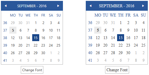
The following example shows the default font sizes and families.
Default FontSize and FontFamily
Office2016Palette.Palette.FontSizeS = 10;
Office2016Palette.Palette.FontSize = 12;
Office2016Palette.Palette.FontSizeL = 14;
Office2016Palette.Palette.FontFamily = new FontFamily(“Segoe UI”);
Example view definition
<StackPanel>
    <telerik:RadCalendar HorizontalAlignment="Center" />
    <telerik:RadButton Content="Change Font" Click=" OnButtonChangeFontSizeClick " HorizontalAlignment="Center" VerticalAlignment="Center" Margin="0 5 0 0"/>
</StackPanel>
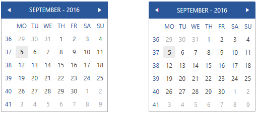
Changing the theme's FontSize and FontFamily
private void OnButtonChangeFontSizeClick(object sender, RoutedEventArgs e)
{
    Office2016Palette.Palette.FontSize = 14;
    Office2016Palette.Palette.FontFamily = new FontFamily("Calibri");
}
Changing FocusThickness
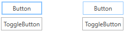
The Office2016 theme palette includes a FocusThickness property. It defines the thickness of the buttons’ focus border. As our design is inspired by the Microsoft Office, the focus border of the buttons is thicker than the one of the other controls and elements. By default the FocusThickness is set to 2, but it is easily changeable in a similar way to the other palette properties.
Setting focus border thickness
Office2016Palette.Palette.FocusThickness = new Thickness(1);
Setting the focus border thickness
Changing Corner Radius
The Office2016 theme exposes an easy way to modify the corner radius of many elements in your application. You can use the corner radius properties of the palette. By default all radius values are 0.
Setting corner radius
Office2016Palette.Palette.CornerRadius = new CornerRadius(0,0,0,0);
Office2016Palette.Palette.CornerRadiusTop = new CornerRadius(0,0,0,0);
Office2016Palette.Palette.CornerRadiusBottom = new CornerRadius(0,0,0,0);
Office2016Palette.Palette.CornerRadiusLeft = new CornerRadius(0,0,0,0);
Office2016Palette.Palette.CornerRadiusRight = new CornerRadius(0,0,0,0);
Changing the default corner radius
Office2016Palette.Palette.CornerRadius = new CornerRadius(2);
Office2016Palette.Palette.CornerRadiusBottom = new CornerRadius(0, 0, 2, 2);
Office2016Palette.Palette.CornerRadiusLeft = new CornerRadius(2, 0, 0, 2);
Office2016Palette.Palette.CornerRadiusRight = new CornerRadius(0, 2, 2, 0);
Office2016Palette.Palette.CornerRadiusTop = new CornerRadius(2, 2, 0, 0);
Using Glyphs
With Office2016 theme, an approach to add icons and icon-like images has been introduced to replace the images or paths that are used in themes introduced prior to this one. The TelerikWebUI font provides over 400 scalable vector glyphs that are available for use to our clients. This approach provides a number of advantages and benefits, including:
- The glyphs are vector paths which are easily scalable without loss of quality.
- There is a wide range of different beautiful built-in glyphs to choose from.
- They are easily colored – since they are text shapes. It is achieved by setting a Foreground color, which allows their usage in scenarios where the background of the control changes between light and dark color in different interaction states – e.g. buttons.
- They are all contained in the small font file and available for use with the inclusion of the Telerik.Windows.Controls assembly and merging the needed resource dictionary for easier referencing.
- They are available for use in any of our themes, when the needed resources are included. They are not specific for the Office2016 theme.
Since each glyph’s string value is ambiguous and not related to its shape, we are providing a resource dictionary with key-value pairs for easier usage and referencing in projects. It also provides compatibility for future inclusions of new glyphs as it is updated to any shifts in the string values of the existing glyphs with no need to change the references in the projects.
Adding the ResourceDictionary with the glyphs
<ResourceDictionary Source="/Telerik.Windows.Controls;component/Themes/FontResources.xaml"/>
Using glyphs
<TextBlock FontFamily=”{StaticResource TelerikWebUI}”
           Foreground=”{telerik:Office2016Resource ResourceKey=IconBrush}”
           Text=”{StaticResource GlyphHeart}”
           FontWeight=”Normal”
           FontSize=”16” />

You can read more about the usage of the new glyph's feature and see the available glyphs in this article.
Changing Opacity
You can easily change the opacity of any disabled element by using the DisabledOpacity property of the Office2016Palette. The default value of the property is 0.5.
Setting the disabled opacity
Office2016Palette.Palette.DisabledOpacity = 0.3;

Merging Modified Palette Resources With StyleManager Theming Approach
When modifying fonts, colors, or other resources from the Office2016Palette and StyleManager is used as theming mechanism, the theme's ResourceDictionary needs to be merged in App.xaml file to apply the changes.
Merging the theme's ResourceDictionary in App.xaml
<Application.Resources>
    <ResourceDictionary>
        <ResourceDictionary.MergedDictionaries>
            <telerik:Office2016ResourceDictionary/>
        </ResourceDictionary.MergedDictionaries>
    </ResourceDictionary>
</Application.Resources>