Editing Control Templates in Telerik UI for WPF
This article demonstrates two approaches on how to extract and edit the default control templates of the Telerik UI for WPF controls:
- Extracting Control Templates Manually from the Theme XAML File
- Extracting Control Templates Using Visual Studio
Extracting Control Templates Manually from the Theme XAML File
The XAML files with the different themes for all controls are located in the Themes.Implicit folder. You can find this folder in the Telerik UI for WPF installation directory, for example, C:\Program Files (x86)\Progress\Telerik UI for WPF R2 2021\Themes.Implicit.
The .xaml files inside the NET Framework folder are meant for .NET Framework 4.6.2. The .xaml files inside the NET contains the resources for .NET 8.
The following example shows how to extract the RadListBox control template for the Office_Black theme:
-
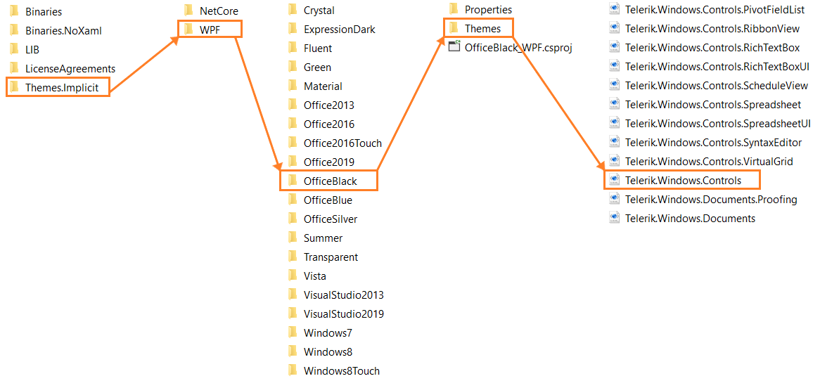
Navigate to the Telerik UI for WPF installation directory and open the Themes.Implicit\NET\OfficeBlack\Themes folder.
You can choose any of the available themes in the NET folder. The folder names correspond to the theme names.
-
Locate the Telerik.Windows.Controls.xaml file and open it with your favorite editor.
To find the XAML file for any control, you need to know the name of the assembly that contains the control The name of the XAML file corresponds to the name of the assembly.
Figure 1: Navigating to the required XAML file
Always extract the desired control template from the theme that you use in your application. For example, if your application uses the Office Black theme, extract the control template from the Themes.Implicit\NET\OfficeBlack\Themes folder. The control templates are different for each theme. Using the wrong template may lead to errors or undesired behavior.
-
In the editor, find the default style for the RadListBox control. It is called RadListBoxStyle.
The default styles follow the convention name of the control + Style, for example, RadListBoxStyle.
Under RadListBoxStyle, navigate to the value of the Template property setter, which points to the control template.
Copy the RadListBox control template from the XAML file.
Once you copy the template, you can modify it and apply it either to a single instance of the control or throughout your application by creating the desired style and setting its Template property.
When changing a Control Template, you must include all required parts. Even if your code compiles, some of the functionality may be impacted due to the omission of the required parts. The required parts are marked with the prefix "PART_".
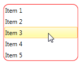
To add a rounded red border around the RadListBox control, follow the steps above to extract the control template. Then modify the control template as demonstrated in Example 1 below.
Example 1: Adding a border around the RadListBox control
<Application.Resources>
    <ResourceDictionary>
        <ResourceDictionary.MergedDictionaries>
            <ResourceDictionary Source="/Telerik.Windows.Themes.Office_Black;component/Themes/Telerik.Windows.Controls.xaml"/>
        </ResourceDictionary.MergedDictionaries>

        <Style BasedOn="{StaticResource RadListBoxStyle}" TargetType="telerik:RadListBox">
            <Setter Property="Template">
                <Setter.Value>
                    <ControlTemplate TargetType="telerik:RadListBox">
                        <Grid>
                            <ScrollViewer x:Name="PART_ScrollViewer"
                                            Margin="0"
                                            Padding="{TemplateBinding Padding}"
                                            Background="{TemplateBinding Background}"
                                            BorderBrush="{TemplateBinding BorderBrush}"
                                            BorderThickness="{TemplateBinding BorderThickness}"
                                            IsTabStop="False"
                                            HorizontalScrollBarVisibility="{TemplateBinding ScrollViewer.HorizontalScrollBarVisibility}"
                                            VerticalScrollBarVisibility="{TemplateBinding ScrollViewer.VerticalScrollBarVisibility}">

                                <!-- Here is the additional Border -->
                                <Border CornerRadius="10" BorderBrush="Red" BorderThickness="1">
                                    <ItemsPresenter/>
                                </Border>

                                <ScrollViewer.InputBindings>
                                    <KeyBinding Command="telerikPrimitives:ListControl.SelectAllCommand" Key="A" Modifiers="Control"/>
                                </ScrollViewer.InputBindings>
                            </ScrollViewer>
                            <ContentPresenter x:Name="PART_DropVisualPlaceholder" Visibility="Collapsed" HorizontalAlignment="Stretch" VerticalAlignment="Stretch"/>
                        </Grid>
                    </ControlTemplate>
                </Setter.Value>
            </Setter>
        </Style>
    </ResourceDictionary>
</Application.Resources>
Figure 2: RadListBox control with red border
Extracting Control Templates Using Visual Studio
Another way to extract a control template is to use the Visual Studio designer or Expression Blend:
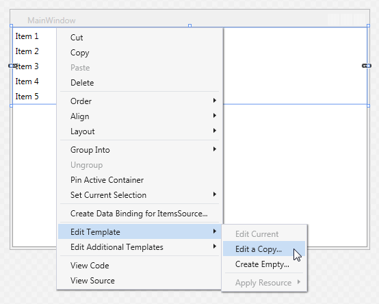
Right-click the desired control and select Edit Template in the context menu.
-
Click Edit a Copy as shown in Figure 3.
Figure 3: Visual Studio designer context menu
-
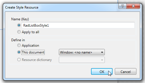
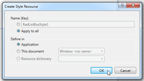
In the Create Style Resource dialog, select one of the following options:
-
To extract the style with the default control template in a specified document with a resource key.
Choose this option if you need to apply the style to a single instance of the control.
Figure 4: Generating a style with a resource key
-
To create an implicit style.
Figure 5: Generating an implicit style
-
Let's assume you just need to style one specific instance of the control and you have chosen to extract the style with a resource key in the current document. Example 2 shows the generated XAML code.
Example 2: The generated XAML code
<UserControl>
    <UserControl.Resources>
        <Style x:Key="RadListBoxStyle1" TargetType="{x:Type telerik:RadListBox}" BasedOn="{StaticResource RadListBoxStyle}">
            <Setter Property="Template">
                <Setter.Value>
                    <ControlTemplate TargetType="{x:Type telerik:RadListBox}">
                        ...
                    </ControlTemplate>
                </Setter.Value>
            </Setter>
        </Style>
    </UserControl.Resources>

    <Grid>
        <telerik:RadListBox Style="{StaticResource RadListBoxStyle1}" ItemsSource="{Binding ListBoxItems}" />
    </Grid>
<UserControl>