Visual Structure
This section defines the terms and concepts used in the scope of the RadTimeBar control. They can be helpful when contacting with the support service in order to describe your issue better. Below you can see snapshots and explanations of the main visual elements of the control:
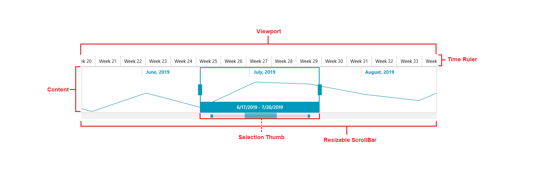
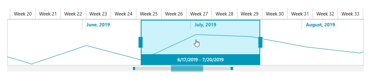
Viewport: The rectangular region representing the time span between VisiblePeriodStart and VisiblePeriodEnd.
Content: The area between the two levels of Labels. You can use the Content to visualize RadChart, RadSparkline or any other custom controls. The picture above demonstrates RadColumnSparkLine.
Resizable ScrollBar: You can use the Resizable ScrollBar or the SelectionThumb to change the time span of the TimeBar control.
Time Ruler: The area where the time periods are shown.
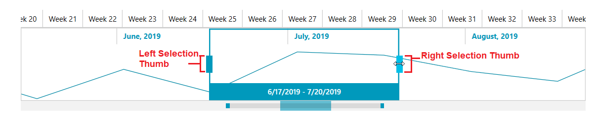
SelectionThumb: The Selection thumb is a visual element, which is used to handle the selection of a time span in the TimeBar control. It is positioned according to the SelectionStart and SelectionEnd properties of the RadTimeBar.
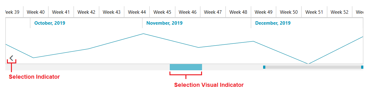
Selection Visibility Indicator: This visual element indicates (as its name implies) where the SelectionThumb is and whether it is in the visible period of the time span.
Selection Indicator: Indicates whether the Selected range is on the right or left side of the current visible time span.
The Selection thumb can be resized in both directions using the mouse. Clicking in the middle of the selection thumb and dragging it moves the entire selection left or right.
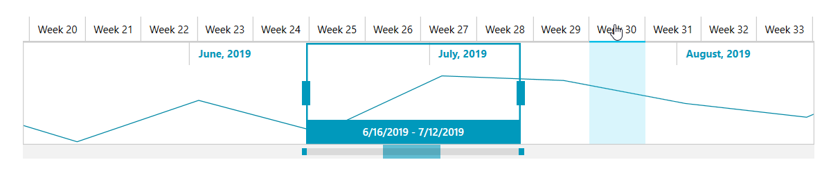
Selecting a time interval can be done also by creating a selection region with the mouse over the time bar like in the image below: