Getting Started with WPF SplashScreen
This tutorial will walk you through the creation of a sample application that shows a splash screen using RadSplashScreenManager.
Assembly References
In order to use RadSplashScreen, you will need to add references to the following assemblies:
- Telerik.Windows.Controls
- Telerik.Windows.Controls.Navigation
You can find the required assemblies for each control from the suite in the Controls Dependencies help article.
Showing Splash Screen
To show a splash screen, use the RadSplashScreenManager class. This allows you to display the default RadSplashScreen control or a custom control.
Note that the splash screen window is running on a separate UI thread.
You can start the splash screen anytime you need to indicate that some work is performed. The following example demonstrates how to show it before the MainWindow is loaded. To do this, call the RadSplashScreenManager.Show method. This displays a window hosting a RadSplashScreen control.
Example 1: Starting the splash screen on application startup
public partial class App : Application
{
protected override void OnStartup(StartupEventArgs e)
{
var dataContext = (SplashScreenDataContext)RadSplashScreenManager.SplashScreenDataContext;
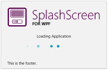
dataContext.ImagePath = "/SplashScreenWPFApplication;component/Images/splashscreen-for-wpf-image.png";
dataContext.Content = "Loading Application";
dataContext.Footer = "This is the footer.";
RadSplashScreenManager.Show();
Thread.Sleep(7000);
RadSplashScreenManager.Close();
base.OnStartup(e);
}
}
The splash screen is setup via the RadSplashScreenManager.SplashScreenDataContext object which by default holds an object of type SplashScreenDataContext. Read more about the data context in the Splash Screen Manager article.
This example is using Thread.Sleep to imitate a loading process, but you can replace this by any code that takes time and notifies you about its actions. Basically, call Show method when you need to display the screen and once your action is completed call the Close method.
Showing Progress Bar
To enable the progress bar in RadSplashScreen, set the IsIndeterminate property of SplashScreenDataContext to False. Then you can control the range and current value via the ProgressValue, MinValue and MaxValue properties of the data context. Read more about this in the Progress Bar article.
Showing Custom User Control in the Splash Screen
RadSplashScreenManager can be used to display any UI element. This means that you can create a custom UserControl and pass its type to the Show method. You can also replace the RadSplashScreenManager.SplashScreenDataContext with a custom object that can be used with the UserControl.
Example 2: Creating a UserControl
<UserControl x:Class="RadSplashScreenTest.MyUserControl"
         xmlns="http://schemas.microsoft.com/winfx/2006/xaml/presentation"
         xmlns:x="http://schemas.microsoft.com/winfx/2006/xaml"
         xmlns:mc="http://schemas.openxmlformats.org/markup-compatibility/2006"
         xmlns:d="http://schemas.microsoft.com/expression/blend/2008"
         mc:Ignorable="d" d:DesignHeight="450" d:DesignWidth="800"
         Width="{Binding Width}" Height="{Binding Height}">
    <Grid Background="#40568D">
        <TextBlock Text="{Binding Text}" Foreground="White" HorizontalAlignment="Center" VerticalAlignment="Center" />
    </Grid>
</UserControl>
Example 3: Defining custom model
public class MyUserControlViewModel
{
    public string Text { get; set; }
    public double Width { get; set; }
    public double Height { get; set; }
}
Example 4: Showing a splash screen with custom control
RadSplashScreenManager.SplashScreenDataContext = new MyUserControlViewModel() { Text = "Loading applicaiton...", Width = 150, Height = 150 };
RadSplashScreenManager.Show<MyUserControl>();

Setting a Theme
The controls from our suite support different themes. You can see how to apply a theme different than the default one in the Setting a Theme help article.
Changing the theme using implicit styles will affect all controls that have styles defined in the merged resource dictionaries. This is applicable only for the controls in the scope in which the resources are merged.
To change the theme, you can follow the steps below:
Choose between the themes and add reference to the corresponding theme assembly (ex: Telerik.Windows.Themes.Windows8.dll). You can see the different themes applied in the Theming examples from our WPF Controls Examples application.
-
Merge the ResourceDictionaries with the namespace required for the controls that you are using from the theme assembly. For the RadSplashScreen, you will need to merge the following resources:
- Telerik.Windows.Controls
- Telerik.Windows.Controls.Navigation
Example 3 demonstrates how to merge the ResourceDictionaries so that they are applied globally for the entire application.
Example 3: Merge the ResourceDictionaries
<Application.Resources>
    <ResourceDictionary>
        <ResourceDictionary.MergedDictionaries>
            <ResourceDictionary Source="/Telerik.Windows.Themes.Windows8;component/Themes/System.Windows.xaml"/>
            <ResourceDictionary Source="/Telerik.Windows.Themes.Windows8;component/Themes/Telerik.Windows.Controls.xaml"/>
            <ResourceDictionary Source="/Telerik.Windows.Themes.Windows8;component/Themes/Telerik.Windows.Controls.Navigation.xaml"/>
        </ResourceDictionary.MergedDictionaries>
    </ResourceDictionary>
</Application.Resources>
Alternatively, you can use the theme of the control via the StyleManager.
Figure 1 shows a RadSplashScreen with the Windows8 theme applied.
Figure 1: RadSplashScreen with the Windows8 theme
Telerik UI for WPF Learning Resources
- Telerik UI for WPF SplashScreen Component
- Getting Started with Telerik UI for WPF Components
- Telerik UI for WPF Installation
- Telerik UI for WPF and WinForms Integration
- Telerik UI for WPF Visual Studio Templates
- Setting a Theme with Telerik UI for WPF
- Telerik UI for WPF Virtual Classroom (Training Courses for Registered Users)
- Telerik UI for WPF License Agreement