Templating the GroupHeaders
This help article explains in details how to use GroupHeaderContentTemplateSelector in order to set different DataTemplates to the GroupHeaders of RadScheduleView.
The article covers the following topics:
How to generate and use GroupHeaderContentTemplateSelector
Choose one of the following approaches to obtain the source code of GroupHeaderContentTemplateSelector:
Generate GroupHeaderContentTemplateSelector from installation folder - In the UI for WPF installation folder on your computer, go to Themes folder and select the theme that you use in your application. Drill down to find the ScheduleView.xaml file in that directory. From this resource dictionary you can extract the GroupHeaderContentTemplateSelector and any needed resources that it uses.
Generate GroupHeaderContentTemplateSelector from RadScheduleView template - Generate first the RadScheduleView template from Expression Blend ( Edit Template > Edit a Copy). Search for the GroupHeaderContentTemplateSelector and copy the style together with all needed resources that it uses.
The end result should include the following XAML code:
<local:GroupHeaderTemplateSelector x:Key="GroupHeaderContentTemplateSelector">
    <local:GroupHeaderTemplateSelector.HorizontalTemplate>
        <DataTemplate>
            <ContentPresenter Content="{Binding FormattedName}" Height="16" Margin="4" />
        </DataTemplate>
    </local:GroupHeaderTemplateSelector.HorizontalTemplate>

    <local:GroupHeaderTemplateSelector.VerticalTemplate>
        <DataTemplate>
            <telerikPrimitives:LayoutTransformControl VerticalAlignment="Top">
                <telerikPrimitives:LayoutTransformControl.LayoutTransform>
                    <RotateTransform Angle="-90" />
                </telerikPrimitives:LayoutTransformControl.LayoutTransform>
                <ContentPresenter Content="{Binding FormattedName}" Margin="4" Height="16"  />
            </telerikPrimitives:LayoutTransformControl>

        </DataTemplate>
    </local:GroupHeaderTemplateSelector.VerticalTemplate>
</local:GroupHeaderTemplateSelector>
Note the use of the local and telerikPrimitives namespaces from the raw source:
xmlns:local="clr-namespace:Telerik.Windows.Controls;assembly=Telerik.Windows.Controls.ScheduleView"
xmlns:telerikPrimitives="clr-namespace:Telerik.Windows.Controls.Primitives;assembly=Telerik.Windows.Controls"
The selector is applied to our instance of RadScheduleView:
<telerik:RadScheduleView x:Name="scheduleView"
        AppointmentsSource="{Binding Appointments}"
        GroupHeaderContentTemplateSelector="{StaticResource GroupHeaderContentTemplateSelector }">
How to create a custom GroupHeaderContentTemplateSelector
Let’s, for example, create a custom Resource like this:
public class EmployeeResource : Resource
{
    public string Photo { get; set; }
    public Brush Brush { get; set; }
}
And add the EmployeeResource to “Employee” ResourceType. Note that the RadScheduleView is grouped by this resource type.
<telerik:RadScheduleView AppointmentsSource="{Binding Appointments}" >
<telerik:RadScheduleView.ViewDefinitions>
<telerik:DayViewDefinition />
</telerik:RadScheduleView.ViewDefinitions>
<telerik:RadScheduleView.GroupDescriptionsSource>
<telerik:GroupDescriptionCollection>
<telerik:DateGroupDescription />
<telerik:ResourceGroupDescription ResourceType="Employee" />
</telerik:GroupDescriptionCollection>
</telerik:RadScheduleView.GroupDescriptionsSource>
<telerik:RadScheduleView.ResourceTypesSource>
<telerik:ResourceTypeCollection>
<telerik:ResourceType Name="Employee">
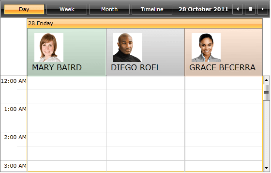
<local:EmployeeResource ResourceName="Mary Baird" DisplayName="MARY BAIRD" Photo="Images/image1.png" Brush="#2D309B46" />
<local:EmployeeResource ResourceName="Diego Roel" DisplayName="DIEGO ROEL" Photo="Images/image2.png" Brush="#2D808080" />
<local:EmployeeResource ResourceName="Grace Becerra" DisplayName="GRACE BECERRA" Photo="Images/image3.png" Brush="#26FF6900 " />
</telerik:ResourceType>
</telerik:ResourceTypeCollection>
</telerik:RadScheduleView.ResourceTypesSource>
</telerik:RadScheduleView>
In order to set different templates to the GroupHeaders , we should create a custom class which inherits ScheduleViewDataTemplateSelector and overrides its SelectTemplate method. Also we need to add the DataTemplates for resource and date GroupHeaders and return the corresponding template:
public class CustomGroupHeaderContentTemplateSelector : ScheduleViewDataTemplateSelector
{
    public DataTemplate HorizontalTemplate { set; get; }
    public DataTemplate VerticalTemplate { set; get; }
    public DataTemplate HorizontalResourceTemplate { set; get; }
    public DataTemplate VerticalResourceTemplate { set; get; }

    public override DataTemplate SelectTemplate(object item, DependencyObject container, ViewDefinitionBase activeViewDeifinition)
    {
        CollectionViewGroup cvg = item as CollectionViewGroup;
        if (cvg != null && cvg.Name is IResource)
        {
            if (activeViewDeifinition.GetOrientation() == Orientation.Vertical)
            {
                if (this.HorizontalResourceTemplate != null)
                {
                    return this.HorizontalResourceTemplate;
                }
            }
            else
            {
                if (this.VerticalResourceTemplate != null)
                {
                    return this.VerticalResourceTemplate;
                }
            }
        }

        if (cvg != null && cvg.Name is DateTime)
        {
            if (activeViewDeifinition.GetOrientation() == Orientation.Vertical)
            {
                return this.HorizontalTemplate;
            }
            else
            {
                return this.VerticalTemplate;
            }
        }
        return base.SelectTemplate(item, container, activeViewDeifinition);
    }
}
Add the DataTemplates to the XAML:
<local:CustomGroupHeaderContentTemplateSelector x:Key="CustomGroupHeaderContentTemplateSelector">
    <local:CustomGroupHeaderContentTemplateSelector.HorizontalTemplate>
        <DataTemplate>
            <TextBlock Margin="4" Text="{Binding Name, StringFormat=dd dddd}"/>
        </DataTemplate>
    </local:CustomGroupHeaderContentTemplateSelector.HorizontalTemplate>
    <local:CustomGroupHeaderContentTemplateSelector.VerticalTemplate>
        <DataTemplate>
            <telerik:LayoutTransformControl>
                <telerik:LayoutTransformControl.LayoutTransform>
                    <RotateTransform Angle="-90" />
                </telerik:LayoutTransformControl.LayoutTransform>
                <TextBlock Margin="4" Text="{Binding Name, StringFormat=dd dddd}" VerticalAlignment="Top" />
            </telerik:LayoutTransformControl>
        </DataTemplate>
    </local:CustomGroupHeaderContentTemplateSelector.VerticalTemplate>
    <local:CustomGroupHeaderContentTemplateSelector.HorizontalResourceTemplate>
        <DataTemplate>
            <Border Background="{Binding Name.Brush}" Height="100" Margin="1 1 1 0">
                <StackPanel Margin="10 10 10 10">
                    <Image Width="60" Height="60" Margin="5 0 10 0" HorizontalAlignment="Left" Stretch="UniformToFill" Source="{Binding Name.Photo}" />
                    <TextBlock  FontSize="16" Margin="0" Text="{Binding Name.DisplayName}" />
                </StackPanel>
            </Border>
        </DataTemplate>
    </local:CustomGroupHeaderContentTemplateSelector.HorizontalResourceTemplate>
    <local:CustomGroupHeaderContentTemplateSelector.VerticalResourceTemplate>
        <DataTemplate>
            <Border Background="{Binding Name.Brush}"  Width="140" Margin="0 2 2 2">
                <StackPanel Margin="15 13 0 10">
                    <Image Width="60" Height="60" Margin="0" HorizontalAlignment="Left" VerticalAlignment="Top" Stretch="UniformToFill" Source="{Binding Name.Photo}" />
                    <TextBlock Margin="-2 3 0 5" FontSize="16" Text="{Binding Name.DisplayName}" />
                </StackPanel>
            </Border>
        </DataTemplate>
    </local:CustomGroupHeaderContentTemplateSelector.VerticalResourceTemplate>
</local:CustomGroupHeaderContentTemplateSelector>
Note how the properties of the custom resource are bound using Name property:
Source="{Binding Name.Photo}"
Finally, set the GroupHeaderContentTemplateSelector property of the ScheduleView:
<telerik:RadScheduleView AppointmentsSource="{Binding Appointments}"
        GroupHeaderContentTemplateSelector="{StaticResource CustomGroupHeaderContentTemplateSelector}">
    ...
</telerik:RadScheduleView>
Here is the result:
Check out the GroupHeaderTemplate Example at WPF demos to see the GroupHeaderContentTemplateSelector in action.