Customizing the Resize and DragDropHighlight
In RadScheduleView it is possible to customize the resize and drag and drop highlight of appointments in the control.
The next examples will demonstrate how to customize the background of the ResizeHighlight and DragDropHighlight by setting the ResizeHighlightStyle and DragDropHighlightStyle of RadScheduleView control.
The following examples use Implicit Styles in order to customize the Background property of the ResizeHighlightStyle/DragDropHighlightStyle. Before proceeding with the following examples you should read about Implicit Styles.
Customizing the ResizeHighlightStyle
In order to customize the ResizeHighlightStyle using Implicit Styles you will need to do the following steps:
Add reference to the ScheduleView NoXaml binaries.
-
Merge the necessary ResourceDictionary in the App.xaml file (the Office Black theme is used in this example):
<ResourceDictionary> <ResourceDictionary.MergedDictionaries> <ResourceDictionary Source="/Telerik.Windows.Themes.Office_Black;component/Themes/System.Windows.xaml"/> <ResourceDictionary Source="/Telerik.Windows.Themes.Office_Black;component/Themes/Telerik.Windows.Controls.xaml"/> <ResourceDictionary Source="/Telerik.Windows.Themes.Office_Black;component/Themes/Telerik.Windows.Controls.Input.xaml"/> <ResourceDictionary Source="/Telerik.Windows.Themes.Office_Black;component/Themes/Telerik.Windows.Controls.Navigation.xaml"/> <ResourceDictionary Source="/Telerik.Windows.Themes.Office_Black;component/Themes/Telerik.Windows.Controls.ScheduleView.xaml"/> </ResourceDictionary.MergedDictionaries> </ResourceDictionary> -
Create a Style that targets the HighlightItem, base it on the StaticResource ResizeHighlightStyle and set the Background property:
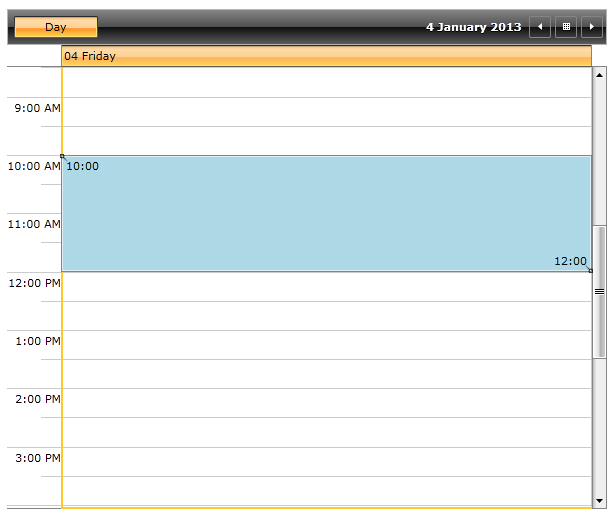
<Style x:Key="MyResizeHighlightStyle" TargetType="telerik:HighlightItem" BasedOn="{StaticResource ResizeHighlightStyle}"> <Setter Property="Background" Value="LightBlue"/> </Style> -
Next we will need to set the newly created Style to the ResizeHighlightStyle of the ScheduleView control:
    <telerik:RadScheduleView AppointmentsSource="{Binding Appointments}"
                        ResizeHighlightStyle="{StaticResource MyResizeHighlightStyle}">
        <telerik:RadScheduleView.ViewDefinitions>
            <telerik:DayViewDefinition/>
        </telerik:RadScheduleView.ViewDefinitions>
    </telerik:RadScheduleView>
The next screenshot shows the final result when resizing an appointment:
Customizing the DragDropHighlightStyle
In order to customize the DragDropHighlightStyle using Implicit Styles you will need to do step 1 and step 2 from the previous example and then:
-
Create a Style that targets the HighlightItem, base it on the StaticResource DragDropHighlightStyle and set the Background property:
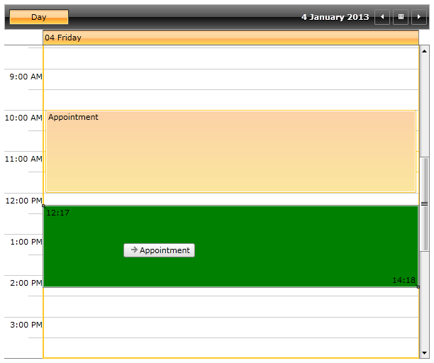
<Style x:Key="MyHighlightItemStyle" TargetType="telerik:HighlightItem" BasedOn="{StaticResource DragDropHighlightStyle}"> <Setter Property="Background" Value="Green"/> </Style> -
Next we will need to set the newly created Style to the DragDropHighlightStyle of the ScheduleView control:
    <telerik:RadScheduleView AppointmentsSource="{Binding Appointments}"
                        DragDropHighlightStyle="{StaticResource MyHighlightItemStyle}">
        <telerik:RadScheduleView.ViewDefinitions>
            <telerik:DayViewDefinition/>
        </telerik:RadScheduleView.ViewDefinitions>
    </telerik:RadScheduleView>
The next screenshot shows the final result when dragging an appointment: