Getting Started with WPF NavigationView
This tutorial walks you through the creation of a sample application that contains a RadNavigationView control. We also demonstrate a few optional features.
Assembly References
To use RadNavigationView, add references to the following assemblies:
- Telerik.Windows.Controls
- Telerik.Windows.Controls.Navigation
- Telerik.Windows.Data
To find the required assemblies for each control, see the Controls Dependencies article.
Defining RadNavigationView
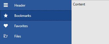
Example 1 demonstrates how you can define a RadNavigationView in xaml.
Example 1: Defining RadNavigationView
<telerik:RadNavigationView x:Name="navigationView" />
Populating with Items
Populate the control with items by adding RadNavigationViewItems to its Items collection:
Example 2: Populating with Items in xaml
<telerik:RadNavigationView x:Name="navigationView" PaneHeader="Header">
<telerik:RadNavigationView.Items>
<telerik:RadNavigationViewItem Content="Bookmarks">
<telerik:RadNavigationViewItem.Icon>
<telerik:RadGlyph Glyph="" FontSize="16"/>
</telerik:RadNavigationViewItem.Icon>
</telerik:RadNavigationViewItem>
<telerik:RadNavigationViewItem Content="Favorites">
<telerik:RadNavigationViewItem.Icon>
<telerik:RadGlyph Glyph="" FontSize="16"/>
</telerik:RadNavigationViewItem.Icon>
</telerik:RadNavigationViewItem>
<telerik:RadNavigationViewItem Content="Files">
<telerik:RadNavigationViewItem.Icon>
<telerik:RadGlyph Glyph="" FontSize="16"/>
</telerik:RadNavigationViewItem.Icon>
</telerik:RadNavigationViewItem>
</telerik:RadNavigationView.Items>
<telerik:RadNavigationView.Content>
<TextBlock Text="Content" Foreground="Black" Margin="5"/>
</telerik:RadNavigationView.Content>
</telerik:RadNavigationView>
Figure 1: Result from Example 1 in the Office 2016 theme
Check out the Icon and IconTemplate article for more information on those properties.
Opening/Closing the NavigationPane in code
By default, users can open or close the NavigationPane that hosts the RadNavigationViewItems by clicking the RadToggleButton. You can manage the state of the control programmatically by setting the IsPaneOpen property of the RadNavigationView. This is demonstrated in Examples 3 and 4:
Example 3: Setting the IsPaneOpen property in xaml
<telerik:RadNavigationView x:Name="navigationView" IsPaneOpen="True" />
Example 4: Setting the IsPaneOpen property in code
this.navigationView.IsPaneOpen = true;
Me.navigationView.IsPaneOpen = True
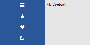
Changing the Width of the Navigation Pane
To control the width of the NavigationPane when it's opened, use the ExpandedPaneWidth property.
To control the width of the NavigationPane when it's closed, use the CompactPaneWidth property.
Example 5 demonstrates how you can set the property in order to increase the default width when the navigation pane is closed.
Example 5: Setting the CompactPaneWidth property
<telerik:RadNavigationView x:Name="navigationView" PaneHeader="Header" CompactPaneWidth="150">
<telerik:RadNavigationView.Items>
<telerik:RadNavigationViewItem Content="Bookmarks">
<telerik:RadNavigationViewItem.Icon>
<telerik:RadGlyph Glyph="" FontSize="16"/>
</telerik:RadNavigationViewItem.Icon>
</telerik:RadNavigationViewItem>
<telerik:RadNavigationViewItem Content="Favorites">
<telerik:RadNavigationViewItem.Icon>
<telerik:RadGlyph Glyph="" FontSize="16"/>
</telerik:RadNavigationViewItem.Icon>
</telerik:RadNavigationViewItem>
<telerik:RadNavigationViewItem Content="Files">
<telerik:RadNavigationViewItem.Icon>
<telerik:RadGlyph Glyph="" FontSize="16"/>
</telerik:RadNavigationViewItem.Icon>
</telerik:RadNavigationViewItem>
</telerik:RadNavigationView.Items>
<telerik:RadNavigationView.Content>
<TextBlock Text="My Content" Foreground="Black" Margin="5"/>
</telerik:RadNavigationView.Content>
</telerik:RadNavigationView>
Figure 2: Result from Example 5 in the Office 2016 theme
Navigation
RadNavigationView doesn't perform any navigation automatically. To perform navigation-related tasks or change the content of the RadNavigationView control, you must handle either of the following events:
The ItemClick event that is raised when a user clicks a RadNavigationViewItem.
The SelectionChanged event that is raised when a user clicks a RadNavigationViewItem and this results in the selection of a new item.
Alternatively, you can use the SelectedItem property to change the content. This is demonstrated in the DataBinding article.
More Features
To further customize RadNavigationView, you can also control:
-
The DisplayMode.
The RadNavigationView control dynamically changes its layout based on its size. It has three display modes: Minimal, Compact and Expanded. You can read more about them in the Display Mode article.
-
The PaneHeader and PaneFooter.
The RadNavigationView control allows you to customize its header and footer. You can set them to simple strings or add a custom control. Check out the Header and Footer article for more information.
Setting a Theme
The controls from our suite support different themes. You can see how to apply a theme different than the default one in the Setting a Theme help article.
Changing the theme using implicit styles will affect all controls that have styles defined in the merged resource dictionaries. This is applicable only for the controls in the scope in which the resources are merged.
To change the theme, you can follow the steps below:
Choose between the themes and add reference to the corresponding theme assembly (ex: Telerik.Windows.Themes.Windows8.dll). You can see the different themes applied in the Theming examples from our WPF Controls Examples application.
-
Merge the ResourceDictionaries with the namespace required for the controls that you are using from the theme assembly. For the RadNavigationView, you will need to merge the following resources:
- Telerik.Windows.Controls
- Telerik.Windows.Controls.Navigation
Example 3 demonstrates how to merge the ResourceDictionaries so that they are applied globally for the entire application.
Example 3: Merge the ResourceDictionaries
<Application.Resources>
    <ResourceDictionary>
        <ResourceDictionary.MergedDictionaries>
            <ResourceDictionary Source="/Telerik.Windows.Themes.Windows8;component/Themes/System.Windows.xaml"/>
            <ResourceDictionary Source="/Telerik.Windows.Themes.Windows8;component/Themes/Telerik.Windows.Controls.xaml"/>
            <ResourceDictionary Source="/Telerik.Windows.Themes.Windows8;component/Themes/Telerik.Windows.Controls.Navigation.xaml"/>
        </ResourceDictionary.MergedDictionaries>
    </ResourceDictionary>
</Application.Resources>
Alternatively, you can use the theme of the control via the StyleManager.
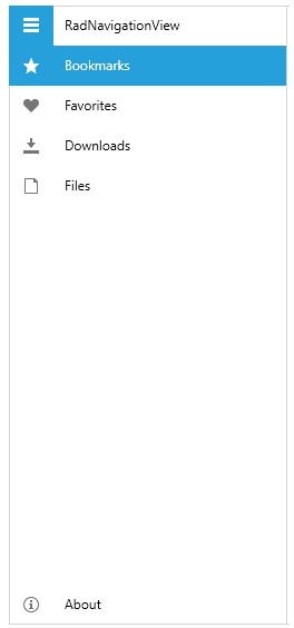
Figure 3 shows a RadNavigationView with the Windows8 theme applied.
Figure 3: RadNavigationView with the Windows8 theme
Telerik UI for WPF Learning Resources
- Telerik UI for WPF NavigationView Component
- Getting Started with Telerik UI for WPF Components
- Telerik UI for WPF Installation
- Telerik UI for WPF and WinForms Integration
- Telerik UI for WPF Visual Studio Templates
- Setting a Theme with Telerik UI for WPF
- Telerik UI for WPF Virtual Classroom (Training Courses for Registered Users)
- Telerik UI for WPF License Agreement