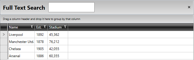
Styling Search Panel
Before reading this topic, you might find it useful to get familiar with RadGridView's Search As You Type functionality.
You can style the SearchPanel within the RadGridView control by creating an appropriate Style that targets the GridViewSearchPanel element.
You have two options:
To create an empty style and set it up on your own.
To copy the default style of the control and modify it.
If you choose to define the style in the resources of the application, it would be available for the entire application. This allows you to define a style only once and then reuse it where needed.
You can apply a style to the Search Panel, similar to Example 1:
Applying a style to the search panel of RadGridView
<!-- If you use NoXaml dlls set the BasedOn property of the Style: BasedOn="{StaticResource GridViewSearchPanelStyle}" -->
<Style TargetType="telerik:GridViewSearchPanel">
        <Setter Property="FontSize" Value="20"></Setter>
        <Setter Property="FontWeight" Value="Bold"></Setter>
        <Setter Property="Height" Value="50"></Setter>
</Style>
You can find the GridViewSearchPanel template structure in the Templates Structure article for RadGridView.
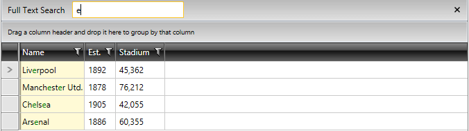
Change the Color of the Highlighted Text
By default, the symbols matching the searching criteria are colored in red. You can easily change the highlighted text value to green by changing the value of the HightlightBrush in the HighlightTextBlock, as shown in the following example:
Change the HighlightBrush of the HighlightTextBlock
<!-- If you use NoXaml dlls set the BasedOn property of the Style: BasedOn="{StaticResource HighlightTextBlockStyle}" -->
<Style TargetType="telerik:HighlightTextBlock">
        <Setter Property="HighlightBrush" Value="Green"/>
</Style>
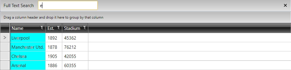
Change the Background Color of the Highlighted Cell
Through the HighlightedBackground property you can modify the background color of the matched GridViewCell element when a search as you type is performed. This property is exposed by the GridViewCell class and it is of type Brush.
Set the HighlightedBackground property of the GridViewCell
<!-- If you use NoXaml dlls set the BasedOn property of the Style: BasedOn="{StaticResource GridViewCellStyle}" -->
<Style TargetType="telerik:GridViewCell">
    <Setter Property="HighlightedBackground" Value="Cyan"/>
</Style>