How to Disable the Tab Navigation of RadDocking Elements
By default, when tab navigation is used, it is possible to focus RadDocking itself as well as some of its elements such as GridResizer and AutoHideArea.
With R2 2016 of UI for WPF, we introduced a way to easily disable the tab navigation of RadDocking elements. This allows the user to directly navigate to the elements inside the active pane content when the Tab key is pressed.
You can use the approach explained here when using Implicit Styles to set a theme to the Docking control.
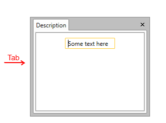
Let’s, for example, have a simple RadDocking definition as shown in Example 1.
Example 1: Simple RadDocking definition
<telerik:RadDocking Width="240" Height="200">
    <telerik:RadDocking.DocumentHost>
        <telerik:RadSplitContainer>
            <telerik:RadPaneGroup>
                <telerik:RadPane Header="Description">
                    <TextBox Text="Some text here"  Width="100" Margin="10" />
                </telerik:RadPane>
            </telerik:RadPaneGroup>
        </telerik:RadSplitContainer>
    </telerik:RadDocking.DocumentHost>
</telerik:RadDocking>
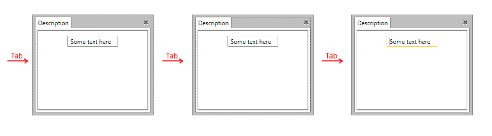
Figure 1: RadDocking behavior when Tab key is pressed multiple times
In order to change this behavior, you will need to set the IsTabStop property to False for some elements inside RadDocking. You can use Styles targeting these elements added inside App.xaml.
Example 2: Applying IsTabStop through the Styles of RadDocking elements
<Application.Resources>
    <ResourceDictionary>
        <ResourceDictionary.MergedDictionaries>
            <ResourceDictionary Source="/Telerik.Windows.Themes.Office_Black;component/Themes/System.Windows.xaml"/>
            <ResourceDictionary Source="/Telerik.Windows.Themes.Office_Black;component/Themes/Telerik.Windows.Controls.xaml"/>
            <ResourceDictionary Source="/Telerik.Windows.Themes.Office_Black;component/Themes/Telerik.Windows.Controls.Navigation.xaml"/>
            <ResourceDictionary Source="/Telerik.Windows.Themes.Office_Black;component/Themes/Telerik.Windows.Controls.Docking.xaml"/>
        </ResourceDictionary.MergedDictionaries>

        <Style TargetType="telerik:AutoHideArea" BasedOn="{StaticResource AutoHideAreaStyle}">
            <Setter Property="IsTabStop" Value="False" />
        </Style>
        <Style TargetType="telerik:RadDocking" BasedOn="{StaticResource RadDockingStyle}">
            <Setter Property="IsTabStop" Value="False"/>
        </Style>
        <Style TargetType="telerik:RadGridResizer" BasedOn="{StaticResource RadGridResizerStyle}">
            <Setter Property="IsTabStop" Value="False"/>
        </Style>
        <Style TargetType="telerik:PaneHeader" BasedOn="{StaticResource PaneHeaderStyle}">
            <Setter Property="IsTabStop" Value="False"/>
        </Style>
    </ResourceDictionary>
</Application.Resources>
Example 2 uses the Office_Black theme, however, the approach is applicable for all themes.
After applying the Styles declared in Example 2, the focus goes directly to the TextBox when the user presses the Tab key as shown in Figure 2.
Figure 2: RadDocking behavior after disabling Tab navigation of its elements