Customizing FunnelChart Series
This article demonstrates how you can change the default look of the RadFunnelChart series.
Customizing Funnel Series
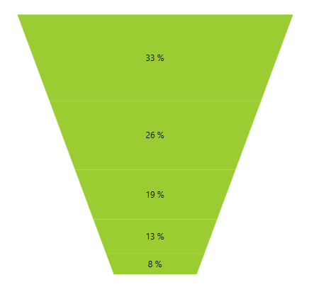
DefaultSegmentStyle
This series expose the DefaultSegmentStyle property. It is of type Style and determines the appearance of the Path element used to visualize the FunnelSeries. Your custom style should target the native Path component. You can set the property like this:
Example 1: Setting DefaultSegmentStyle property in XAML
<telerik:FunnelSeries.DefaultSegmentStyle>
    <Style TargetType="Path">
        <Setter Property="Fill" Value="YellowGreen"/>
    </Style>
</telerik:FunnelSeries.DefaultSegmentStyle>
Figure 1: DefaultSegmentStyle property set
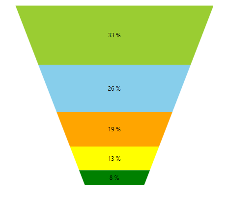
SegmentStyles
This series also expose the SegmentStyles property. It is of type ObservableCollection and gets or sets a collection of styles that will be consecutively applied on all slices of the FunnelSeries. This means that if you have more segments than Styles defined, the RadFunnelChart will repeatedly apply the collection so that the number of the applied styles equals the number of the segments. You can define the collection in XAML like this:
Example 2: Setting SegmentStyles property in XAML
<telerik:FunnelSeries.SegmentStyles>
    <Style TargetType="Path">
        <Setter Property="Fill" Value="YellowGreen"/>
    </Style>
    <Style TargetType="Path">
        <Setter Property="Fill" Value="Orange"/>
    </Style>
    <Style TargetType="Path">
        <Setter Property="Fill" Value="Red"/>
    </Style>
    <Style TargetType="Path">
        <Setter Property="Fill" Value="Yellow"/>
    </Style>
    <Style TargetType="Path">
        <Setter Property="Fill" Value="Green"/>
    </Style>
</telerik:FunnelSeries.SegmentStyles>
Figure 2: SegmentStyles property set