Visual Structure
This section defines terms and concepts used in the scope of the RadCardView control with which you have to get familiar before you continue to read its documentation. They can also be helpful when contacting our support service in order to describe your issue better.
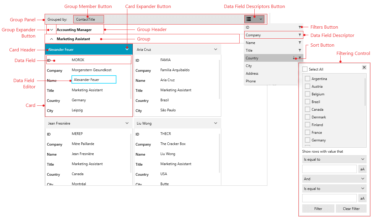
Card: An element representing an item from the ItemsSource of the control.
Card Header: Displays the header of the card.
Card Expander Button: Displays a button that allows you to expand or collapse the card.
Data Field: Displays a label (left text) and a value presenter (right text) representing the corresponding property from the underlying data items.
Data Field Editor: Displays an editor control when the Data Field is in edit mode.
Group: Hosts Card elements which share the same data group.
Group Header: Displays the header of the group.
Group Expander Button: Displays a button that allows you to expand or collapse the group.
Group Member Button: Displays the name of the property used for grouping. Also, clicking on it allows you to sort the groups.
Group Panel: Hosts Group Member Buttons and the Data Field Descriptors Button. Also, you can drop data field descriptors from the drop down list to the group panel.
Filters Button: A button that opens a popup with the available filters for the corresponding data field descriptor.
Data Field Descriptor: Displays the property name, the sort state and filters of the associated data field descriptor object.
Sort Button: Sorts the items by the associated data field descriptor's DataMemberBinding.
Filtering Control: Displays a popup with the filters available for the corresponding data field descriptor.
Get started with the control with its Getting Started help article that shows how to use it in a basic scenario.