Setting the CSS Class of Items
RadPanelItem objects have a number of properties whose value is the name of a CSS class. These properties let you alter the appearance of individual tabs in the tab strip without using a custom skin.
Typically, the Skin overrides some of the attributes set using the CSS class properties. If your CSS class does not achieve the desired effect, try using the !important modifier, or look at the skin CSS file to understand what is happening.
CssClass: controls the appearance of the item in all states.
SelectedCssClass: controls the appearance of the item when it is selected.
DisabledCssClass: controls the appearance of the item when it is disabled.
FocusedCssClass: controls the appearance of the item when it has focus.
ExpandedCssClass: controls the appearance of the item when it is expanded.
ClickedCssClass: controls the appearance of the item when it is clicked.
ChildGroupCssClass: controls the appearance of the set of child items that appear when the item is expanded.
Most of these properties have a default value that identifies a class that is defined in the skin CSS file. For example, the default value for a disabled item is "rpDisabled".
To set the CSS class properties of an item at design time, use the RadPanelBar Item Builder.
The CSS class of a tab is applied to the anchor
<a>tag that represents the item in the rendered HTML output, except for the ChildGroupCssClass property, which is applied to an unordered list<ul>. For more information about the rendered output of RadPanelBar, see Understanding the Skin CSS File.
Defining the CSS Class
There are two ways you can define the CSS classes that you add using the CSS class properties:
- You can use a separate CSS file. When taking this approach, you must add a
<link>tag to the<head>section of the ASPX file:
<head runat="server">
    <title>Untitled Page</title>
    <link href="App_Data/MyStyles.css" rel="stylesheet" type="text/css" />
</head>
- You can define the styles directly in the
<head>section of the ASPX file:
<head runat="server">
    <title>Untitled Page</title>
    <style>
        .MyItem
        {
            background: red;
        }
    </style>
</head>
Example
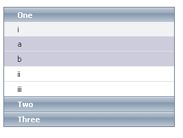
The following example uses the ChildGroupCssClass property to make the appearance of level 2 items more visually distinct:
<head runat="server">
    <title>Untitled Page</title>
    <style>
        .Shaded
        {
            background: #ccd;
        }
    </style>
</head>
<body>
    <form id="form1" runat="server">
    <asp:ScriptManager ID="ScriptManager1" runat="server" />
    <telerik:radpanelbar id="RadPanelBar1" runat="server" skin="WebBlue">
    <Items>
        <telerik:RadPanelItem runat="server" Text="One" >
         <Items>
             <telerik:RadPanelItem runat="server" Text="i" ChildGroupCssClass="Shaded" >
             <Items>
                 <telerik:RadPanelItem runat="server" Text="a" />
                 <telerik:RadPanelItem runat="server" Text="b" />
             </Items>
             </telerik:RadPanelItem>
             <telerik:RadPanelItem runat="server" Text="ii" />
             <telerik:RadPanelItem runat="server" Text="iii" />
         </Items>
         </telerik:RadPanelItem>
         <telerik:RadPanelItem runat="server" Text="Two" />
         <telerik:RadPanelItem runat="server" Text="Three" />
     </Items>
     </telerik:radpanelbar>
    </form>
</body>