Dashboard
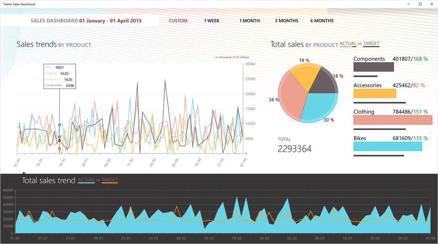
The Telerik Dashboard sample app shows you how to use Telerik UI for Windows Universal Charts and Gauges in a real use-case scenario to bring data to end-users in an appealing and meaningful way.
The application visualizes statistic data about various economic factors in a number of countries and allows comparison between these countries' values. Included are various Telerik controls, serving two main purposes - visualizing data and filtering the parameters for the displayed statistics.
Goals
The Telerik Dashboard application displays some real-world usages of the data visualization and list controls from the Windows Universal suite. It includes:
- CartesianChart(LineSeries) visualizing GDP per capita statistics for each chosen country.
- CartesianChart(AreaSeries) visualizing GPD per capita statistics for one country.
- CartesianChart(BarSeries) displaying the value added to GDP by services, manufacturing and agriculture.
- PieChart(PieSeries) displaying the value added to GDP by services, manufacturing and agriculture for one country.
- Radial Gauge showing the total tax rate in the chosen countries.
- BulletGraph used to display the "ease of doing business" index of each chosen country/ies.

Where to Find this Example
You can find the Telerik Dashboard source code in your account. When you follow the "Browse all product files" link under the Windows Universal product, at the bottom, under Demos and Sample Application, you will find a download link for XAML Dashboard.