Visual Structure
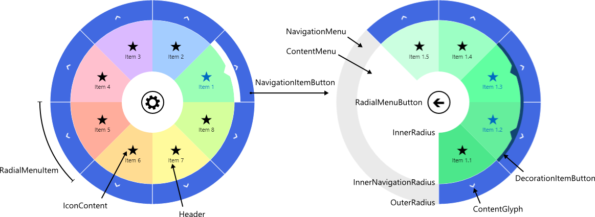
This article describes all the visual elements and terms used in a standard RadRadialMenu control.

Legend
- ContentMenu: Represents the container of the menu items.
- NavigationMenu: Represents the container of the navigation buttons.
- RadialMenuItem: Defines a menu item that has Header and Icon.
- IconContent: Represents the icon associated with this RadialMenuItemControl.
- Header: Represents the header associated with this RadialMenuItemControl.
- NavigationItemButton: Navigates to the children items of this RadialMenuItem.
- ContentGlyph: Represents the glyph displayed in the NavigationItemButton.
- RadialMenuButton: Navigates to the parent RadialMeniItem or opens/closes the RadRadialMenu control.
- DecorationItemButton: Marks the selected items.
- InnerNavigationRadius: Marks the border between the RadialMenuItemControl and the NavigationItemButton. Its size is controlled by the InnerNavigationRadiusFactor property.
- InnerRadius: This is the inner radius of the RadialMenuItem. Its size is controlled by the InnerRadiusFactor property.
- OuterRadius: This is the outer radius of the RadialMenuItem. Its size is controlled by the OuterRadiusFactor property.