Header and Footer
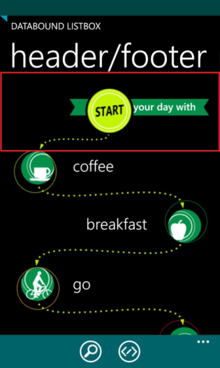
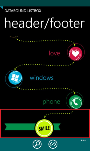
RadDataBoundListBox allows for defining a Header and a Footer. These are specialized visual items that are displayed at the beginning and at the end of the scrollable list and bring additional information to the end-user. The might also expose functionality like the search button found on the native phonebook of the Windows Phone OS. Setting a header or a footer is simply done by defining the desired DataTemplate and assigning it to the ListHeaderTemplate, ListHeaderContent or ListFooterTemplate, ListFooterContent property.
Defining a Header
The following XAML code demonstrates how to define and set a header for the RadDataBoundListBox control:
<telerikDataControls:RadDataBoundListBox>
    <telerikDataControls:RadDataBoundListBox.ListHeaderTemplate>
        <DataTemplate>
            <StackPanel>
                <Image Source="Images/HeaderAndFooter/header.png" Stretch="None" />
                <TextBlock Text="your day with" HorizontalAlignment="Right" FontFamily="Segoe WP Semibold" FontSize="22" Margin="0, 23, 28, 0" />
            </StackPanel>
        </DataTemplate>
    </telerikDataControls:RadDataBoundListBox.ListHeaderTemplate>
</telerikDataControls:RadDataBoundListBox>
You can also use the ListHeaderContent property in context with ListHeaderTemplate.
Defining a Footer
The following XAML code demonstrates how to define and set a footer for the RadDataBoundListBox control:
<telerikDataControls:RadDataBoundListBox>
    <telerikDataControls:RadDataBoundListBox.ListFooterTemplate>
        <DataTemplate>
            <StackPanel>
                <Image Source="Images/HeaderAndFooter/footer.png" Stretch="None" />
                <TextBlock Text="do it again" FontFamily="Segoe WP Semibold" FontSize="22" Margin="28, 23, 0, 0" />
            </StackPanel>
        </DataTemplate>
    </telerikDataControls:RadDataBoundListBox.ListFooterTemplate>
</telerikDataControls:RadDataBoundListBox>
You can also use the ListFooterContent property in context with ListFooterTemplate.
Header and Footer display mode
RadDataBoundListBox exposes the ListHeaderDisplayMode and ListFooterDisplayMode properties. These properties can be used to adjust the behavior of the header and footer depending on whether there are items in the source attached to the DataBoundListBox instance. The properties accept values from the HeaderFooterDisplayMode enum which are as follows:
- AlwaysVisible - header or footer are always displayed, no matter if the source is empty or not
- WithDataItems - header or footer are always displayed when there is at least 1 item in the attached data source.
Here is an example of how your RadDataBoundListBox could look like when using a Header and a Footer:

