Drop-down Styling
RadAutoCompleteBox does not expose a specific style property for modifying the look and feel of the drop-down control, but you can achieve this by setting implicit styles for the custom controls that represent the filtered items list (SuggestionItemsControl) and its items (SuggestionItem).
To set a SuggestionItemsControl or SuggestionItem style, first you will have to add a namespace definition to the Telerik.Windows.Controls.AutoCompleteTextBox namespace.
xmlns:autoComplete="using:Telerik.UI.Xaml.Controls.Input.AutoCompleteBox"
The code below demonstrates how to change the drop-down width with implicit style for the SuggestionItemsControl control:
<telerikInput:RadAutoCompleteBox >
    <telerikInput:RadAutoCompleteBox.Resources>
        <Style TargetType="autoComplete:SuggestionItemsControl" >
            <Setter Property="Width" Value="350" />
        </Style>
    </telerikInput:RadAutoCompleteBox.Resources>
</telerikInput:RadAutoCompleteBox>
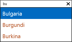
To change the font size and foreground of every suggestion item, for example, you can apply a custom SuggestionItem style like this:
<telerikInput:RadAutoCompleteBox >
    <telerikInput:RadAutoCompleteBox.Resources>
        <Style TargetType="autoComplete:SuggestionItem" >
            <Setter Property="FontSize" Value="23" />
            <Setter Property="Foreground" Value="#B45121" />
        </Style>
    </telerikInput:RadAutoCompleteBox.Resources>
</telerikInput:RadAutoCompleteBox>