First Steps with ThemeBuilder
In this ThemeBuilder tutorial, you will learn how to make your first steps with the tool, and then you will discover its advanced features.
By using ThemeBuilder, you will style the Telerik and Kendo UI components and make them match the design requirements of your project. The steps in this tutorial represent the standard workflow that you can follow when working with ThemeBuilder.
Prerequisites
To follow the steps in this tutorial, you need a Telerik account. If you don't have a Telerik account yet, register and start your free ThemeBuilder trial in a single step.
Don't worry if you do not have a ThemeBuilder subscription. You can start a free trial by following the instructions in this guide.
Creating a Project
To start applying your styles and customizing your favorite themes, you must create a ThemeBuilder project. ThemeBuilder is a cloud application and it automatically saves the changes in your project as you make them. You can even share your projects with colleagues and collaborate on projects.
To create a new ThemeBuilder project:
Navigate to the ThemeBuilder app.
-
Enter the credentials for your Telerik account and log in.
- If this is your first ThemeBuilder project, the application will take you automatically to the Create New Project screen.
- If you already have an existing ThemeBuilder project, click the Create New Project button.
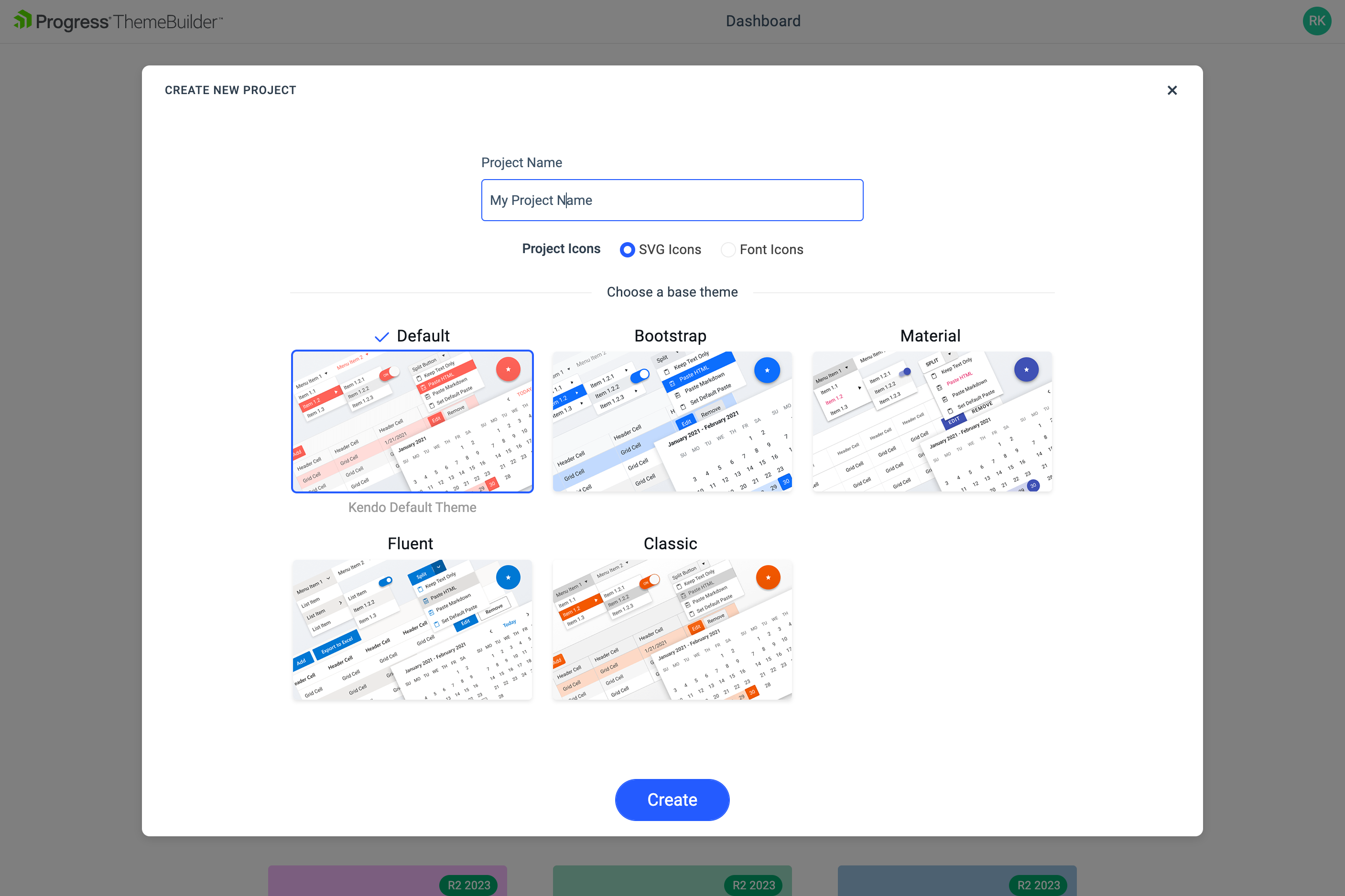
Enter a name for your project and then select the Kendo Bootstrap Theme base theme. Bootstrap is one of the five themes that you can use as a starting point for your customizations.
-
Finally, click CREATE.
After creating the project, you will see the ThemeBuilder workspace:
The UI components are in the center of the screen. These are live components—any change to their styles is immediately rendered on the screen.
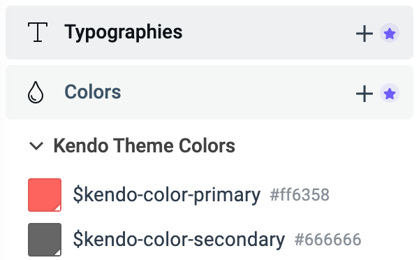
The Kendo variables are in the THEME STYLES pane on the left-hand side of the screen.
(Optional) Activating Your Free Trial
This tutorial demonstrates various features that require the ThemeBuilder subscription or a free trial license. If you already have access to the paid features, continue to the Customizing Theme Variables section.
To activate your free trial:
-
Locate and click the Start Trial banner in the toolbar or one of the star icons in your ThemeBuilder project, for example:
-
Click the banner on the top of the ThemeBuilder screen.

-
Click the star icon near Typography and Colors on the left of the screen.
-
In the new window that opens, click Start a Trial. Then accept the license agreement.
Customizing Theme Variables
A visual theme consists of multiple SASS or CSS variables, their values, and complex style inheritance relations. Customizing these variables is the first step to meeting the application requirements.
To customize the variables for this tutorial:
In the THEME STYLES pane, select the
$primaryvariable.In the color editor that appears, change the primary color value to
#40C676. The primary color and all components that use it are immediately updated and you can see their new looks on the screen. All changes that you make in ThemeBuilder are applied to the live components almost instantly.-
Repeat the steps above for the following variables:
Variable New Value Description $kendo-button-text#004284Changes the text color in the Buttons $kendo-button-bg#EFF4F9Changes the background of the Buttons $kendo-border-radius20pxChanges the border radius of the Buttons
Creating Custom Theme Variables
Creating custom theme variables requires an active free trial or a ThemeBuilder subscription.
Adding new variables gives you endless possibilities to style the UI components as you like or as required by the application design.
To create the custom variables for this tutorial:
Navigate to the THEME STYLES pane and click the + button next to the Color section.
-
In the ADD COLOR editor:
2.1. Enter
$button-borderas the name of the new variable.2.2. Enter
#DBE3EDas the value for the new variable.2.3. Click Create
-
Repeat the steps above to add the following new variables:
New Variable Value Description $primary-button-border#19B859The border for the Primary Button $input-border#CED4DAThe border for the Inputs UI components $label-color#004284The color for the labels
The newly added variables appear on the bottom of the THEME STYLES pane in a section called OTHER.
Adding Custom Typography
Adding custom typography requires an active free trial or a ThemeBuilder subscription.
Adding custom typography allows you to change various font-related styles.
Select the + button next to Typography.
-
In the Name field, enter
$text-typographyand set the following properties:2.1. Select the
Verdanafont family.2.2. Set the font weight to
400.2.3. Set the font size to
14px.2.4. Set the line height to
24px.
Using Advanced Customization
Using the advanced customization requires an active free trial or a ThemeBuilder subscription.
To enable the advanced mode, select the Advanced Edit button on the top of your screen.

Once you select Advanced Edit, ThemeBuilder enables you to edit all properties of the select UI component.
Editing Advanced Button Properties
-
To access the properties of the Button component and see all its states, select the Button frame.
-
Change the typography of the secondary Button component:
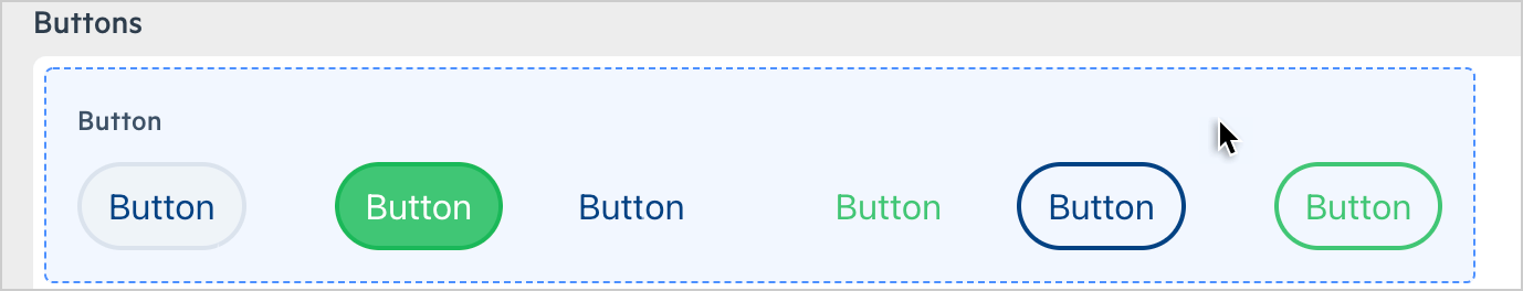
2.1. Select the SOLID/SECONDARY Button in its NORMAL state—the top left Button.
Adjust the zoom level (by using the
+and-keys orctrl+mouse wheel).2.2. In the COMPONENT PARTS pane on the right, select button.
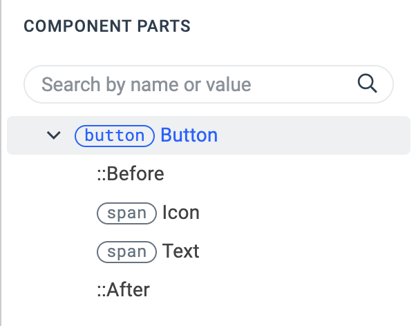
The COMPONENT PARTS pane represents the DOM tree and informs you about the structure of the component.
2.3. In the PROPERTIES pane on the right, locate the Text property.
2.4. From the dropdown menu, select
$text-typography—the custom typography that you added in the previous part of this tutorial.The top left component propagates its styles to all other instances of the component. That's why applying style changes from left to right and from top to bottom is the main styling strategy that you can use in ThemeBuilder. This approach saves time and allows you to style more components because it takes advantage of the built-in style inheritance.
-
Change the border of the secondary Button component:
3.1. In the PROPERTIES pane, locate the Border property.
3.2. Enter
2as a value for the border width.3.3. To change the border color, select
$button-borderfrom the border color dropdown list on the right. You added this color earlier in this tutorial. -
Change the border of the primary Button component:
4.1. Select the SOLID/PRIMARY Button in its NORMAL state.
4.2. In the PROPERTIES pane, locate the Border property.
4.3. From the border color dropdown list, select
$primary-button-border. You added this color earlier in this tutorial.
Editing Advanced Input Properties
Next, you will customize the style of the Input component.
To access the advanced properties of the Input component, select < Back to exit the advanced view for the Button Component and see the frames with all other components. Then select the Input.
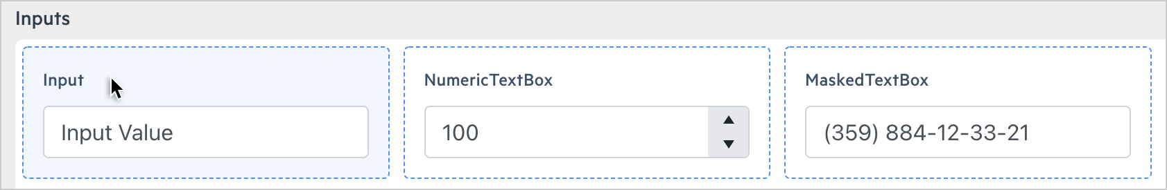
To style the Input component:
Select the NORMAL state of the Input component—the top left Input.
-
In the PROPERTIES pane on the right, locate the Border property:
2.1. Enter
2px as a value for the border width.2.2. To change the border color, select
$input-borderfrom the border color dropdown list on the right. You added this color earlier in this tutorial.
Editing Advanced CheckBox Properties
To access the advanced properties of the CheckBox component, select < Back to exit the advanced view for the Input Component and see the frames with all other components. Then select the CheckBox.
To style the CheckBox component:
-
Select the NORMAL state of the UNSELECTED CheckBox component.
Note that the checkboxes are too rounded because you applied a global border radius earlier in this tutorial.
In the PROPERTIES pane, locate the Border Radius property and enter
4px.
The last customization in this tutorial concerns the Label component, which is on the same frame as the CheckBox:
Select the NORMAL state of the Label component.
In the PROPERTIES pane, locate the Text property and select
$label-color. You added this color earlier in this tutorial.Locate the Padding property and expand it to see all padding properties.
Add
6px padding on the left side of the label.
Exporting Your Theme
When you are done styling the Telerik and Kendo UI components, you can export the theme that you created by clicking Export in the top right corner.
The exported file is a zip archive that contains:
An npm package—You can use it in version control so that your styles are versioned.
A minified compiled CSS—You can directly reference these styles in your application.
SASS files—You can add them to the build of your project to style the components
Video Onboarding
If you prefer video tutorials, see the ThemeBuilder onboarding video below.