Images
Images enhance user experience and better illustrate a specific topic. This article describes how to prepare the UI before you take a screenshot and how to add elements like arrows, boxes, and text.
In This Article
About Images
- Images can include screenshots and visual elements such as arrows pointing to a button, callouts providing additional information about a chart axis value, and so on.
- Images are static resources. When displaying UI elements, they usually require future maintenance efforts because UI changes over time.
Naming
- Give a descriptive and meaningful name of the image you add to the documentation.
- For component-delivering products, the name of the image may not include the name of the component. For example, you can name the file either
grid-popup-editor.pngorpopup-editor.png.
Eligible Images
- Use images that you created.
- Don't use random images from the Internet.
- If you need a specific image, contact a Progress designer and request the creation of the desired visualization.
Metadata
- Add an
<alt>description for each image you include in the documentation. The<alt>information is very important not only for SEO, but is also an irreplaceable source of information for screen readers and in cases when images are not properly displayed. - In Markdown, enclose the
<alt>text in square brackets, for example,. - In the
<alt>tag, include the framework, the component (if applicable), and the feature or functionality the image displays. For example,[Kendo UI for jQuery Grid Popup Editor].
Image Compression
Page speed is one of the crucial factors that determine the SEO rank of a page. Poorly optimized images impair the loading time of the page. Follow the steps below to guarantee the optimal performance of your document:
- Finalize all changes to the images that you will use in your document.
-
Navigate to one of the following pages:
- (For PNG and JPEG files) https://tinypng.com/
- (For GIF files) https://ezgif.com/optimize
Upload your image files and wait till the service completes the image processing.
- Download the compressed images and use them in your document.
Screenshots
When adding screenshots to the documentation, consider aspects such as their size and the font, colors, and styles they display.
Basics
- When you take a screenshot, use the default appearance of the product. For example, avoid using 3D effects such as drop shadows, or custom color themes or skins.
- Use a white background whenever possible.
- To point to an element in the screenshot, use an arrow.
- To surround an element in the screenshot, use a box.
- Position labels outside the screenshot whenever possible.
- Position labels next to the arrows.
- Labels do not require colored borders when the labels are outside the screenshot. If it is impossible to position a label outside the screenshot, use a colored border and a white background.
- Before taking the screenshot, set the UI:
- Ensure the UI elements in the screenshot take as much of the screenshot real estate as possible. Minimize empty space.
- Ensure that the screenshot shows meaningful examples of user-changeable values—for example, domain names, and URLs.
- Ensure that the screenshot does not reveal company-internal domain names—for example, IP addresses, user names, email addresses, and other sensitive or confidential data. Do not smudge such values, replace them with meaningful examples instead.
- When the screenshot is showing how to set options in a dialog box, ensure that options that do not directly concern the text are at their default values. In the accompanying text, let the user know that unmentioned options must be kept at their defaults.
- When you take a screenshot of Visual Studio or Visual Studio Code, use the Light color theme whenever possible.
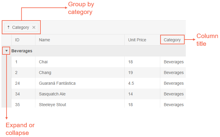
The following example illustrates how to add boxes, arrows, and labels.

Product-specific guidelines take precedence over the guidelines that are described here. If the product team uses a specific theme for the screenshots of the product or for the screenshots of Visual Studio, follow the team's guidelines. The goal of this article is to ensure the consistent look of the product documentation.
Size
- Avoid using images larger than 1000px in width.
- For arrows, boxes, and label borders, use a line width of two pixels.
- Size the image in such a way that it does not scale down when rendered.
Font
- Use Arial, 16pt.
- Apply the following color conventions.
Colors and Styles
When you create arrows, text boxes, and boxes, adhere to the following guidelines:
- Use the same color for the borders, the arrows, and the labels.
- Avoid using more than three colors for the elements that you add to the screenshot.
- Avoid using colored borders for labels when the text is next to the arrow.
- To ensure consistency across documents, use the colors listed below. Use the primary color whenever possible. If you cannot use the primary color because the boxes, arrows, or text are not contrasting or not visible, use one of the secondary colors.
 Primary color: #f56147
 Secondary color: #3366cc
 Secondary color: #27a306
You can use Microsoft Word to edit screen captures. Word has enough screenshot editing features, and it is installed on every company computer.