Pager JSP Tag Overview
The Pager JSP tag is a server-side wrapper for the Kendo UI Pager widget.
The Kendo UI Pager widget enables splitting a set of data into pages with flexible and intuitive UI. The user interface of the Pager is useful for paging data-bound components that have a data source and do not have a built-in UI for paging such as the ListView or scenarios that require paging options—for example, Kendo Templates with a data source.
You can customize the page number templates or use an input for navigation to a specific page, toggle the visibility of previous and next buttons, include a pagesize dropdown and alter the information messages. The pager API also offers the ability to localize its messages.
Getting Started
Configuration
Below are listed the steps for you to follow when configuring the Kendo UI Pager.
Step 1 Make sure you followed all the steps from the introductory article on Telerik UI for JSP.
Step 2 Create a new action method which renders the view.
    @RequestMapping(value = {"/", "/index"}, method = RequestMethod.GET)
    public String index() {
        return "pager/index";
    }
Step 3 Add the Kendo UI taglib mapping to the page.
<%@taglib prefix="kendo" uri="https://www.telerik.com/kendo-ui/jsp/tags"%>
Step 4 Add a Pager tag.
<kendo:pager name="pager1"></kendo:pager>
Step 5 Set its data source.
    <script>
            $(document).ready(function () {
                var dataSource = new kendo.data.DataSource({
                  data: [
                    { productName: "Tea", category: "Beverages" },
                    { productName: "Coffee", category: "Beverages" },
                    { productName: "Ham", category: "Food" },
                    { productName: "Bread", category: "Food" }
                  ],
                  pageSize: 2
                });

                $("#pager1").getKendoPager().setDataSource(dataSource);
                dataSource.read();
            });
    </script>
Pager Settings and Types
The Pager has two types:
numericinput
The Pager is numeric by default. To configure the number of buttons that will be shown in a numeric pager, use the buttonCount property. To configure the pager to accept only use input, set the numeric property to false and the input property to true.
Responsive
The Kendo UI Pager is responsive by default. To disable the responsive behavior and have all of its elements visible at all times set the responsive property to false.
The Pager widget determines which internal elements to render based on its width. When the Pager width is greater than or equal to 600 pixels, all elements are visible:
When the Pager width is greater than or equal to 600 pixels, all elements are visible:

When the Pager width is greater than 480 and less than 600 pixels, the label showing the current paging information is hidden:

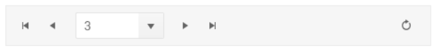
When the Pager width is greater than 360 and less than 480 pixels, the current page is represented by a native <select/> element. The pageSizes dropdown and the label showing the current paging information are hidden.
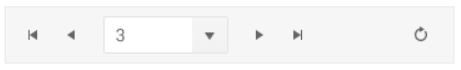
When the Pager width is less than 360 pixels, the current page is represented by a native <select/> element. The pageSizes dropdown and the label showing the current paging information are hidden.
Templates
The Kendo UI Pager features templates for its page number links.
To change the look of the currently selected page number, use the selectTemplate property.
To change the look of the non-selected page number links, use the linkTemplate property.
Messages
The Pager provides options for defining the tooltips for its page and navigation links, information text and labels.
To localize the messages, set the desired strings in the messages tags.
Event Handling
Subscribe to Events
You can subscribe to the events exposed by Kendo UI Pager by the handler name.
<kendo:pager-change>
        function (e) {
            console.log("pager change event");
        }
</kendo:pager-change>
Reference
Existing Instances
You are able to reference an existing Pager instance via the jQuery.data(). Once a reference is established, you are able to use the Pager API to control its behavior.
//Put this after your Kendo Pager tag declaration
<script>
$(function() {
    // Notice that the name of the Pager is used to get its client-side instance
    var pager = $("#pager").data("kendoPager");
});
</script>