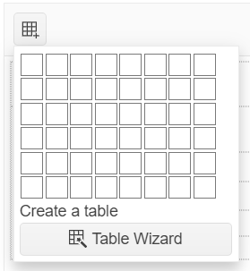
Table Wizard Dialog
As of the Kendo UI R3 2016 release and in addition to the Insert Table tool, the user can add and configure tables by using the Table Wizard dialog.
Inserting Tables
To insert a new table by using the Table Wizard dialog:
- Open the Insert Table tool.
- To open the dialog, click the Table Wizard button.
- Configure the table that is to be inserted.
- Click the OK button.
Modifying Tables
To modify an existing table or a table cell:
- Select the table or the table cell to edit.
- Click the Table Properties or Cell Properties tool in the toolbar.
You can resize the table rows and columns by dragging the cell border with the mouse and without using the Table Wizard dialog.
Available Options
The table and cell options that are available in the Table Wizard are displayed in the following three tabs:
- Table—The available options for the table element.
- Cell—The available options for the selected cell or all cells in the table.
- Accessibility—The available options related to accessibility.
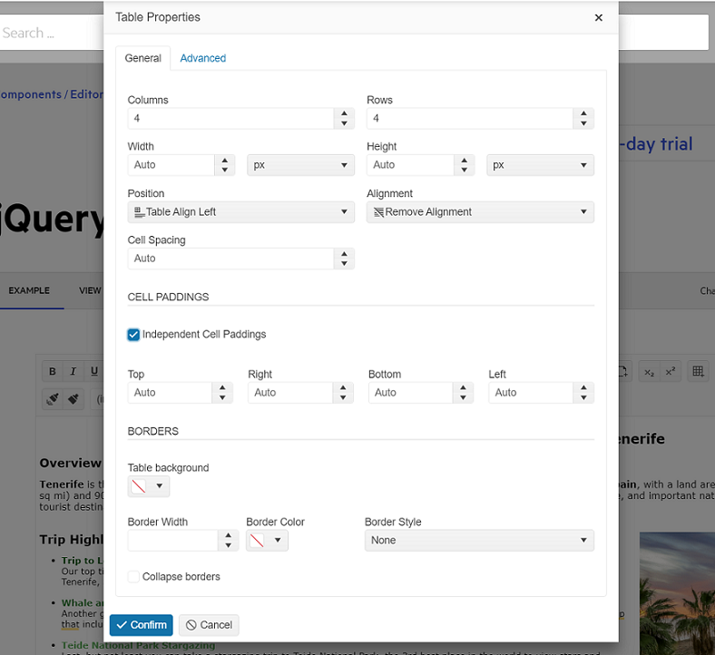
Table Tab
The Table tab provides the following options:
- Width—Changes the width of the table (in pixels, em, or percent).
- Height—Changes the height of the table (in pixels, em, or percent).
- Columns—Defines the columns of the table.
- Rows—Defines the rows of the table.
-
Cell Spacing—Specifies the space between the cells (
cellspacingattribute). -
Cell Padding—Specifies the padding in the cells (
cellpaddingattribute). -
Independent Cell Paddings (available as of 2024.1.319 release)—Specifies individual padding in the cells for
top,right,bottomandleft.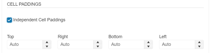
- Alignment—Specifies the text alignment in the cells.
- Background—Specifies the background color of the table.
- CSS Class—Defines the class names for the table element (white space-separated).
- ID—Defines the id of the table element.
- Border—Defines the border size (in pixels only) and color.
-
Border Style—Defines the border style (
none,hidden,dotted,dashed,solid,double,groove,ridge,inset,outset,initial, andinherit). -
Collapse borders—Adds an inline style to that table element with the
border-collapse: collapserule (border-collapseproperty).
Cell Tab
The Cell tab provides the following options:
- Select All Cells—Applies the changes to all cells in the table.
- Width—Changes the width of the cell or cells (in pixels, em, or percent).
- Height—Changes the height of the cell or cells (in pixels, em, or percent).
- Cell Margin—Defines the margin of the cell or cells.
- Cell Padding—Defines the padding of the cell or cells.
-
Independent Cell Paddings (available as of 2024.1.319 release)—Specifies individual padding of the cell or cells for
top,right,bottomandleft.
- Alignment—Specifies the text alignment of the cell or cells.
- Background—Specifies the background color of the cell or cells.
- CSS Class—Defines class names for the cells (white space-separated).
- ID—Defines the id of the cells.
- Border—Defines the border size (in pixels only) and color of the cells.
-
Border Style—Defines the border style (
none,hidden,dotted,dashed,solid,double,groove,ridge,inset,outset,initial, andinherit). -
Wrap text—When unchecked, applies a
white-space: nowrapstyle to the cells (white-spaceproperty).
Accessibility Tab
The Accessibility tab provides the following options:
-
Header Rows—Allows the user to specify the number of rows in the table that should belong to header and should render
<th>cell elements instead of<td>. When creating a new Table, those rows will be placed within a<thead>element. -
Header Cols—Allows the user to specify the number of columns in the table that would be headers for their respective rows. The cells will be rendered as
<th>elements instead of<td>. -
Caption—Adds a
captionelement for the table with the respective text. - Alignment—Defines the text alignment of the caption.
-
Summary—Adds a
summaryattribute to the table using value defined. Thesummaryattribute has been deprecated in HTML5 and its use should be avoided when possible. -
Associate headers—Allows the user to specify the mode in which content cells should be associated with their header cells. it provides the following three options:
- None - Will not explicitly associate cells. That is the default option and it is appropriate for tables with simple structure (no merged cells).
-
Associate using 'scope' attribute - The wizard will add the appropriate
scopeattribute to all header cells. -
Associate using Ids - The wizard will assign IDs to all header cells and will inject
headersattribute with the appropriate value to all data (and header, if needed) cells.