Alert for Xamarn.iOS: Customizations
TKAlert allows customizing almost every aspect of its visual appearance. This article demonstrates some of the customization techniques that can be used with it.
Alert Layout
TKAlert comes with two predefined actions layouts. You can choose between:
-
TKAlertActionsLayoutHorizontal- actions horizontal alignment -
TKAlertActionsLayoutVertical- actions vertical alignment
You can switch between layouts by setting TKAlert's property ActionsLayout:
alert.ActionsLayout = TKAlertActionsLayout.Vertical;
Alert Style
TKAlert has a property Style of type TKAlertStyle for styling it's appearance. The essential properties of TKAlertStyle class are:
- ShowAnimation
- DismissAnimation
- BackgroundStyle
You can switch between two customizable background styles - Blur and Dim.
| Background type | Figures |
|---|---|
| Dim |  |
| Blur | 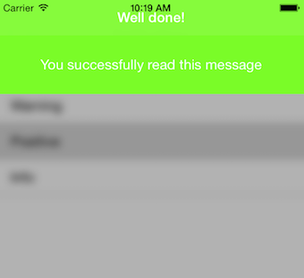 |
| None | 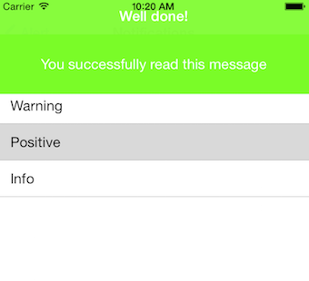 |
Setting TKAlert's back behind could be done as follows:
alert.Style.BackgroundStyle = TKAlertBackgroundStyle.None;
You can control background's opacity and color by setting TKAlert's style as follows:
alert.Style.BackgroundDimAlpha = 0.5f;
alert.Style.BackgroundTintColor = UIColor.LightGray;
TKAlert's parallax effect could be turned on/off with single line of code:
alert.AllowParallaxEffect = true;
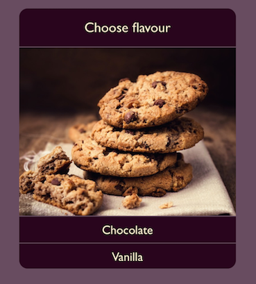
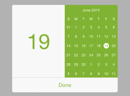
Custom Content
In some scenarios you may need to use custom views for TKAlert header or content view. TKAlert allows this by using its HeaderView and ContentView properties:
add a custom content view to te TKAlert ContentView
TKAlert alert = new TKAlert ();
alert.Style.HeaderHeight = 0;
alert.TintColor = new UIColor (0.5f, 0.7f, 0.2f, 1f);
alert.CustomFrame  = new CGRect ((this.View.Frame.Size.Width - 300) / 2, 100, 300, 250);
AlertCustomContentView view = new AlertCustomContentView (new CGRect(0, 0, 300, 210));
alert.ContentView.AddSubview (view);
Demos for Alert Customization can be found in our Native Xamarin.iOS examples.