ListView for Xamarin.Android: CollapsibleGroupsBehavior
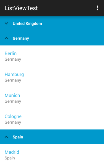
If your list contains group headers as demonstrated in this article, you can use the CollapsibleGroupsBehavior which will allow users to collapse and expand groups by tapping on their headers.

Getting Started
The ListViewDataSourceAdapter's default header template contains an image that shows whether a group is expanded or collapsed. Since our example uses its own adapter - CityDataSourceAdapter, we will need to
add an image element that will hold an indication arrow. Change the city_group_item.xml added in the article for grouping to include an image:
<LinearLayout xmlns:android="http://schemas.android.com/apk/res/android"
    android:orientation="horizontal"
    android:background="#FF0099CC"
    android:padding="8dp"
    android:layout_width="match_parent" android:layout_height="match_parent">
    <ImageView
        android:id="@+id/groupHeaderCollapseImage"
        android:layout_gravity="center_vertical"
        android:src="@drawable/ic_collapse"
        android:visibility="gone"
        android:paddingLeft="8dp"
        android:paddingRight="8dp"
        android:layout_width="wrap_content"
        android:layout_height="match_parent" />
    <TextView
        android:id="@+id/headerTextView"
        android:layout_width="match_parent"
        android:layout_height="match_parent"
        android:textStyle="bold"
        android:textColor="#FFFFFF"
        android:textSize="14sp"
        android:padding="8dp" />
</LinearLayout>
Now we can create a new instance of the collapsible groups behavior and add it to the list view:
CollapsibleGroupsBehavior collapsibleGroupsBehavior = new CollapsibleGroupsBehavior ();
listView.AddBehavior (collapsibleGroupsBehavior);
Customization
If you need to change the image that is used for indication of whether the group is collapsed you can use the setCollapseImageResource(int) method. The image will be automatically rotated when the group is collapsed. You can also
provide a different image of the collapsed state by using setExpandImageResource(int). The default value is -1 indicating that instead of another resource the upside down version of the collapse image will be used.
Collapse Group Listener
The CollapseGroupListener can be used to get notification that a group is collapsed or expanded. Here's one simple implementation:
public class CollapseListener : Java.Lang.Object,
    CollapsibleGroupsBehavior.ICollapseGroupListener {

    Context context;
    public CollapseListener(Context context) {
        this.context = context;
    }

    public void OnGroupCollapsed (Java.Lang.Object p0)
    {
        Toast.MakeText (context, String.Format (
            "Group {0} was collapsed", p0.ToString ()), ToastLength.Short).Show ();
    }

    public void OnGroupExpanded (Java.Lang.Object p0)
    {
        Toast.MakeText (context, String.Format (
            "Group {0} was expanded", p0.ToString ()), ToastLength.Short).Show ();
    }
}
Now we can add the listener to our behavior:
CollapseListener listener = new CollapseListener (Context);
collapsibleGroupsBehavior.AddListener (listener);
Manual collapse/expand
With CollapsibleGroupsBehavior you can also manually change whether a group is expanded or collapsed with changeIsGroupCollapsed(Object group). To determine the current state of a group you can use isGroupCollapsed(Object group). You can also expand all groups or collapse them by using expandAll() or collapseAll().