ListView ItemTemplateSelector
The RadListView control exposes an ItemTemplateSelector property which you can use to apply different template to each item depending on a specific condition.
This article will show you how you can utilize this property to achieve divergent appearance for the different items within your Telerik ListView control.
TemplateSelector Implementation
1. Let's assume you have a RadListView bound to a collection of multiple DataItem objects and the appearance of each item depends on a specific property of the business object. Below is the DataItem class definition:
public class DataItem : ViewModelBase
{
    private string name;
    private bool isSpecial;

    public string Name
    {
        get
        {
            return this.name;
        }
        set
        {
            this.name = value;
            this.OnPropertyChanged();
        }
    }

    public bool IsSpecial
    {
        get
        {
            return this.isSpecial;
        }
        set
        {
            this.isSpecial = value;
            this.OnPropertyChanged();
        }
    }
}
2. The first step is to declare a simple RadListView and set its ItemsSource property to point to the collection of custom objects:
public class ViewModel
{
    public ViewModel()
    {
        this.Source = new ObservableCollection<DataItem>{
            new DataItem{ Name = "Item1"},
            new DataItem{ Name = "Item2"},
            new DataItem{ Name = "Item3", IsSpecial = true },
            new DataItem{ Name = "Item4"},
            new DataItem{ Name = "Item5"},
            new DataItem{ Name = "Item6"},
            new DataItem{ Name = "Item7"},
            new DataItem{ Name = "Item8"},
            new DataItem{ Name = "Item9"},
            new DataItem{ Name = "Item10", IsSpecial = true },
            new DataItem{ Name = "Item11"},
            new DataItem{ Name = "Item12"},
            new DataItem{ Name = "Item13"},
            new DataItem{ Name = "Item14", IsSpecial = true },
            new DataItem{ Name = "Item15"},
            new DataItem{ Name = "Item16"}
        };
    }

    public ObservableCollection<DataItem> Source { get; private set; }
}
3. Eventually, as you need to apply different template to the item based on the value of the IsSpecial property, you have to create a custom class that inherits from DataTemplateSelector. This class will return different DataTemplate according to whether the value is true or false:
public class CustomItemTemplateSelector : DataTemplateSelector
{
    public DataTemplate Template1 { get; set; }
    public DataTemplate Template2 { get; set; }

    protected override DataTemplate OnSelectTemplate(object item, BindableObject container)
    {
        var book = item as DataItem;
        if (book.IsSpecial)
        {
            return this.Template2;
        }

        return this.Template1;
    }
}
4. As a last step, you need to set this custom class as the ItemTemplateSelector property of the RadListView and customize the templates within it:
<telerikDataControls:RadListView x:Name="listView" ItemsSource="{Binding Source}" >
    <telerikDataControls:RadListView.BindingContext>
        <local:ViewModel />
    </telerikDataControls:RadListView.BindingContext>
    <telerikDataControls:RadListView.ItemTemplateSelector>
        <local:CustomItemTemplateSelector>
            <local:CustomItemTemplateSelector.Template1>
                <DataTemplate>
                    <telerikListView:ListViewTemplateCell>
                        <telerikListView:ListViewTemplateCell.View>
                            <Grid>
                                <Grid.ColumnDefinitions>
                                    <ColumnDefinition/>
                                    <ColumnDefinition/>
                                </Grid.ColumnDefinitions>
                                <Label Grid.Column="0" Margin="10" Text="{Binding Name}" />
                                <Button Grid.Column="1" Text="Mark as Special" Clicked="Button_Clicked"/>
                            </Grid>
                        </telerikListView:ListViewTemplateCell.View>
                    </telerikListView:ListViewTemplateCell>
                </DataTemplate>
            </local:CustomItemTemplateSelector.Template1>
            <local:CustomItemTemplateSelector.Template2>
                <DataTemplate>
                    <telerikListView:ListViewTemplateCell>
                        <telerikListView:ListViewTemplateCell.View>
                            <Grid BackgroundColor="Orange">
                                <Grid.RowDefinitions>
                                    <RowDefinition />
                                    <RowDefinition />
                                </Grid.RowDefinitions>
                                <Label Text="{Binding Name}" FontSize="16" FontAttributes="Bold" VerticalOptions="Center" Margin="10, 10, 10, 0"/>
                                <Label Text="Special Item" FontSize="13" FontAttributes="Italic" TextColor="Gray" Grid.Row="1" Margin="10, 0, 10, 10" />
                            </Grid>
                        </telerikListView:ListViewTemplateCell.View>
                    </telerikListView:ListViewTemplateCell>
                </DataTemplate>
            </local:CustomItemTemplateSelector.Template2>
        </local:CustomItemTemplateSelector>
    </telerikDataControls:RadListView.ItemTemplateSelector>
</telerikDataControls:RadListView>
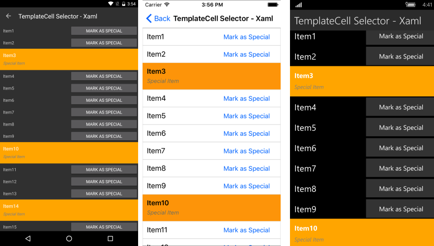
5. Running the sample will lead to the following appearance of the control:
A full example that shows the scenario is available in the SDK Samples Browser application from your local installation.