Key Features
The purpose of this help article is to show you the key features of the RadExpander control.
Collapsed/expanded States
RadExpander provides an expandable container which can host any content. You can show or hide this content by interacting with the Header of the control. The default state of RadExpander is collapsed.
You could use IsExpanded Boolean property to switch the current state of the control.
Expander Header
You could either apply HeaderText property or use the ExpanderHeader content control which provides a set of useful properties for customizing the way the header looks. For more details refer to ExpanderHeader control topic.
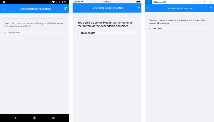
Additionally, you could place the Header at the top or at the bottom of the expandable container through HeaderLocation property of type ExpanderHeaderLocation. The next snippet shows how the HeaderLocation could be set to “Bottom”:
<telerikPrimitives:RadExpander x:Name="expander"
     HeaderText="Read more"
        HeaderLocation="Bottom">
    <telerikPrimitives:RadExpander.Content>
        <StackLayout Margin="10, 20, 10, 20">
            <Label Text="You could place the Header at the top or at the bottom of the expandable container." />
        </StackLayout>
    </telerikPrimitives:RadExpander.Content>
</telerikPrimitives:RadExpander>
And here is how it looks:
Animation while expanding/collapsing
To enable or disable the animation you need to use the IsAnimationEnabled property of RadExpander. By default, the Animation is enabled.
You could also customize the duration and easing (acceleration over time) through AnimationDuration(in ms) and AnimationEasing (of type Xamarin.Forms.Easing) properties.
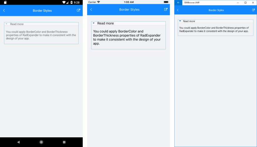
Border Styling
You could apply BorderColor and BorderThickness properties of RadExpander to make it consistent with the design of your app.
ExpanderHeader also provides means for customizing its border, you can learn more about this in the ExpanderHeader: Border Styling article.
Check the example below on how the border settings could be defined:
<telerikPrimitives:RadExpander x:Name="expander"
        HeaderText="Read more"
        BorderColor="LightBlue"
        BorderThickness="2">
    <telerikPrimitives:RadExpander.Content>
        <StackLayout Margin="10, 20, 10, 20">
            <Label Text="You could apply BorderColor and BorderThickness properties of RadExpander to make it consistent with the design of your app." />
        </StackLayout>
    </telerikPrimitives:RadExpander.Content>
</telerikPrimitives:RadExpander>
And the result is: