Animations
Built-in Animations
RadBusyIndicator provides a set of built-in animations. You can change the selected animation through the AnimationType property.
The AnimationType property is an enum that accepts values from Animation1 to Animation10. Animation1 is the default.
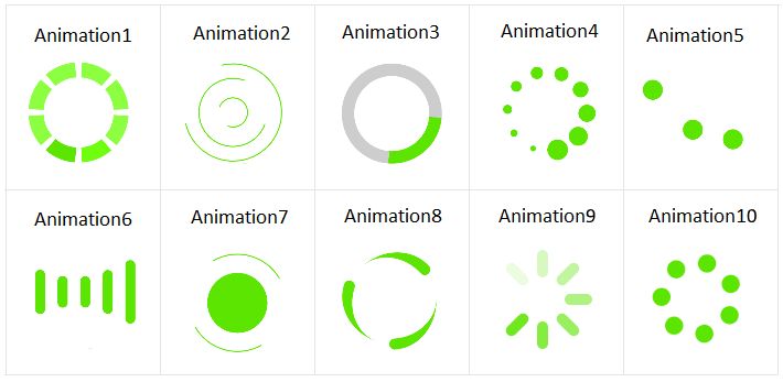
The animation will be displayed only when the IsBusy property is set to True.
Changing animation size and color
You can use the following properties to change the size and color of the animated element (animation content):
- AnimationContentWidthRequest
- AnimationContentHeightRequest
- AnimationColor
By default, the size of the animation content is 25x25 pixels.
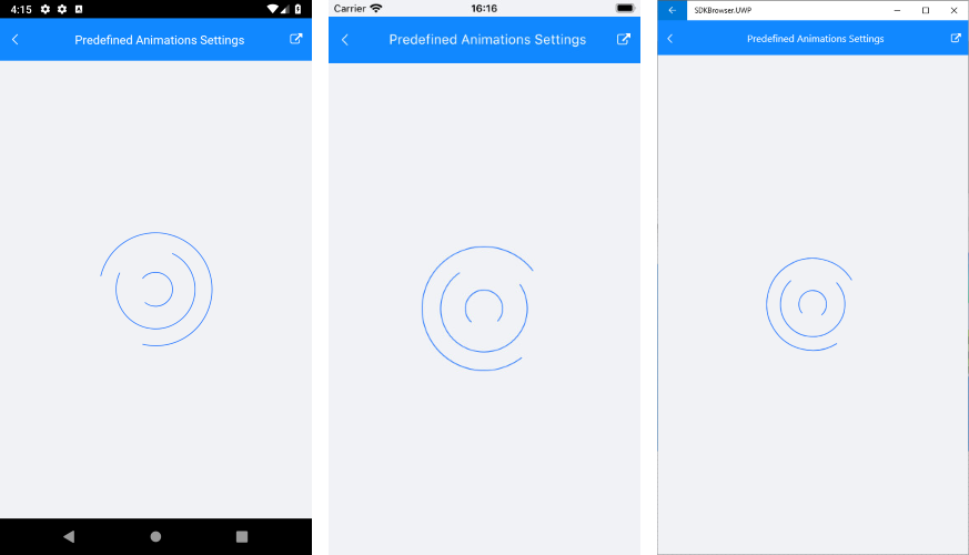
The snippet below shows how to configure the predefined RadBusyIndicator animations:
<telerikPrimitives:RadBusyIndicator x:Name="BusyIndicator"
                                   AnimationType="Animation2"
                                   AnimationContentColor="#2374FF"
                                   AnimationContentHeightRequest="150"
                                   AnimationContentWidthRequest="150"
                                   IsBusy="True">
    <telerikPrimitives:RadBusyIndicator.Content>
        <Label Text="This is displayed when the indicator is not busy."
               TextColor="Black" />
    </telerikPrimitives:RadBusyIndicator.Content>
</telerikPrimitives:RadBusyIndicator>
Here is the result on different platforms:
AnimationContentWidthRequest, AnimationContentHeightRequest and AnimationColor won't be applied if you use custom animations.
Custom animation
You can create a custom animation by using a combination of 3 properties - AnimationType, BusyContent, and Animations:
- To tell the control that you use a custom animation, set the AnimationType to Custom.
- Add the content that you want to animate to BusyContent.
- The custom animation is added in the Animations collection of the busy indicator.
The following example demonstrates how to create a custom animation that changes the opacity of a text (blinking effect).
Defining custom animation in Xaml
<telerikPrimitives:RadBusyIndicator x:Name="radBusyIndicator"
                                       AnimationType="Custom"
                                       IsBusy="True">
    <telerikPrimitives:RadBusyIndicator.Content>
        <Label Text="This is the content of the RadBusyIndicator control displayed when the indicator is not busy." />
    </telerikPrimitives:RadBusyIndicator.Content>
    <telerikPrimitives:RadBusyIndicator.BusyContent>
        <Label HorizontalOptions="Center"
               Text="Loading..."
               VerticalOptions="Center" />
    </telerikPrimitives:RadBusyIndicator.BusyContent>
</telerikPrimitives:RadBusyIndicator>
RadDoubleAnimation annimation = new RadDoubleAnimation() { Duration = 800, From = 0.1, To = 1, PropertyPath = "Opacity", Target = radBusyIndicator.BusyContent, RepeatForever = true, AutoReverse = true };
radBusyIndicator.Animations.Add(annimation);

Device.StartTimer(TimeSpan.FromMilliseconds(5000),
    () =>
    {
        radBusyIndicator.IsBusy = false;
        return false;
    });
Defining custom animation in code-behind
RadBusyIndicator radBusyIndicator = new RadBusyIndicator()
{
    IsBusy = true,
    AnimationType = AnimationType.Custom,
    Content = new Label() { Text = "This is the content of the RadBusyIndicator control displayed when the indicator is not busy." },
    BusyContent = new Label()
    {
        Text = "Loading...",
        VerticalOptions = new LayoutOptions(LayoutAlignment.Center, false),
        HorizontalOptions = new LayoutOptions(LayoutAlignment.Center, false),
    },
};

RadDoubleAnimation annimation = new RadDoubleAnimation() { Duration = 800, From = 0.1, To = 1, PropertyPath = "Opacity", Target = radBusyIndicator.BusyContent, RepeatForever = true, AutoReverse = true };
radBusyIndicator.Animations.Add(annimation);

Device.StartTimer(TimeSpan.FromMilliseconds(5000),
    () =>
    {
        radBusyIndicator.IsBusy = false;
        return false;
    });