Key Features
The purpose of this help article is to show you the key features of the RadAccordion control.
Collapsed/expanded States
In the Accordion control each item provides a header that expands when clicked, showing more information. The control is designed in such a way that opening one AccordionItem automatically closes the previously displayed content.
There can be only one expanded item at a time indicated by IsExpanded property of the AccordionItem object.
Collapse All Items
Through CanCollapseAllItems boolean property you can allow users to fully collapse the Accordion items. If CanCollapseAllItems is enabled, clicking on the header of an expanded Accordion item will collapse it.
The option for collapsing all items is available with R1 2020 release of Telerik UI for Xamarin.
Animation while expanding/collapsing
To enable or disable the animation you need to use the IsAnimationEnabled property of RadAccordion. By default, the Animation is enabled.
You could also customize the duration and easing through AnimationDuration and AnimationEasing properties.
- AnimationDuration (int): Defines the duration of the animation while expanding/collapsing the AccordionItem. The default value is 500.
- AnimationEasing (Xamarin.Forms.Easing): Specifies animation acceleration over time. The default value is Easing.Linear.
Spacing between items
Through Spacing(double) property you could specify the distance between the Accordion items. The default value is 0.
Example
The snippet below shows how the CanCollapseAllItems, AnimationDuration, AnimationEasing and Spacing properties can be applied:
<telerikPrimitives:RadAccordion CanCollapseAllItems="True"
AnimationDuration="1500"
AnimationEasing="SpringOut"
Spacing="5">
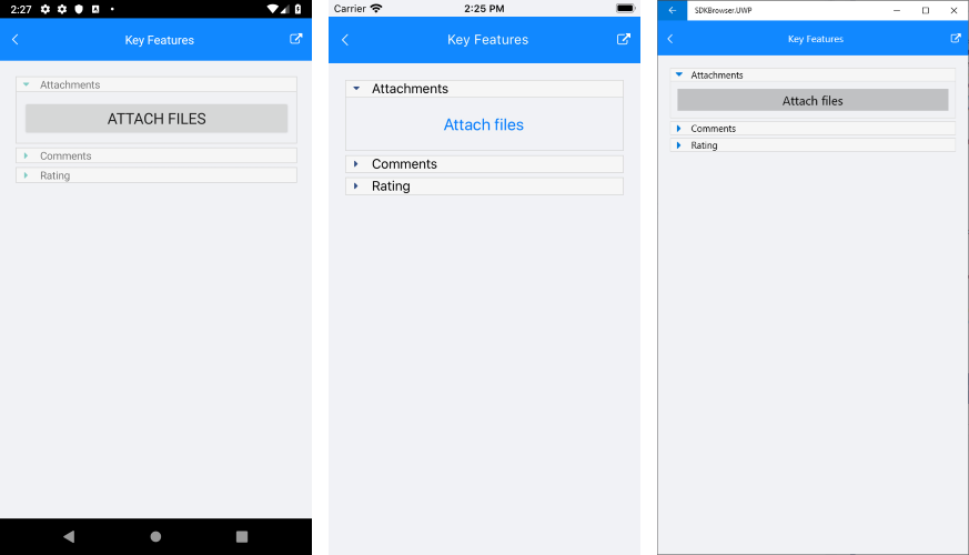
<telerikPrimitives:AccordionItem HeaderText="Attachments"
IsExpanded="True">
<telerikPrimitives:AccordionItem.Content>
<Button Text="Attach files" FontSize="20" Margin="10" />
</telerikPrimitives:AccordionItem.Content>
</telerikPrimitives:AccordionItem>
<telerikPrimitives:AccordionItem HeaderText="Comments">
<telerikPrimitives:AccordionItem.Content>
<Label Text="Add your comment here" Margin="30" />
</telerikPrimitives:AccordionItem.Content>
</telerikPrimitives:AccordionItem>
<telerikPrimitives:AccordionItem HeaderText="Rating">
<telerikPrimitives:AccordionItem.Content>
<telerikInput:RadShapeRating x:Name="rating" Margin="20"/>
</telerikPrimitives:AccordionItem.Content>
</telerikPrimitives:AccordionItem>
</telerikPrimitives:RadAccordion>
In addition to this, you need to add the following namespace:
xmlns:telerikBusyIndicator="clr-namespace:Telerik.XamarinForms.Primitives;assembly=Telerik.XamarinForms.Primitives"
xmlns:telerikInput="clr-namespace:Telerik.XamarinForms.Input;assembly=Telerik.XamarinForms.Input"
using Telerik.XamarinForms.Primitives;
using Telerik.XamarinForms.Input;
The image below shows the result after running the snippet:
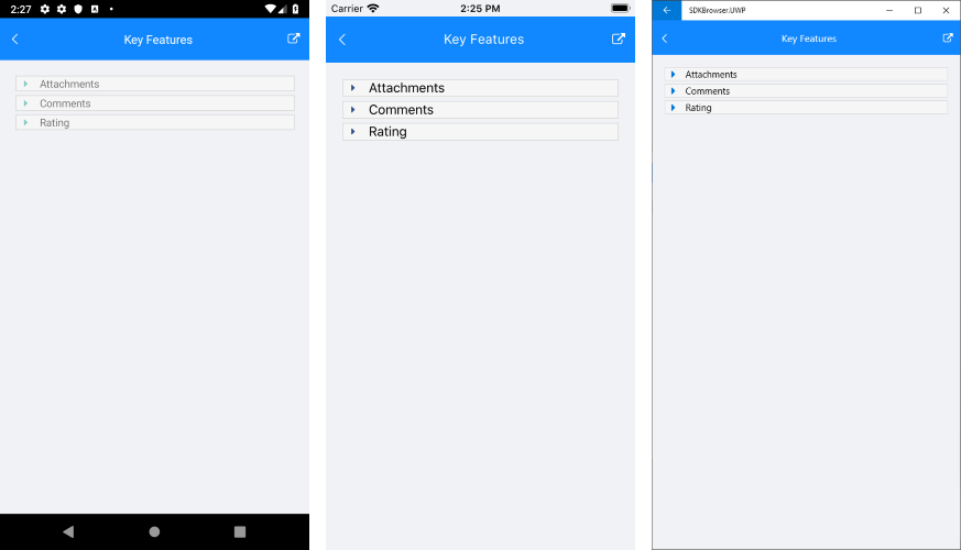
And the Accordion when all items are collapsed:
A sample Key Features example can be found in the Accordion/Features folder of the SDK Samples Browser application.