AccordionItem control
Basic Features
AccordionItem Header
You could either apply HeaderText property or use the AccordionItemHeader content control which provides a set of useful properties for customizing the look & feel of the Header. For more details refer to AccordionItemHeader section.
IsExpanded
IsExpanded is a Boolean property to indicate the currently expanded state of the AccordionItem.
Border Styles
You could utilize BorderColor, BorderThickness and CornerRadius properties of RadAccordionItem to change the way the Border around the control looks.
AccordionItemHeader
The indicator is the little triangle that is rotated according to whether the AccordionItem control is expanded or collapsed. AccordionItemHeader provides various options for customizing the look of the indicator via the following properties:
- IndicatorText: The indicator is represented by a string symbol that could be changed through IndicatorText property;
- IndicatorFontFamily: Specifies the indicator text FontFamily;
- IndicatorFontSize: Defines the indicator text font size;
- IndicatorColor: This property sets the color of the indicator;
- IndicatorLocation: This property is of type ExpandCollapseIndicatorLocation and is used to place the indicator to the left or to the right inside the Header;
- IndicatorAnimationDuration: Specifies the duration of the rotation animation of the indicator;
- IndicatorAnimationEasing: Specifies the easing of the rotation animation of the indicator;
- IndicatorMargin: This property is of type Thickness and sets the margin applied to the indicator;
You could apply BorderColor, BorderThickness and CornerRadius properties of AccordionItemHeader to make it consistent with the design of your app.
The following snippet shows the AccordionItemHeader could be customized:
<telerikPrimitives:AccordionItem IsExpanded="True"
                                 BorderColor="LightBlue"
                                 BorderThickness="2">
    <telerikPrimitives:AccordionItem.Header>
        <telerikPrimitives:AccordionItemHeader
                                IndicatorColor="Blue"
                                IndicatorFontSize="16"
                                IndicatorLocation="End"
                                BorderColor="LightBlue"
                                BorderThickness="2">
            <Label Text="Settings" Margin="8" />
        </telerikPrimitives:AccordionItemHeader>
    </telerikPrimitives:AccordionItem.Header>
    <telerikPrimitives:AccordionItem.Content>
        <StackLayout Margin="10, 20, 10, 20">
            <StackLayout Orientation="Horizontal" Spacing="10">
                <telerikPrimitives:RadCheckBox  />
                <Label Text="Make my profile private" />
            </StackLayout>
            <StackLayout Orientation="Horizontal" Spacing="10">
                <telerikPrimitives:RadCheckBox  />
                <Label Text="Only show my posts to people who follow me" />
            </StackLayout>
        </StackLayout>
    </telerikPrimitives:AccordionItem.Content>
</telerikPrimitives:AccordionItem>
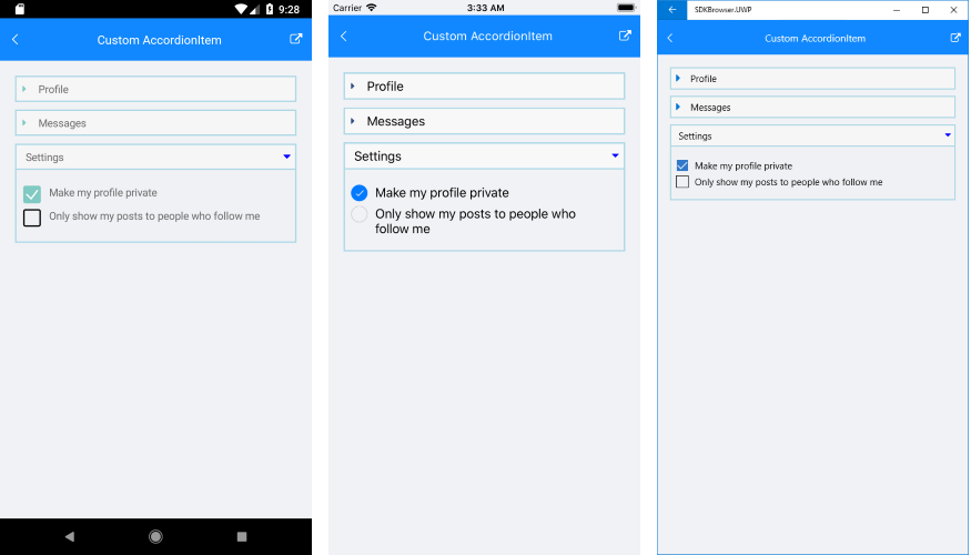
Next image displays how RadAccordion will look with thus defined items:
A sample AccordionItem example can be found in the Accordion/Features folder of the SDK Samples Browser application.