CheckBox for Xamarin Mobile Blazor Bindings
Telerik CheckBox for Xamarin Mobile Blazor Bindings is a checkbox control which enables users to make a choice between three mutually exclusive options (checked, unchecked and indeterminate states). The user’s selection is indicated by a check mark, and when a user clicks the checkbox its appearance and state change.
The CheckBox is part of Telerik UI for Xamarin, a
professional grade UI component library for building modern and feature-rich applications. To try it out sign up for a free 30-day trial.
Figure 1: RadCheckBox Overview

Key features
Indeterminate state support
RadCheckBox provides an additional indeterminate state which indicates the control is neither checked nor unchecked. You will need to set IsThreeState property to true:
<RadCheckBox IsThreeState="true"/>
and the result:

Color customization
RadCheckBox exposes a few useful Color properties for customizing its visual appearance. You could set the color of the check mark as well as the control itself in each of the available states.
- Background/Border Colors
- CheckedColor: Defines the Color applied to the control when it is checked. This is both the border and background color.
- UncheckedColor: Defines the Color applied to the control when it is unchecked. This is the border color only, the background is transparent when unchecked.
- IndeterminateColor: Defines the Color applied to the control when it is in Indeterminate state. This is both the border and background color.
- Symbol Colors
- CheckedSymbolColor: Defines the Color applied to the check symbol of the control when it is in Checked state.
- IndeterminateSymbolColor: Defines the Color applied to the Indeterminate symbol of the control.
Example
Here is a sample checkbox definition with the above properties applied:
<StackLayout>
    <Label Text="CheckedColor" />
    <RadCheckBox CheckedColor="Color.Aqua" />
    <Label Text="CheckedSymbolColor" />
    <RadCheckBox CheckedSymbolColor="Color.Black" />
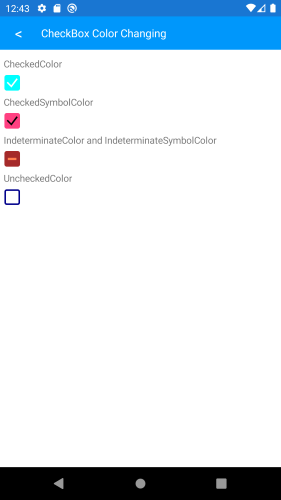
    <Label Text="IndeterminateColor and IndeterminateSymbolColor" />
    <RadCheckBox IndeterminateColor="Color.Brown"
                 IndeterminateSymbolColor="Color.Coral"
                 IsThreeState="true"/>
    <Label Text="UncheckedColor" />
    <RadCheckBox UncheckedColor="Color.DarkBlue" />
</StackLayout>
and the result:

Stroke Width customization
The RadCheckBox control exposes a StrokeWidth property that specifies the width of the lines with which the Checkbox element is drawn. It affects the border of the control as well as the check mark.
Here is an example how you can apply a StrokeWidth value:
<RadCheckBox StrokeWidth="5" />
and the result:

Different sizes
The width and height of the checkbox is controlled through the Length property and maintains a 1:1 aspect ratio.
Here is an example of setting the Length value:
<RadCheckBox StrokeWidth="5"
             Length="40" />
and the result:
