WPF ToolBar Overview
Thank you for choosing Telerik RadToolBar!
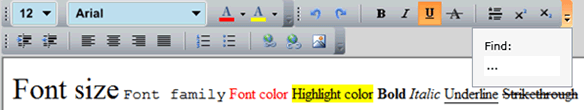
RadToolBar is an ItemsControl that can contain a group of controls (items). The RadToolBar can also display its items in accompanying (pop-up) overflow area if the available area is too small.
The RadToolBar is part of Telerik UI for WPF, a
professional grade UI library with 160+ components for building modern and feature-rich applications. To try it out sign up for a free 30-day trial.
The RadToolBar mimics the functionality and behavior of the Visual Studio toolbar with its Strip and Overflow areas. All the items in the toolbar will jump between the strip and the overflow depending on the toolbar's size. In addition, the developer is able to stick items into one of these areas using the attached OverflowMode property.
By default, when not all items in the ToolBar are visible, the OverflowButton will be enabled so it can display its content. Respectively, it will be disabled when all items in the ToolBar are displayed. In order the OverflowButton to be automatically hidden instead of disabled, set the AutoHideOverflowButton property to True. This property has a lower priority compared to OverflowButtonVisibility.
The RadToolBar also enables you to apply conditional styling to its items. The ToolBarContainerStyleSelector class allows you to easily specify different styles for the different control types by providing a collection of ToolBarContainerStyle objects.
There are also pre-defined styles for many of the standard controls – Button, RadButton, ToggleButton, RadToggleButton, CheckBox, RadioButton, RadRadioButton, RadDropDownButton, TextBox, TextBlock, RadToolBarSeparator.
Telerik UI for WPF Support and Learning Resources
- Telerik UI for WPF ToolBar Homepage
- Get Started with the Telerik UI for WPF ToolBar
- Telerik UI for WPF API Reference
- Getting Started with Telerik UI for WPF Components
- Telerik UI for WPF Virtual Classroom (Training Courses for Registered Users)
- Telerik UI for WPF ToolBar Forums
- Telerik UI for WPF Knowledge Base