Overview
With the R1 2019 version Telerik UI for WPF we have introduced the RadDiagramRibbon control. It allows users to examine and modify the settings of the diagramming items in run-time.
The control is a configured RadRibbonView which is used as a top level navigation control for the RadDiagram. Its main purpose is to provide you with a ready-to-use view that contains the most common features and settings of the RadDiagram. RadDiagramRibbon is fully customizable and scales its child widgets automatically based on the available area.
In order to use the RadDiagramRibbon control along with the RadDiagram in your projects you have to add references to the following assemblies:
- Telerik.Windows.Controls
- Telerik.Windows.Controls.Diagrams
- Telerik.Windows.Controls.Diagrams.Extensions
- Telerik.Windows.Controls.Diagrams.Ribbon
- Telerik.Windows.Controls.Input
- Telerik.Windows.Controls.Navigation
- Telerik.Windows.Controls.RibbonView
- Telerik.Windows.Diagrams.Core
RadDiagramRibbon exposes a Diagram property which is used to associate the ribbon with a particular diagram instance.
Example 1: Specify RadDiagramRibbon in XAML
<Grid>
    <Grid.RowDefinitions>
        <RowDefinition Height="Auto"/>
        <RowDefinition Height="*"/>
    </Grid.RowDefinitions>
    <telerik:RadDiagramRibbon Diagram="{Binding ElementName=diagram}"/>
    <telerik:RadDiagram x:Name="diagram" Grid.Row="1">
        <telerik:RadDiagramShape Content="Shape 1"/>
    </telerik:RadDiagram>
</Grid>
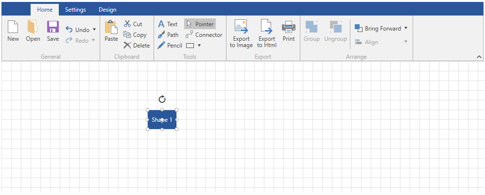
Figure 1: DiagramRibbon Overview
Please note that the examples in this tutorial are showcasing the Windows8 theme. In the Setting a Theme article you can find more information on how to set an application-wide theme.
Customize Tabs and Groups
RadDiagramRibbon by design contains three build-in RibbonTabs which hold different types of settings for customizing your RadDiagram: Home, Settings and Design. To add a new tab or a new group, you can use the AdditionalTabs and AdditionalGroups collection properties.
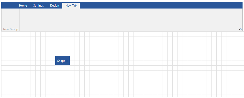
Add New RadRibbonTab
To add a new tab you can just call the Add() method of the AdditionalTabs collection or declare it dirrectly in XAML. The new tab will be placed at the last position.
Example 2: Add RadRibbonTab in XAML
<telerik:RadDiagramRibbon x:Name="diagramRibbon"
                          Diagram="{Binding ElementName=diagram}" >
    <telerik:RadRibbonTab Header="New Tab">
        <telerik:RadRibbonGroup Header="New Group"/>
    </telerik:RadRibbonTab>
</telerik:RadDiagramRibbon>
Example 3: Add RadRibbonTab programmatically
public MainWindow()
{
    InitializeComponent();
    RadRibbonTab newTab = new RadRibbonTab();
    newTab.Header = "New Tab";
    newTab.Items.Add(new RadRibbonGroup() { Header="New Group" });
    diagramRibbon.AdditionalTabs.Add(newTab);
}
Figure 2: Add new tab
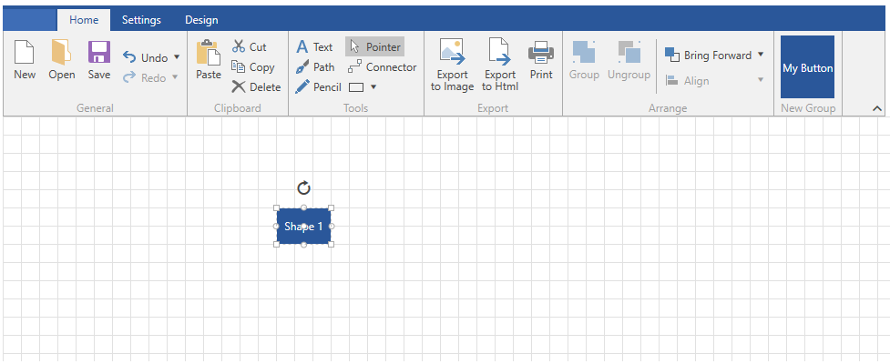
Add New RadRibbonGroup
To add a new group to Home tab for example first you can create a new RadRibbonGroup and add a RadRibbonButton to that group. Then you need to specify to which tab you want to add the group. To do that you can set the DiagramRibbonExtensions.RibbonTabHeader attached property. The last step is to add the new group to the AdditionalGroups collection.
Example 4: Add RadRibbonGroup in XAML
<telerik:RadDiagramRibbon x:Name="diagramRibbon"
                          Diagram="{Binding ElementName=diagram}" >
    <telerik:RadDiagramRibbon.AdditionalGroups>
        <telerik:RadRibbonGroup Header="New Group"  telerik:DiagramRibbonExtensions.RibbonTabHeader="Home">
            <telerik:RadRibbonButton Content="My Button" VerticalContentAlignment="Center" Foreground="White" Background="#2A579A"/>
        </telerik:RadRibbonGroup>
    </telerik:RadDiagramRibbon.AdditionalGroups>
</telerik:RadDiagramRibbon>
Example 5: Add RadRibbonGroup programmatically
public void AddNewGroup()
{
    RadRibbonButton button = new RadRibbonButton();
    button.Content = "My Button";
    button.Foreground = Brushes.White;
    button.Background = new SolidColorBrush((Color)(ColorConverter.ConvertFromString("#2A579A")));
    button.VerticalContentAlignment = VerticalAlignment.Center;

    RadRibbonGroup newGroup = new RadRibbonGroup();
    newGroup.Name = "new_group";
    newGroup.Header = "Group Name";
    newGroup.Items.Add(button);
    newGroup.SetValue(DiagramRibbonExtensions.RibbonTabHeaderProperty, "Home");

    this.diagramRibbon.AdditionalGroups.Add(newGroup);
}
Figure 3: Add new group
Keyboard Support
RadDiagramRibbon provides a keyboard navigation mechanism using key tips and the arrow keys. The key tips are enabled by default. This feature can be disabled by setting the KeyTipService.IsKeyTipsEnabled attached property on the RadDiagramRibbon to False.
Example 6: Disable DiagramRibbon KeyTips
<telerik:RadDiagramRibbon telerik:KeyTipService.IsKeyTipsEnabled="False" />
DiagramRibbon Commands
The RadDiagramRibbon control provides built-in commands which can be used in an MVVM scenario to modify your diagram and its items. The static DiagramRibbonCommands class is located in the Telerik.Windows.Controls.Diagrams.Ribbon assembly:
- SugiyamaLayout: Rearange the RadDiagram items in Sugiyama Layout. (Read more)
- TreeLayout: Rearange the RadDiagram items in Tree Layout. (Read more)
- ChangeConnectionType: Change the connection type. (Read more)
- ChangeUseFreeConnectors: Change UseFreeConnectors property of the RadDiagram.
- EnableAStarRouter: Set AStarRouter to the RadDiagram and update all connections.
- RouteAll: Update all connections in the RadDiagram.
Events
- HtmlExportButtonClicked: This event is called when the HTML Export button is clicked. Plase note that there is no built-in logic which will export the RadDiagram in HTML file and this event is exposed so that you can handle it and call your exporting logic. More information on how to export RadDiagram in HTML can be found in the Html Support article.
Simplified Layout
Since the R2 2019 SP1 version, you have the option of changing the default layout mode to a simplified one. This feature is enabled by the Simplified Layout feature of the RadRibbonView. The following properties were introduced in the RadDiagramRibbon class:
LayoutMode: Gets or sets the LayoutMode of the RadDiagramRibbon. The property is of type RibbonLayout and the possible values are Default and Simplified.
ShowLayoutModeButton: Gets or sets a value indicating whether the button for switching the LayoutMode will be visible.
LayoutModeButtonContent: Gets or sets the content of the LayoutMode button.
Example 7: Setting the ShowLayoutModeButton property
<telerik:RadDiagramRibbon Diagram="{Binding ElementName=diagram}" ShowLayoutModeButton="True" />
Figure 4: RadDiagramRibbon Simplified LayoutMode in the Fluent Theme
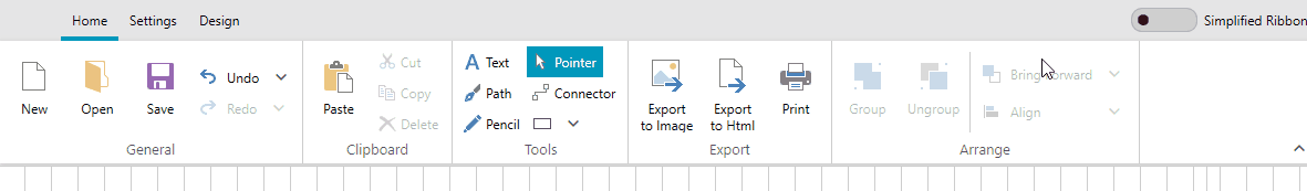
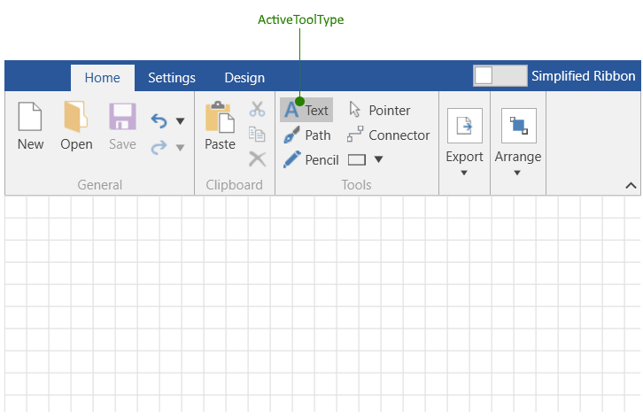
Diagram Active Tool
The RadDiagramRibbon control allows you to set the currently active tool in the corresponding RadDiagram control. You can do this via the Tools group in the ribbon's UI, or the ActiveToolType property of RadDiagramRibbon.
Example 8: Setting ActiveToolType to Text tool
<telerik:RadDiagramRibbon Diagram="{Binding ElementName=diagram}" ActiveToolType="Text" />
Figure 5: RadDiagramRibbon Simplified LayoutMode in the Fluent Theme