WPF CircularProgressBar Overview
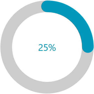
CircularProgressBar is a component that allows you to convey the progress of different tasks in a circular manner.
The RadCircularProgressBar is part of Telerik UI for WPF, a
professional grade UI library with 160+ components for building modern and feature-rich applications. To try it out sign up for a free 30-day trial.

Get started with the control with its Getting Started help article that shows how to use it in a basic scenario.
Key Features
Segments—The CircularProgressBar can be split into numerous segments to indicate its progress.
Color Ranges—CircularProgressBar supports defining ranges with different colors. Each range allows you to specify a start and end position, as well as an option to make its fill gradient.
Determinate and indeterminate states—The determinate state shows a specific amount of the progress. The indeterminate one plays an animation of the circular progress.
Customizable content—CircularProgressBar supports complex implementation for the content of its progress.
Radius manipulation—The control allows you to customize the indicator and track inner and outer radiuses.
Angles—You can control the beginning and ending angles of the component for a more customized appearance.
Secondary progress indicator—CircularProgressBar allows you to visualize an additional progress indicator. This is useful in scenarios where the primary indicator depends on the progress of the secondary one.
Indeterminate animation customization—You can modify the played animation when CircularProgressBar is in indeterminate state.
Check out the demos application at demos.telerik.com.
Telerik UI for WPF Support and Learning Resources
- Telerik UI for WPF CircularProgressBar Homepage
- Get Started with the Telerik UI for WPF CircularProgressBar
- Telerik UI for WPF API Reference
- Getting Started with Telerik UI for WPF Components
- Telerik UI for WPF Virtual Classroom (Training Courses for Registered Users)
- Telerik UI for WPF CircularProgressBar Forums
- Telerik UI for WPF Knowledge Base