WPF CardView Overview
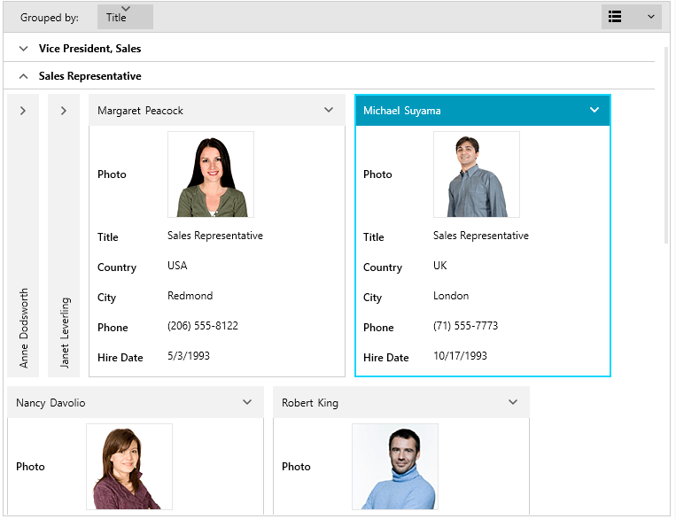
RadCardView allows you to display data in a card-like layout where you can sort, group and edit each card.
The RadCardView is part of Telerik UI for WPF, a
professional grade UI library with 160+ components for building modern and feature-rich applications. To try it out sign up for a free 30-day trial.
Key Features
Editing: The RadCardView cards contain sets of data fields that can be edited while the corresponding card is selected. Read more in the Editing article.
Selection: The control provides a built-in selection support. Clicking on a card in the layout selects it. You can also use the selection API. Read more in the Selection article.
Grouping: The users can interactively organize their data in a way that suits best their needs with a single drag and drop action. Data can be grouped according to several criteria effectively creating a tree of groups with the leaf nodes holding the actual data records. Users can group data by dragging a data field from the drop down menu and dropping it in the group area. Additionally, you can group the data programmatically using the GroupDescriptors collection of the corresponding collection view. Read more in the Grouping article.
Sorting: RadCardView allows you to sort the cards via the drop down menu listing the data fields. Read more in the Sorting article.
Filtering: The control has built-in filtering support. Read more in the Filtering article.
Different card layouts: The layout of the cards and groups can be altered between row and column based ordering. Read more in the Card Layout article.
Customizeable elements: The visualization of RadCardView's groups and cards can be easily customized using the control's API. Read more in the Appearance section of the documentation.
Data Validation: The control comes with a built-in data validation feature and visual feedback for values that don't match the validation criteria. Read more in the Data Validation article.
Localization support: The text used in the settings areas of the controls is localized. Read more about the Telerik Localization support in the Localization article which lists also the supported languages.
UI Virtualization: RadCardView item containers are virtualized which means that only the containers visible in the viewport are generated, thus boosting the performance.
Get started with the control with its Getting Started help article that shows how to use it in a basic scenario.
Check out the online demos at demos.telerik.com.
Telerik UI for WPF Support and Learning Resources
- Telerik UI for WPF CardView Homepage
- Get Started with the Telerik UI for WPF CardView
- Telerik UI for WPF API Reference
- Getting Started with Telerik UI for WPF Components
- Telerik UI for WPF Virtual Classroom (Training Courses for Registered Users)
- Telerik UI for WPF CardView Forums
- Telerik UI for WPF Knowledge Base