WinUI RibbonView Overview
Thank you for choosing Telerik RadRibbonView for WinUI control!
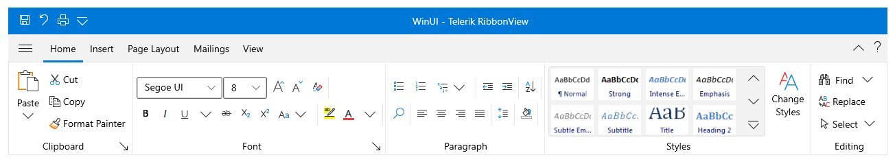
RadRibbonView is an easy-to-use implementation of the MS Office “ribbon” UI, which allows you to codelessly organize the navigation functionality of your application into a single compact toolbar control. Its popup engine, dynamic resizing and powerful customization capabilities make the RibbonView your shortcut to creating powerful navigation systems.
The RadRibbonView is part of Telerik UI for WinUI, a
professional grade UI component library for building modern and feature-rich applications. To try it out sign up for a free 30-day trial.
Figure 1: RadRibbonView Overview
Key Features
MS Office Interface at your Fingertips: The RibbonView control provides a UI very similar to the one provided by the MS Office ribbon.
Automatic Resizing and Minimization: The ribbon provides built-in mechanisms that allow you to minimize and automatically resize the ribbon content. Read more about this in the Minimization and Resizing articles.
Rich Set of Ribbon Specific Controls: The ribbon control works with special components (buttons, galleries, tabs, groups, etc.). Read more about this in the Ribbon Controls section.
Backstage: The ribbon allows you to open a backstage menu where you can display information related to the content. Read more about this in the Ribbon Backstage article.
Quick Access Toolbar: The quick access toolbar is an easily accessible toolbar displayed in the header of the ribbon where you can place buttons for quick actions as print, copy, etc. Read more about this in the Quick Access Toolbar article.
Screen Tips: The ribbon allows you to display a small window that appears when the mouse cursor hovers over an icon or a ribbon element (command). The popup window will provide details that explain the command's function. Read more about this in the Screen Tips article.
Contextual Tabs: The control allows you to organize your tabs in groups by using contextual tabs. This way the user can see multiple tabs available for a specific context. Read more about this in the Contextual Tabs article.
Keyboard Support: The control supports two types of keyboard navigation - via key tips and via arrow keys. Read more about this in the Keyboard Support article.
Simplified Layout: The ribbon allows you to define a more compact, simplified layout, using less space. Read more about this in the Simplified Ribbon article.
MVVM Support: RadRibbonView supports data binding and manual population with data out of the box.
Get started with the control with its Getting Started help article that shows how to use it in a basic scenario.
You can check out our demos application, which showcases the controls from the Telerik UI for WinUI suite. You can take a look at the Examples Application article, which describes how you can navigate to the download page.
Telerik UI for WinUI Support and Learning Resources
- Telerik UI for WinUI RibbonView Homepage
- Get Started with the Telerik UI for WinUI RibbonView
- Telerik UI for WinUI API Reference
- Getting Started with Telerik UI for WinUI Components
- Telerik UI for WinUI RibbonView Forums