WinUI LoopingList Overview
Thank you for choosing RadLoopingList!
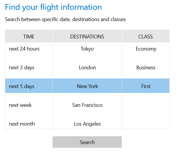
RadLoopingList allows users to visualize a list of data items in a single column (more columns can be simulated with a custom item data template) with great performance and a looping capability. The control uses its own UI virtualized data source and items-representation mechanism that is highly optimized. The looping capability means that once the control reaches the end of the data list, it seamlessly continues from the beginning, wrapping to the first data item. This is most easily demonstrated in the RadDatePicker control which can display the weekdays for example and when the list scrolls to Sunday it wraps back to Monday so that the user does not have to flick backward.
The LoopingList is part of Telerik UI for WinUI, a
professional grade UI component library for building modern and feature-rich applications. To try it out sign up for a free 30-day trial.

Key Features
Looping: The looping feature can be turned on and off with the IsLoopingEnabled property.
Item Sizing: RadLoopingList only supports items with uniform height. This is the core assumption on which the good performance of the control rests. The visual item size can be controlled with the ItemWidth and ItemHeight properties.
Snapping: The snapping feature allows the closest item to the center of the viewport to always be centered. The term snapping comes from the situation in which the user flicks over the list and triggers a scroll animation. When the scrolling finishes there will most likely be an item that is close to the center but not exactly at it. At this point the snapping kicks in by starting a short animation and snapping the item closest to the center exactly at the center of the viewport. To use the snapping feature users have to use the IsCentered property. It is important to note the snapping feature changes the selected item without user interaction. The item closest to the center is always selected and snapped in place.
Collapsing: The looping list can be collapsed so that it displays only the selected item. The whole list collapses, hiding all items in the list except the selected item. The collapsing feature can be controlled with the IsExpanded property.
Visual Item Customization: The visual items in the looping list can be customized by providing a custom data template and assigning it to the ItemTemplate property. There is also an ItemStyle property which can be set to a style object if users need to provide more settings along with the data template.
You can check out our demos application, which showcases the controls from the Telerik UI for WinUI suite. You can take a look at the Examples Application article, which describes how you can navigate to the download page.
Telerik UI for WinUI Support and Learning Resources
- Telerik UI for WinUI LoopingList Homepage
- Get Started with the Telerik UI for WinUI LoopingList
- Telerik UI for WinUI API Reference
- Getting Started with Telerik UI for WinUI Components
- Telerik UI for WinUI LoopingList Forums