Group Header Styling
The DataGrid provides several approaches to customize its group headers.
Styling Properties
The appearance of the group headers can be changed through the following properties:
-
GroupHeaderStyle&mdas;Allows you to apply a style to all group headers. TheTargetTypeof theStylehas to be aDataGridGroupHeader.DataGridGroupHeader Style
<Grid xmlns:grid="using:Telerik.UI.Xaml.Controls.Grid" xmlns:gridPrimitives="using:Telerik.UI.Xaml.Controls.Grid.Primitives"> <grid:RadDataGrid Width="600" Height="460" x:Name="grid"> <grid:RadDataGrid.GroupHeaderStyle> <Style TargetType="gridPrimitives:DataGridGroupHeader"> <Setter Property="FontSize" Value="20"/> <Setter Property="FontStyle" Value="Italic"/> <Setter Property="Foreground" Value="Red"/> </Style> </grid:RadDataGrid.GroupHeaderStyle> </grid:RadDataGrid> </Grid> GroupHeaderStyleSelector—Allows you to apply different styles to group headers depending on some custom logic. The following examples demonstrate a possible implementation.-
GroupHeaderTemplate—Specifies a customDataTemplatethat will be applied to the group header.Custom GroupHeaderTemplate
<Grid xmlns:grid="using:Telerik.UI.Xaml.Controls.Grid" xmlns:gridPrimitives="using:Telerik.UI.Xaml.Controls.Grid.Primitives"> <grid:RadDataGrid Width="600" Height="460" x:Name="grid"> <grid:RadDataGrid.GroupHeaderTemplate> <DataTemplate> <StackPanel> <TextBlock Text="Group :"/> <TextBlock Text="{Binding Group.Key}"/> </StackPanel> </DataTemplate> </grid:RadDataGrid.GroupHeaderTemplate> </grid:RadDataGrid> </Grid> -
GroupHeaderTemplateSelector—Applies differentDataTemplatesto the group headers depending on some custom logic. The following examples demonstrate a possible implementation.
You can define whether the group headers will be frozen or scrollable through the
GroupHeaderDisplayModeproperty.
Styling The Group Headers
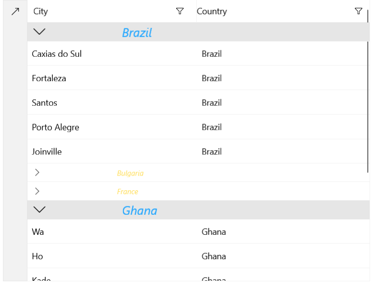
The following examples demonstrate how to populate the DataGrid with data and conditionally apply a style and a DataTemplate to the group headers. The examples show how to display a different Style/DataTemplate for expanded and collapsed groups.
Define the DataGrid
<Grid xmlns:grid="using:Telerik.UI.Xaml.Controls.Grid"
      xmlns:dataCore="using:Telerik.Data.Core"
      xmlns:gridPrimitives="using:Telerik.UI.Xaml.Controls.Grid.Primitives">
    <Grid.Resources>
        <local:CustomStyleSelector x:Key="StyleSelector">
            <local:CustomStyleSelector.ExpandedStyle>
                <Style TargetType="gridPrimitives:DataGridGroupHeader">
                    <Setter Property="FontSize" Value="20"/>
                </Style>
            </local:CustomStyleSelector.ExpandedStyle>
            <local:CustomStyleSelector.CollapsedStyle>
                <Style TargetType="gridPrimitives:DataGridGroupHeader">
                    <Setter Property="FontSize" Value="12"/>
                </Style>
            </local:CustomStyleSelector.CollapsedStyle>
        </local:CustomStyleSelector>

        <local:CustomDataTemplateSelector x:Key="TemplateSelector">
            <local:CustomDataTemplateSelector.ExpandedTemplate>
                <DataTemplate>
                    <TextBlock Text="{Binding Group.Key}" Foreground="#21A6FF"
                   FontStyle="Italic"
                   Margin="115,0,0,0" VerticalAlignment="Center"/>
                </DataTemplate>
            </local:CustomDataTemplateSelector.ExpandedTemplate>
            <local:CustomDataTemplateSelector.CollapsedTemplate>
                <DataTemplate>
                    <TextBlock Text="{Binding Group.Key}" Foreground="#FFDE5B"
                   FontStyle="Italic"
                   Margin="115,0,0,0" VerticalAlignment="Center"/>
                </DataTemplate>
            </local:CustomDataTemplateSelector.CollapsedTemplate>
        </local:CustomDataTemplateSelector>
    </Grid.Resources>
    <grid:RadDataGrid Width="600" Height="460" x:Name="grid"
              GroupHeaderTemplateSelector="{StaticResource TemplateSelector}"
              GroupHeaderStyleSelector="{StaticResource StyleSelector}">
        <grid:RadDataGrid.GroupDescriptors>
            <dataCore:PropertyGroupDescriptor PropertyName="Country"/>
        </grid:RadDataGrid.GroupDescriptors>
    </grid:RadDataGrid>
</Grid>
GroupHeaderTemplateSelector and GroupHeaderStyleSelector Implementation
public sealed partial class MainPage : Page
{
    public MainPage()
    {
        this.InitializeComponent();

        List<CustomData> data = new List<CustomData>
        {
            new CustomData { Country = "Brazil", City = "Caxias do Sul" },
            new CustomData { Country = "Ghana", City = "Wa" },
            new CustomData { Country = "Brazil", City = "Fortaleza" },
            new CustomData { Country = "Italy", City = "Florence" },
            new CustomData { Country = "France", City = "Bordeaux" },
            new CustomData { Country = "Bulgaria", City = "Vratsa" },
            new CustomData { Country = "Spain", City = "Las Palmas" },
            new CustomData { Country = "France", City = "Le Mans" },
            new CustomData { Country = "Brazil", City = "Santos" },
            new CustomData { Country = "Ghana", City = "Ho" },
            new CustomData { Country = "Spain", City = "Malaga" },
            new CustomData { Country = "France", City = "Marseille" },
            new CustomData { Country = "Bulgaria", City = "Koynare" },
            new CustomData { Country = "Spain", City = "Valencia" },
            new CustomData { Country = "Ghana", City = "Kade" },
            new CustomData { Country = "Brazil", City = "Porto Alegre" },
            new CustomData { Country = "Bulgaria", City = "Byala Slatina" },
            new CustomData { Country = "Italy", City = "Naples" },
            new CustomData { Country = "Brazil", City = "Joinville" },
        };
        this.grid.ItemsSource = data;
    }
}

public class CustomData
{
    public string City { get; set; }

    public string Country { get; set; }
}

public class CustomStyleSelector : StyleSelector
{
    public Style ExpandedStyle { get; set; }

    public Style CollapsedStyle { get; set; }

    protected override Style SelectStyleCore(object item, DependencyObject container)
    {
        if ((item as GroupHeaderContext).IsExpanded == true)
        {
            return this.ExpandedStyle;
        }
        else
        {
            return this.CollapsedStyle;
        }
    }
}

public class CustomDataTemplateSelector : DataTemplateSelector
{
    public DataTemplate ExpandedTemplate { get; set; }

    public DataTemplate CollapsedTemplate { get; set; }

    protected override DataTemplate SelectTemplateCore(object item, Microsoft.UI.Xaml.DependencyObject container)
    {
        if ((item as GroupHeaderContext).IsExpanded == true)
        {
            return this.ExpandedTemplate;
        }
        else
        {
            return this.CollapsedTemplate;
        }
    }
}