Customizing Data Fields
The DataForm provides flexible API for customizing the UI of its data fields.
The component allows you to replace the automatically created panel with data fields and also the labels of the fields.
Custom Style
You can customize the auto-generated data fields by using the DataFieldStyle property of the DataForm.
Set the DataFieldStyle
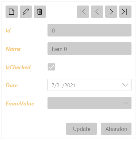
<telerik:RadDataForm>
    <telerik:RadDataForm.DataFieldStyle>
        <Style TargetType="telerik:DataFormDataField">
            <Setter Property="Foreground" Value="#F5CC84" />
            <Setter Property="LabelTemplate">
                <Setter.Value>
                    <DataTemplate>
                        <TextBlock Text="{Binding}" FontWeight="Bold" FontStyle="Italic"/>
                    </DataTemplate>
                </Setter.Value>
            </Setter>
        </Style>
    </telerik:RadDataForm.DataFieldStyle>
</telerik:RadDataForm>
Custom Content
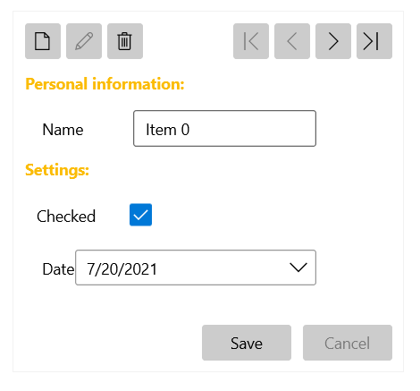
To control the UI of each DataForm page, set the ReadOnlyTemplate and EditTemplate properties. The ReadOnlyTemplate is used when the component is in its normal state and the EditTemplate is used when the current item is in edit mode.
You can also replace the content of the DataForm when adding a new item by setting the NewItemTemplate property in the same manner as ReadOnlyTemplate and EditTemplate.
The following example shows a possible way to use the ReadOnlyTemplate and EditTemplate properties.
Set ReadOnlyTemplate and EditTemplate
<telerik:RadDataForm AutoGenerateFields="False">
    <telerik:RadDataForm.ReadOnlyTemplate>
        <DataTemplate>
            <StackPanel>
                <TextBlock Text="Personal information:" FontWeight="Bold" Margin="0 10 0 0" Foreground="#d1cab8"/>
                <telerik:DataFormDataField Margin="15 0 0 0" Label="Name" LabelPosition="Beside" IsReadOnly="True" DataMemberBinding="{Binding Name, Mode=TwoWay}" />
                <TextBlock Text="Settings:" FontWeight="Bold" Margin="0 10 0 0" Foreground="#d1cab8"/>
                <telerik:DataFormCheckBoxField  Margin="10 0 0 0" Label="Checked" IsReadOnly="True" LabelPosition="Beside" DataMemberBinding="{Binding IsChecked, Mode=TwoWay}" />
                <telerik:DataFormDateField Margin="15 0 0 0" Label="Date" IsReadOnly="True" LabelPosition="Beside" DataMemberBinding="{Binding Date, Mode=TwoWay}" />
            </StackPanel>
        </DataTemplate>
    </telerik:RadDataForm.ReadOnlyTemplate>
    <telerik:RadDataForm.EditTemplate>
        <DataTemplate>
            <StackPanel>
                <TextBlock Text="Personal information:" FontWeight="Bold" Margin="0 10 0 0" Foreground="#FBBC05"/>
                <telerik:DataFormDataField Margin="15 0 0 0" Label="Name" LabelPosition="Beside" DataMemberBinding="{Binding Name, Mode=TwoWay}" />
                <TextBlock Text="Settings:" FontWeight="Bold" Margin="0 10 0 0" Foreground="#FBBC05"/>
                <telerik:DataFormCheckBoxField  Margin="10 0 0 0" Label="Checked" LabelPosition="Beside" DataMemberBinding="{Binding IsChecked, Mode=TwoWay}" />
                <telerik:DataFormDateField Margin="15 0 0 0" Label="Date" LabelPosition="Beside" DataMemberBinding="{Binding Date, Mode=TwoWay}" />
            </StackPanel>
        </DataTemplate>
    </telerik:RadDataForm.EditTemplate>
</telerik:RadDataForm>
Custom Labels
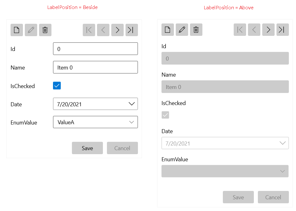
The DataForm allows you to customize the labels of its data fields. To customize all labels in the component globally, set the LabelPosition and LabelStyle properties. LabelPosition accepts the Above (default) and Beside values.
Set the Label Position
<telerik:RadDataForm LabelPosition="Beside">
Set the Label Style
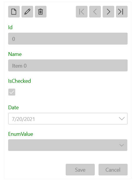
<telerik:RadDataForm>
    <telerik:RadDataForm.LabelStyle>
        <Style TargetType="TextBlock">
            <Setter Property="Foreground" Value="Green"/>
        </Style>
    </telerik:RadDataForm.LabelStyle>
</telerik:RadDataForm>
LabelPosition and LabelTemplate properties of the corresponding DataFormDataField.
Set the Label Template
<telerik:DataFormDataField>
    <telerik:DataFormDataField.LabelTemplate>
        <DataTemplate>
            <TextBlock Text="{Binding}" Foreground="Green"/>
        </DataTemplate>
    </telerik:DataFormDataField.LabelTemplate>
</telerik:DataFormDataField>