Getting Started with WinForms PropertyGrid
| RELATED VIDEOS | |
|---|---|
| RadPropertyGrid provides an easy and versatile approach to processing data objects' properties. Utilizing its autogeneration features and the intuitive custom editors apabilities, users would be able either to display data in a way that best fits their needs or modify it with minimal effort. RadPropertyGrid can be bound to an item with just a single line of code and you may start exploring or editing its properties. The property editor controls are auto generated - text fields for string properties, DateTimePickers for dates, ComboBoxes for enums and Booleans, RadColorPicker for colors. In addition, RadPropertyGrid allows flexible manual settings and customization of editors. RadPropertyGrid also supports scrolling operations via touch interface. |
WinForms RadPropertyGrid Getting started with RadPropertyGrid 
|
The following example will demonstrate the basic functionalities of RadPropertyGrid control. Let’s start with adding RadPropertyGrid control to a RadForm. In the code behind we will set the SelectedObject property of the control to an object, which properties we want to display. For the sake of this example we will use the element of the control – PropertyGridElement.
RadPropertyGrid`s SelectedObject
this.radPropertyGrid1.SelectedObject = new PropertyGridElement();
Me.RadPropertyGrid1.SelectedObject = New PropertyGridElement()
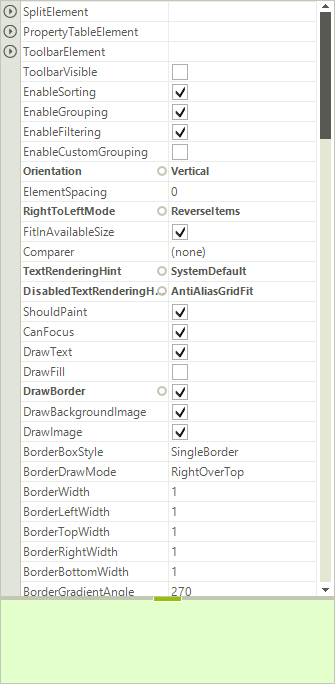
It is all set and RadProperyGrid reads all public properties of the given object and displays them:
Figure 1: Selected Object
Now, let’s customize the example a bit and take advantage of some of its features. As you can see in the image above, on the bottom of the control a help section is displayed. This section reads the name and the content of the Description attribute of the selected property. The section visibility is controlled by the HelpVisible property and it is turned on by default.
Next, we will add a predefined toolbox on the top of the control. This toolbox contains of two buttons – for alphabetical sorting and for grouping the items (grups are created by reading the Category attribute of the SelectedObject properties) – and also a text box used for filtering the property grid. All this functionality comes out of the box by simply setting the ToolBarVisible property to true:
ToolbarVisible
this.radPropertyGrid1.ToolbarVisible = true;
Me.RadPropertyGrid1.ToolbarVisible = True
Additionally, since the toolbox consists of a StackLayoutPanel, is supports adding additional elements. Here is how to add a button that clears the filter text box:
Add Element to Toolbox
RadButtonElement clearFiltering = new RadButtonElement();
clearFiltering.Text = "Clear";
clearFiltering.MinSize = new System.Drawing.Size(25, 22);
clearFiltering.StretchHorizontally = false;
clearFiltering.Click += new EventHandler(clearFiltering_Click);
Dim clearFiltering = New RadButtonElement()
clearFiltering.Text = "Clear"
clearFiltering.MinSize = New System.Drawing.Size(25, 22)
clearFiltering.StretchHorizontally = False
AddHandler clearFiltering.Click, AddressOf clearFiltering_Click
Clear the Filter
void clearFiltering_Click(object sender, EventArgs e)
{
    this.radPropertyGrid1.PropertyGridElement.ToolbarElement.SearchTextBoxElement.Text = "";
}
Private Sub clearFiltering_Click(ByVal sender As Object, ByVal e As EventArgs)
    Me.RadPropertyGrid1.PropertyGridElement.ToolbarElement.SearchTextBoxElement.Text = ""
End Sub
By default, opening the editor for editing is done by double clicking the editor. This behavior can be easily changed by selecting one of the predefined options of the BeginEditMode property. The options to choose from are follows:
BeginEditOnClick: The editor is opened on the first click
BeginEditOnDoubleClick: The editor is opened on double click
BeginEditoProgramatically: The editor can be opened only programmatically (by calling BeginEdit() method)
Begin Edit Mode
this.radPropertyGrid1.BeginEditMode = RadPropertyGridBeginEditModes.BeginEditOnClick;
Me.RadPropertyGrid1.BeginEditMode = RadPropertyGridBeginEditModes.BeginEditOnClick
To set the default sorting or grouping of the properties, just set the PropertySort property, to one of the enumerated values:
Alphabetical: Sorts the properties according to the SortOrder setting (Ascending or Descending)
Categorized: Groups the properties according to their Category attribute
CategorizedAlphabetical: Groups the properties according to their Category attribute and sorts them Alphabetically, according to the SortOrder setting (Ascending or Descending)
None: Removes sorting and grouping
Group by Categories
this.radPropertyGrid1.PropertySort = PropertySort.Categorized;
Me.RadPropertyGrid1.PropertySort = PropertySort.Categorized
You can control the sort order, by setting the SortOrder property of the control. Possible values are Ascending, Descending and None:
Setting the Sort Order
this.radPropertyGrid1.SortOrder = SortOrder.Ascending;
Me.RadPropertyGrid1.SortOrder = SortOrder.Ascending
There are also four properties that allow you to control the expand/collapse image of the control. These are as follows: CollapseImage, ExpandImage, HoveredCollapseImage and HoveredExpandImage.
The selection of the items is controlled by either setting a certain item to the SelectedGridItem property, or by calling the Select() method of an item.
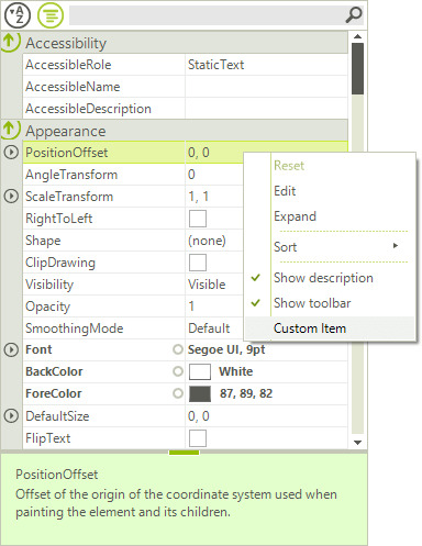
Accessing and modifying the default context menu, can be achieved by accessing the RadContextMenu property of the control. For more information on how to work with menu items, please refer to our Menu section.
Figure 2: Context Menu
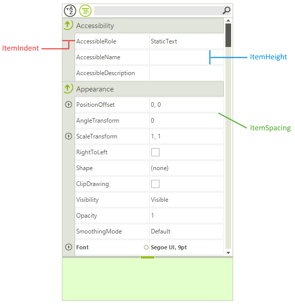
There are a few properties that you can set in order to change the item appearance:
ItemHeight: Sets the visible items height.
ItemSpacing: Sets the spacing between the items.
ItemIndent: Sets the indent space in the beginning of the items.
Item Settings
this.radPropertyGrid1.ItemHeight = 30;
this.radPropertyGrid1.ItemIndent = 25;
this.radPropertyGrid1.ItemSpacing = 1;
Me.RadPropertyGrid1.ItemHeight = 30
Me.RadPropertyGrid1.ItemIndent = 25
Me.RadPropertyGrid1.ItemSpacing = 1
Figure 3: Selected Object
At the end, if you want to expand all groups automatically, you can set the AutoExpandGroups to true (which is also the default setting).
See Also
Telerik UI for WinForms Learning Resources
- Telerik UI for WinForms PropertyGrid Component
- Getting Started with Telerik UI for WinForms Components
- Telerik UI for WinForms Setup
- Telerik UI for WinForms Application Modernization
- Telerik UI for WinForms Visual Studio Templates
- Deploy Telerik UI for WinForms Applications
- Telerik UI for WinForms Virtual Classroom(Training Courses for Registered Users)
- Telerik UI for WinForms License Agreement)