WinForms ListView Overview
RadListView is created as a result of the concord of the powerful data layer used by RadGridView and RadListControl, together with the outstanding Telerik Presentation Framework. The data layer provides very high performance when working with data and also different types of binding options. Additionally, it provides features like grouping, sorting and filtering. Thanks to the Telerik Presentation Framework, the control customization is very flexible and intuitive.
The ListView is part of Telerik UI for WinForms, a
professional grade UI library with 160+ components for building modern and feature-rich applications. To try it out sign up for a free 30-day trial.
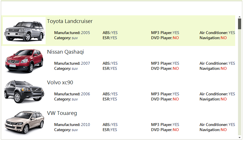
RadListView is a bindable control for representing and editing list data with lots of customization abilities. RadListView will offer three different types of views, which will let you visualize your data the way that you want. You may choose between SimpleListView, IconView or DetailView.
RadListView will also provide a rich and flexible API, which will let the developers easily customize the layout or the behavior of the control. Furthermore, the API will be similar to the API of our existing controls, so it will be easier for those who have already used our products to use the new component. The known family of items’ creating/formatting events will let you replace or style the items according to your preferences. Check boxes, re-sizing and reordering of columns, hot tracking, multiple selection and different sizing modes are another small part of the possibilities provided by the API.
You can review below the Key Features that RadListView supports.
Key Features
DataBinding: Data binding is a mechanism for automatic population of the RadListView with items, based on the provided data structure. RadListView support data binding either at design time or at run time.
ViewTypes: RadListView supports three ViewTypes – ListView, IconView and DetailView. With RadListView you can customize its appearance in order to fit your needs.
Columns: Adding columns to the control at design time, is done by populating the Columns collection of RadListView. This collection can be accessed either through the Columns property in the property grid of the control or through the Smart Tag of RadListView.
Sorting: Sorting can be achieved in two ways. Either programmatically by adding the appropriate SortDescriptor to the SortDescriptors collection of RadListView, or by enabling the user to sort by clicking a column header in DetailsView.
Grouping: RadListView supports both custom grouping and automatic grouping based on a certain property. You can read more about this here.
Filtering: RadListView allows filtering operations in all views.
Kinetic scrolling
CheckBoxes: RadListViews' items have built-in checkboxes which can be shown by setting the ShowCheckBoxes property of RadListView to true.
Multi selection: RadListView supports both single and multiple selection. The selection mode is determined by the MultiSelect property of the control. You can read more about this here.
Hot tracking
In the related Getting Started article you can find how to use the control with a sample scenario.
Download and check out the online demo at demos.telerik.com
Telerik UI for WinForms Learning Resources
- Telerik UI for WinForms ListView Homepage
- Get Started with the Telerik UI for WinForms ListView
- Telerik UI for WinForms API Reference
- Getting Started with Telerik UI for WinForms Components
- Telerik UI for WinForms Virtual Classroom (Training Courses for Registered Users)
- Telerik UI for WinForms Forum
- Telerik UI for WinForms Knowledge Base
Telerik UI for WinForms Additional Resources
- Telerik UI for WinForms Product Overview
- Telerik UI for WinForms Blog
- Telerik UI for WinForms Videos
- Telerik UI for WinForms Roadmap
- Telerik UI for WinForms Pricing
- Telerik UI for WinForms Code Library
- Telerik UI for WinForms Support
- What’s New in Telerik UI for WinForms