Accessing and Customizing Elements
Accessing and customizing elements can be performed either at design time, or at run time. Before proceeding with this topic, it is recommended to get familiar with the visual structure of the RadCheckedDropDownList.
Design time
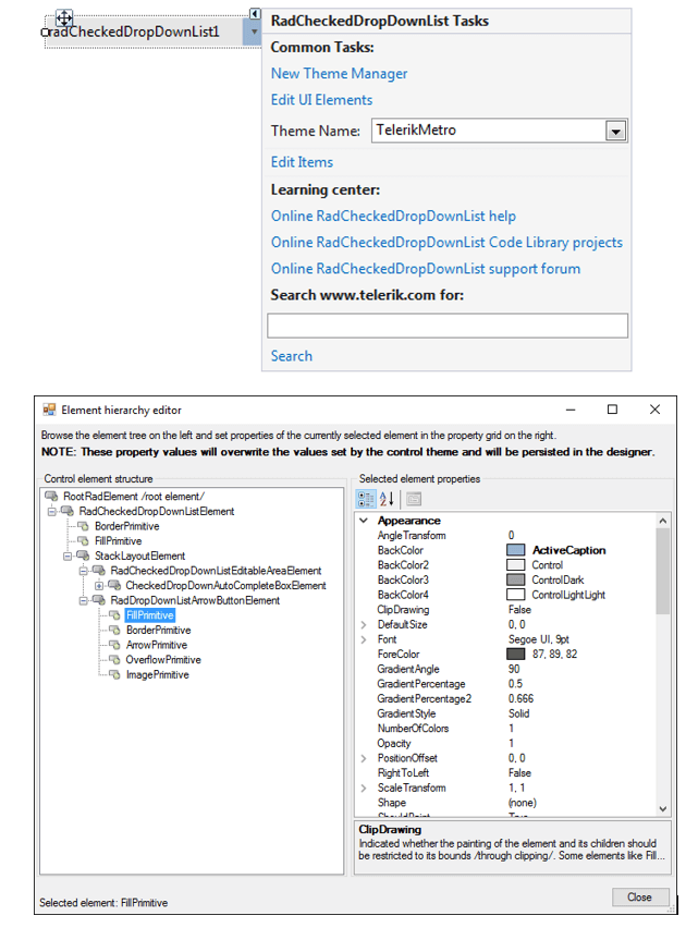
You can access and modify the style for different elements in RadCheckedDropDownList by using the Element hierarchy editor.
In order to access the Element hierarchy editor select RadCheckedDropDownList and click the small arrow on the top right position in order to open the Smart Tag. Then, click the Edit UI Elements.
Figure 1: Element Hierarchy Editor
Programmatically
You can customize the nested elements at run time as well:
Figure 2: Customize Elements
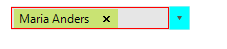
Customize elements
this.radCheckedDropDownList1.DropDownListElement.ArrowButton.Fill.BackColor = Color.Aqua;
this.radCheckedDropDownList1.DropDownListElement.EditableElement.BorderColor  = Color.Red;
this.radCheckedDropDownList1.DropDownListElement.EditableElement.DrawBorder = true;
this.radCheckedDropDownList1.DropDownListElement.EditableElement.BorderGradientStyle = GradientStyles.Solid;
this.radCheckedDropDownList1.DropDownListElement.EditableElement.BorderWidth = 1;
Me.RadCheckedDropDownList1.DropDownListElement.ArrowButton.Fill.BackColor = Color.Aqua
Me.RadCheckedDropDownList1.DropDownListElement.EditableElement.BorderColor = Color.Red
Me.RadCheckedDropDownList1.DropDownListElement.EditableElement.DrawBorder = True
Me.RadCheckedDropDownList1.DropDownListElement.EditableElement.BorderGradientStyle = GradientStyles.Solid
Me.RadCheckedDropDownList1.DropDownListElement.EditableElement.BorderWidth = 1
In order to style the pop-up items it is suitable to use the Formatting Items event.