RadMenuItem
The following controls are used to create a menu structure:
RadMenuItem
RadMenuHeaderItem
RadMenuComboItem
RadMenuSeparatorItem
RadMenuContentItem
RadMenuItem
The RadMenuItem represents a standard menu item. Some of its properties include:
| Properties | Description |
|---|---|
| AutoSizeMode | Indicates how the menu item will be sized and can be FitToAvailableSize, WrapAroundChildren or Auto. |
| AngleTransform | Sets the angle offset from horizontal with which the item will be displayed. |
| CommandBinding | Allows you to configure keyboard shortcuts to fire a given menu item. See the Getting Started topic for an example. |
| DisplayStyle | Lets you choose whether to show an image, text, or both on the item. |
| DescriptionText | Contains the text for the description that appears just below the Text. DescriptionFont controls the font characteristics of the DescriptionText display. See the example menu item in the figure below. 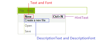
|
| Enabled | When set to false shows the menu item as grayed out and does not react to mouse clicks. To allow non-standard painting when the menu item is not enabled set the UseDefaultDisabledPaint property to false and then use the Visual Style Builder to customize the appearance of this state. |
| FlipText | Flips the text of the item vertically if set to true. |
| BackColor and ForeColor | Set the colors of the background and text. |
| Font | Sets the font and size of the item text. |
| HintText | Sets the text to appear at the right side of the menu item, such as Ctrl+N for New. |
| Image, ImageIndex, and ImageKey | Let you assign an image to display on the item. |
| IsChecked | Controls whether a check mark is displayed on the item. |
| TextImageRelation | Controls the relationship between the text and image displayed on the item. |
| Text | Specifies the text to show on the item. |
| TextOrientation | Allows you to choose vertical or horizontal text display. |
| CheckOnClick | Indicates whether selecting the item should set a check mark. |
| HasTwoColumnDropDown | Lets you add a drop-down menu that contains two columns. |
| IsMainMenuItem | Indicates that the menu item is an item on the main menu, rather than an item on a drop-down menu. |
| PopupDirection | Indicates whether the direction in which the drop-down menu will open will be to the left, right, up, or down. |
| ShowArrow | Displays an arrow button on the drop-down menu. |
| StringAlignment | Formats the alignment of the text string so it is positioned near, center, or far from the left border of the menu item. |
RadMenuComboItem
The RadMenuComboItem allows you to put a drop-down list on a menu. To add items to the combo box work with the Items collection of the RadMenuComboItem.ComboBoxElement property. Since the ComboBoxElement returns a RadDropDownListElement, you can also use data binding to put items in the drop-down list from any data source.
RadMenuContentItem
The RadMenuContentItem is a container control that allows you to build up custom menu items from other controls. You can assign any RadElement based control to the ContentElement property of a RadMenuContentItem. See Nesting Controls in Menu Items for an example.
RadMenuSeparatorItem
The RadMenuSeparatorItem is used to add a horizontal line for visual separation between successive items on a menu.
RadMenuSeparatorItem defines a TextVisibility property and it needs to be set to Visible in order the text set to the item to be displayed.