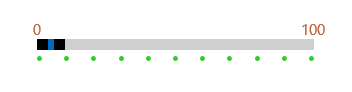
Styling
Apply Style to parts of the ScalePrimitive Control
-
First define styles that target the ScalePrimitive class as a StaticResource:
<Style TargetType="telerikPrimitives:ScalePrimitive" x:Key="ScaleStyle">
    <Setter Property="LabelPlacement" Value="None"/>
    <Setter Property="TickPlacement" Value="TopLeft"/>
    <Setter Property="TickTemplate">
        <Setter.Value>
            <DataTemplate>
                <Ellipse Width="5" Height="5" Margin="0,5,0,0" Fill="LimeGreen"/>
            </DataTemplate>
        </Setter.Value>
    </Setter>
</Style>

<Style TargetType="telerikPrimitives:ScalePrimitive" x:Key="ScaleStyle2">
    <Setter Property="LabelPlacement" Value="Center"/>
    <Setter Property="LabelStyle">
        <Setter.Value>
            <Style TargetType="TextBlock">
                <Setter Property="Foreground" Value="#BE673D"/>
                <Setter Property="FontSize" Value="15"/>
            </Style>
        </Setter.Value>
    </Setter>
    <Setter Property="TickPlacement" Value="None"/>
</Style>
Where:
xmlns:telerikPrimitives="using:Telerik.UI.Xaml.Controls.Primitives" -
Set the BottomRightScaleStyle and TopLeftScaleStyle properties to the custom defined styles:
<telerikInput:RadRangeSlider BottomRightScaleStyle="{StaticResource ScaleStyle}"
                             TopLeftScaleStyle="{StaticResource ScaleStyle2}"
                             Width="300" TickFrequency="10"/>
The result is:
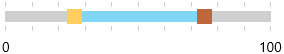
Apply Style to parts of the SliderPrimitive Control
Apply Custom Style to the Thumbs
-
Define custom style that targets the RangeSliderPrimitive class as a StaticResource:
<Style TargetType="telerikPrimitives:RangeSliderPrimitive" x:Key="PrimitiveStyle">
    <Setter Property="SelectionStartThumbStyle">
        <Setter.Value>
            <Style TargetType="Thumb">
                <Setter Property="BorderThickness" Value="0"/>
                <Setter Property="Background" Value="#FFCE5E"/>
                <Setter Property="Width" Value="15"/>
                <Setter Property="Height" Value="15"/>
            </Style>
        </Setter.Value>
    </Setter>
    <Setter Property="SelectionMiddleThumbStyle">
        <Setter.Value>
            <Style TargetType="Thumb">
                <Setter Property="BorderThickness" Value="0"/>
                <Setter Property="Background" Value="#80D6F4"/>
                <Setter Property="Height" Value="11"/>
            </Style>
        </Setter.Value>
    </Setter>
    <Setter Property="SelectionEndThumbStyle">
        <Setter.Value>
            <Style TargetType="Thumb">
                <Setter Property="BorderThickness" Value="0"/>
                <Setter Property="Background" Value="#BE673D"/>
                <Setter Property="Width" Value="15"/>
                <Setter Property="Height" Value="15"/>
            </Style>
        </Setter.Value>
    </Setter>
</Style>
Where:
xmlns:telerikPrimitives="using:Telerik.UI.Xaml.Controls.Primitives" -
Set the SliderPrimitiveStyle property of the RadRange slider to the defined style:
<telerikInput:RadRangeSlider SliderPrimitiveStyle="{StaticResource PrimitiveStyle}"
                             Width="300" TickFrequency="10"/>
The result is:
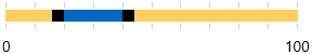
Apply Custom Style to the Track
The track of the slider can be styled by setting explicit style in the slirer resources.
<telerikInput:RadRangeSlider Width="300" TickFrequency="10">
    <telerikInput:RadRangeSlider.Resources>
        <Style TargetType="sliderPrimitives:RangeTrackPrimitive">
            <Setter Property="Background" Value="#FFCE5E"/>
        </Style>
    </telerikInput:RadRangeSlider.Resources>
</telerikInput:RadRangeSlider>
The result is:
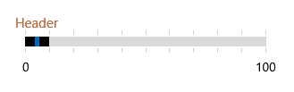
Apply Style to the RangeSlider Header Control
-
Define custom style that targets the ContentControl class as a StaticResource:
<Style TargetType="ContentControl" x:Key="HeaderStyle">
    <Setter Property="Foreground" Value="#BE673D"/>
    <Setter Property="FontSize" Value="15"/>
</Style>
Where:
xmlns:telerikPrimitives="using:Telerik.UI.Xaml.Controls.Primitives" -
Set the HeaderStyle property of the RadDataGrid to the defined style:
<telerikInput:RadRangeSlider HeaderStyle="{StaticResource HeaderStyle}" Header="Header"
                             Width="300" TickFrequency="10" Margin="50"/>
The result is:
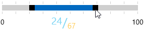
Apply style to the slider RangeToolTip
You can style the RangeToolTip by setting explicit style in the Resources of the RadRangeSlider. You can change the properties that affect the default style of the tooltip or you can retemplate the control. The following code snippet demonstrates how to set a custom template:
<telerikInput:RadRangeSlider Width="300" TickFrequency="10">
    <telerikInput:RadRangeSlider.Resources>
        <Style TargetType="sliderPrimitives:RangeToolTip">
            <Setter Property="Template">
                <Setter.Value>
                    <ControlTemplate TargetType="sliderPrimitives:RangeToolTip">
                        <StackPanel Orientation="Horizontal" Margin="10" HorizontalAlignment="Center" VerticalAlignment="Center">
                            <TextBlock FontSize="20" VerticalAlignment="Top" Foreground="#80D6F4" Text="{Binding StartValue}"/>
                            <TextBlock FontSize="25" VerticalAlignment="Center" Foreground="#80D6F4" Text="/"/>
                            <TextBlock FontSize="15" VerticalAlignment="Bottom" Foreground="#FFCE5E" Text="{Binding EndValue}" />
                        </StackPanel>
                    </ControlTemplate>
                </Setter.Value>
            </Setter>
        </Style>
    </telerikInput:RadRangeSlider.Resources>
</telerikInput:RadRangeSlider>
Where:
xmlns:sliderPrimitives="using:Telerik.UI.Xaml.Controls.Primitives.RangeSlider"
The result is: