Use the CellContentStyleSelector Property
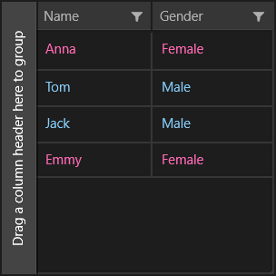
This example describes how to use the CellContentStyleSelector property to set custom foreground to the grid cells depending on a property from the model.
To style the background of the grid cells, you have to use the CellDecorationStyleSelector property.

Example
First lets create a simple class that represents our data:
public enum Gender
{
    Male,
    Female
}

public class Person
{
    public string Name { get; set; }

    public Gender Gender { get; set; }
}
And a ViewModel class that will be used as DataContext of the grid:
public class ViewModel
{
    public ObservableCollection<Person> Data { get; set; }

    public ViewModel()
    {
        Data = new ObservableCollection<Person>()
        {
            new Person() { Name = "Anna", Gender = Gender.Female },
            new Person() { Name = "Tom", Gender = Gender.Male },
            new Person() { Name = "Jack", Gender = Gender.Male },
            new Person() { Name = "Emmy", Gender = Gender.Female }
        };
    }
}
Now we have to implement a class that inerits the StyleSelector class and override its StyleSelectorCore method in order to provide custom logic for cell Columns. In this example it will provide different styles depending on whether the data item's Gender is Male or Female.
public class CellStyleSelector : StyleSelector
{
    public Style MaleStyle { get; set; }

    public Style FemaleStyle { get; set; }

    protected override Style SelectStyleCore(object item, DependencyObject container)
    {
        var cell = (item as DataGridCellInfo);
        var person = cell.Item as Person;

        if (person.Gender == Gender.Female)
        {
            return this.FemaleStyle;
        }

        return this.MaleStyle;
    }
}
Let's add an instance of the CellStyleSelector class to the page resources that will be used by the CellContentStyleSelector property of the grid and set its style properties.
We have to set the Style properties with TargetType="TextBlock".
<local:CellStyleSelector x:Key="ForegroundSelector">
    <local:CellStyleSelector.MaleStyle>
        <Style TargetType="TextBlock">
            <Setter Property="Foreground" Value="LightSkyBlue"/>
            <Setter Property="Margin" Value="10"/>
        </Style>
    </local:CellStyleSelector.MaleStyle>
    <local:CellStyleSelector.FemaleStyle>
        <Style TargetType="TextBlock">
            <Setter Property="Foreground" Value="HotPink"/>
            <Setter Property="Margin" Value="10"/>
        </Style>
    </local:CellStyleSelector.FemaleStyle>
</local:CellStyleSelector>
Finally we are ready to define our grid and set the CellContentStyleSelector property of its columns:
<telerik:RadDataGrid ItemsSource="{Binding Data}" AutoGenerateColumns="False" Width="300" Height="300">
    <telerik:RadDataGrid.DataContext>
        <local:ViewModel/>
    </telerik:RadDataGrid.DataContext>
    <telerik:RadDataGrid.Columns>
        <telerik:DataGridTextColumn PropertyName="Name" CellContentStyleSelector="{StaticResource ForegroundSelector}"/>
        <telerik:DataGridTextColumn PropertyName="Gender" CellContentStyleSelector="{StaticResource ForegroundSelector}"/>
    </telerik:RadDataGrid.Columns>
</telerik:RadDataGrid>
As we expect: when the item is Female, the foreground is pink; and when the item is Male, the foreground is blue.