MultiDayView
RadCalendar for UWP provides MultiDayView mode which enables the end-user to have a detailed view of the schedule for a specific day (or days). You could visualize between 1 and 7 days at once on the DayView area.
In order to enable it you need to set DisplayMode property of RadCalendar to “MultiDayView”.
<telerikInput:RadCalendar x:Name="calendar"
      Width="300" Height="300"
      DisplayMode="MultiDayView" />
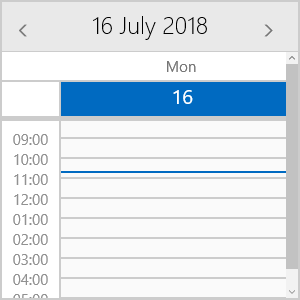
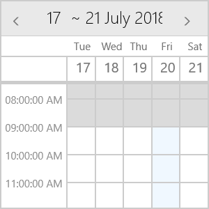
The next image shows the default look of MultiDayView:
Key Features
This section lists the key properties of MultiDayView you could use to set its time ruler and AllDayArea, so that the Calendar best suits your needs.
- VisibleDays: Defines the number of days visualized on the DayView area. The default is 7 days.
- DayStartTime: Defines the time used to indicate the start of the time ruler. The default value of the DayStartTime is 00:00:00 or 12:00 AM.
- DayEndTime: Sets the time used to indicate the end of the time ruler.
- TimerRulerTickLength: This property is of type TimeSpan and defines the density of the time ruler items.
- TimeLinesSpacing: Defines the space between the lines on the DayView area in pixels.
- ShowCurrentTimeIndicator: Provides the option to visually mark the current time in the time ruler and across the view. By default, it is True.
- WeekendsVisible: Boolean property that will allow to exclude the weekends from the timeline, so that only the work week is displayed.
All of the above are applied using the MultiDayViewSettings property of RadCalendar. Here is a quick example on how they could be set:
<telerikInput:RadCalendar x:Name="calendar"
            Width="300" Height="300"
            DisplayMode="MultiDayView">
    <telerikInput:RadCalendar.MultiDayViewSettings>
        <telerikInput:MultiDayViewSettings VisibleDays="1"
                                DayStartTime="8:00:00"
                                DayEndTime="18:00:00"
                                TimerRulerTickLength="01:00:00"
                                TimeLinesSpacing="20"
                                ShowCurrentTimeIndicator="True" />
    </telerikInput:RadCalendar.MultiDayViewSettings>
</telerikInput:RadCalendar>
And the result after applying these settings:
MultiDayView provides AllDay area used to display appointments for the whole day. Following are the properties related to AllDay area:
- ShowAllDayArea: Defines whether the AllDay area will be shown.
- AllDayAreaText: Specifies the Text shown inside TimeRuler next to the AllDay area.
- AllDayMaxVisibleRows: Specifies how may rows will be visible in AllDay area.
- AllDayAppointmentMinHeight: Sets the height of the appointments inside AllDay area.
-
AllDayAppointmentSpacing: Defines the gap between appointments inside AllDay area.
The last three properties define the overall height of the AllDay area.
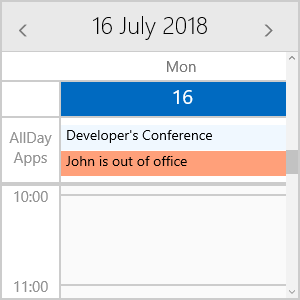
<telerikInput:RadCalendar x:Name="calendar"
                Width="300" Height="300"
                DisplayMode="MultiDayView"
                AppointmentSource="{Binding Appointments}">
    <telerikInput:RadCalendar.MultiDayViewSettings>
        <telerikInput:MultiDayViewSettings VisibleDays="1"
                                ShowAllDayArea="True"
                                AllDayAreaText="AllDay Apps"
                                AllDayMaxVisibleRows="2"
                                AllDayAppointmentMinHeight="25"
                                AllDayAppointmentSpacing="1"/>
    </telerikInput:RadCalendar.MultiDayViewSettings>
</telerikInput:RadCalendar>
And here is how the AllDay area looks:
Special Slots
Using MultiDayView you can define special slots and apply different styles to them. You just need to prepare a collection of Slot objects and assign it to SpecialSlotsSource property of the MultiDayViewSettings.
Each Slot has the following properties:
- Start - start date of the Slot.
- End - end date of the Slot.
Additionally, by utilizing the SpecialSlotStyleSelector you could define different Styles according to a certain condition.
Let’s, for example, create a collection of Special Slots containing the nonworking hours during the current week as well as a separate slot marking the working hours on Friday:
var today = DateTime.Now.Date;
var start = today.AddHours(9);
var end = today.AddHours(18);

var SpecialSlots = new ObservableCollection<Slot>();

for (int i = 0; i < 7; i++)
{
    SpecialSlots.Add(new Slot(today.AddDays(i), start.AddDays(i).AddHours(9)));
    SpecialSlots.Add(new Slot(end.AddDays(i), today.AddDays(i).AddHours(24)));
}

var thisFriday = today.AddDays(DayOfWeek.Friday - today.DayOfWeek).Date;
SpecialSlots.Add(new Slot(thisFriday.AddHours(9), thisFriday.AddHours(18)));
Then, create the SpecialStyleSelector which returns different Styles for nonworking slots and for Friday hours:
public class SpecialSlotStyleSelector : StyleSelector
{
    public Style NonWorkingHours { get; set; }
    public Style SpecialHours { get; set; }

    protected override Style SelectStyleCore(object item, DependencyObject container)
    {
        Slot slot = (Slot)item;
        if (slot.Start.Hour < 9 || slot.Start.Hour >= 18)
        {
            return this.NonWorkingHours;
        }

        return this.SpecialHours;
    }
}
Here is the SpecialSlotStyleSelector representation inside the page Resources:
<example:SpecialSlotStyleSelector x:Key="SpecialSlotStyleSelector">
    <example:SpecialSlotStyleSelector.NonWorkingHours>
        <Style TargetType="Border">
            <Setter Property="Background" Value="#DBDBDB"/>
        </Style>
    </example:SpecialSlotStyleSelector.NonWorkingHours>
    <example:SpecialSlotStyleSelector.SpecialHours>
        <Style TargetType="Border">
            <Setter Property="Background" Value="#F0F8FF"/>
        </Style>
    </example:SpecialSlotStyleSelector.SpecialHours>
</example:SpecialSlotStyleSelector>
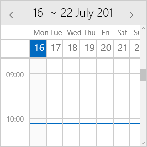
Finally, set the SpecialSlotsSource and SpecialSlotStyleSelector properties of the MultiDayView:
<telerikInput:RadCalendar x:Name="calendar"
                    Width="300" Height="300"
                    DisplayMode="MultiDayView">
    <telerikInput:RadCalendar.MultiDayViewSettings>
        <telerikInput:MultiDayViewSettings VisibleDays="5"
            TimeLinesSpacing="40"
            SpecialSlotsSource="{Binding SpecialSlots}"
            SpecialSlotStyleSelector="{StaticResource SpecialSlotStyleSelector}" />
    </telerikInput:RadCalendar.MultiDayViewSettings>
</telerikInput:RadCalendar>
The next screenshot demonstrates how the applied special slots styling will look.
Styling
MultiDayView provides means for customizing its look & feel through various styling properties. You could check them below:
- TimeRulerItemStyleSelector: StyleSelector used to apply the style of the horizontal and vertical lines as well as the TimeRuler labels.
- CurrentTimeIndicatorStyle: Sets the Style applied to CurrentTimeIndicator shown across the view to mark the current time.
- TodaySlotStyle: Defines the Style of the Slot that represents the current day.
- AllDayAreaBackground: This property is of type Brush and sets the background color of the AllDay area.
-
AllDayAreaBorderStyle: Sets the Style of the Border wrapped around the AllDay area.
- AllDayAreaTextStyle: Defines the Style applied to AllDayAreaText.
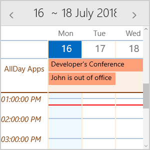
The snippet below demonstrates how the styling options could be applied:
<telerikInput:RadCalendar x:Name="calendar"
                    Width="300" Height="300"
                    DisplayMode="MultiDayView"
                    AppointmentSource="{Binding Appointments}">
    <telerikInput:RadCalendar.MultiDayViewSettings>
        <telerikInput:MultiDayViewSettings VisibleDays="3"
              AllDayMaxVisibleRows="2"
              AllDayAppointmentMinHeight="25"
              TimeLinesSpacing="40"
              AllDayAreaBackground="Linen"
              TodaySlotStyle="{StaticResource TodaySlotStyle}"
              CurrentTimeIndicatorStyle="{StaticResource CurrentTimeIndicatorStyle}"
              TimeRulerItemStyleSelector="{StaticResource CalendarTimeRulerItemStyleSelector}"
              AllDayAreaBorderStyle="{StaticResource CustomAllDayAreaBorderStyle}"
              AllDayAreaTextStyle="{StaticResource CustomAllDayAreaTextStyle}"/>
       </telerikInput:RadCalendar.MultiDayViewSettings>
</telerikInput:RadCalendar>
And here is how the referenced StaticResources are defined:
<Style TargetType="Border" x:Key="TodaySlotStyle">
    <Setter Property="Background" Value="AliceBlue"/>
</Style>
<Style TargetType="Border" x:Key="CurrentTimeIndicatorStyle">
    <Setter Property="BorderBrush" Value="Red"/>
    <Setter Property="BorderThickness" Value="5"/>
</Style>
<Style TargetType="Border" x:Key="CustomAllDayAreaBorderStyle">
    <Setter Property="BorderBrush" Value="SaddleBrown"/>
    <Setter Property="BorderThickness" Value="2"/>
</Style>
<Style TargetType="TextBlock" x:Key="CustomAllDayAreaTextStyle">
    <Setter Property="Foreground" Value="SaddleBrown"/>
    <Setter Property="TextAlignment" Value="Center"/>
    <Setter Property="Text" Value="AllDay Apps"/>
    <Setter Property="Padding" Value="0, 10 , 0, 0"/>
</Style>
<telerikCalendar:CalendarTimeRulerItemStyleSelector x:Key="CalendarTimeRulerItemStyleSelector">
    <telerikCalendar:CalendarTimeRulerItemStyleSelector.HorizontalLineStyle>
        <Style TargetType="Border">
            <Setter Property="BorderBrush" Value="LightSteelBlue"/>
        </Style>
    </telerikCalendar:CalendarTimeRulerItemStyleSelector.HorizontalLineStyle>
    <telerikCalendar:CalendarTimeRulerItemStyleSelector.VerticalLineStyle>
        <Style TargetType="Border">
            <Setter Property="BorderBrush" Value="BlanchedAlmond"/>
        </Style>
    </telerikCalendar:CalendarTimeRulerItemStyleSelector.VerticalLineStyle>
    <telerikCalendar:CalendarTimeRulerItemStyleSelector.TimeLabelStyle>
        <Style TargetType="TextBlock">
            <Setter Property="FontStyle" Value="Italic"/>
            <Setter Property="Foreground" Value="SaddleBrown" />
        </Style>
    </telerikCalendar:CalendarTimeRulerItemStyleSelector.TimeLabelStyle>
</telerikCalendar:CalendarTimeRulerItemStyleSelector>
where telerikCalendar namespace is declared like this:
xmlns:telerikCalendar="using:Telerik.UI.Xaml.Controls.Input.Calendar"
Check the result in the screenshot below: