Special Slots
For styling specific cell types you can use the properties exposed by the RadCalendar control.
When you wish to use more complex logic than the cell type for styling, you can change the appearance of a custom cell/cells through the CalendarCellStyleSelector and the CalendarCellStateSelector is used to change the default cell type.
Examples of CellStateSelector
You can change the cell state in different views. You can check the current view through the RadCalendar.DisplayMode property.
CustomCellStateSelector in MonthView
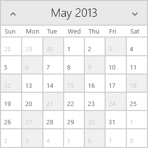
Here it will be demonstrated how to define a custom cell state selector and apply it to specific cells. The example shows how to set the state of the dates divisible to 3 to blackout dates.
First you will need a class inheriting the CalendarCellStateSelector class. You have to override the SelectStateCore method - the context parameter holds information about the current cell and using this information you can provide the logic for applying a state to this cell.
public class CustomCellStateSelector : CalendarCellStateSelector
{
    protected override void SelectStateCore(CalendarCellStateContext context, RadCalendar container)
    {
        if (context.Date.Day % 3 == 0)
        {
            context.IsBlackout = true;
        }
    }
}
Now you can use the custom CellStateSelector in your calendar:
<telerik:RadCalendar>
    <telerik:RadCalendar.CellStateSelector>
        <local:CustomCellStateSelector/>
    </telerik:RadCalendar.CellStateSelector>
</telerik:RadCalendar>
And this is the result:

CustomCellStateSelector in YearView
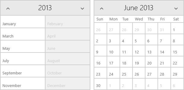
Here it will be demonstrated how to define a custom cell state selector to specific cells only in YearView. The example shows how to set the state of the cells holding even months to blackout.
Again you will need to create a class inheriting the CalendarCellStateSelector class and override the SelectStateCore method. This time you have to check the DisplayMode of the container.
public class CustomCellStateSelectorYearView : CalendarCellStateSelector
{
    protected override void SelectStateCore(CalendarCellStateContext context, RadCalendar container)
    {
        if (container.DisplayMode == CalendarDisplayMode.YearView && context.Date.Month % 2 == 0)
        {
            context.IsBlackout = true;
        }
    }
}
Now you can use the custom CellStateSelector in your calendar:
<telerik:RadCalendar>
    <telerik:RadCalendar.CellStateSelector>
        <local:CustomCellStateSelectorYearView/>
    </telerik:RadCalendar.CellStateSelector>
</telerik:RadCalendar>
And this is the result:

As you can see, only the cells in the YearView are set to blackout, whereas in MonthView all cells in a blackout month are normal.
Example of CellStyleSelector
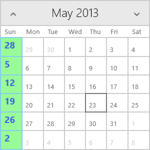
Here it will be demonstrated how to define a custom cell style selector and apply it to specific cells. The example shows how to set the style of the Sundays.
First you will need a class inheriting the CalendarCellStyleSelector class. You have to override the SelectStyleCore method - the context parameter holds information about the current cell and using this information you can provide the logic for applying a style to this cell.
public class CustomStyleSelector : CalendarCellStyleSelector
{
    public CalendarCellStyle SundayStyle { get; set; }

    protected override void SelectStyleCore(CalendarCellStyleContext context, Telerik.UI.Xaml.Controls.Input.RadCalendar container)
    {
        if (context.Date.DayOfWeek == DayOfWeek.Sunday)
        {
            context.CellStyle = SundayStyle;
            context.ApplyCellTemplateDecorations = false;
        }
    }
}
You have to define the styles you want to have in your CustomCalendarCellStyleSelector class. The easiest way is to do it in XAML:
<local:CustomStyleSelector x:Key="CustomStyleSelector">
    <local:CustomStyleSelector.SundayStyle>
        <telerik:CalendarCellStyle>
            <telerik:CalendarCellStyle.ContentStyle>
                <Style TargetType="TextBlock">
                    <Setter Property="Margin" Value="7,0,4,4"/>
                    <Setter Property="FontSize" Value="18" />
                    <Setter Property="FontWeight" Value="Bold" />
                    <Setter Property="Foreground" Value="RoyalBlue" />
                    <Setter Property="TextAlignment" Value="Center" />
                    <Setter Property="VerticalAlignment" Value="Center" />
                </Style>
            </telerik:CalendarCellStyle.ContentStyle>
            <telerik:CalendarCellStyle.DecorationStyle>
                <Style TargetType="Border">
                    <Setter Property="Background" Value="PaleGreen" />
                    <Setter Property="BorderBrush" Value="SkyBlue"/>
                </Style>
            </telerik:CalendarCellStyle.DecorationStyle>
        </telerik:CalendarCellStyle>
    </local:CustomStyleSelector.SundayStyle>
</local:CustomStyleSelector>
Now you can use the custom CellStyleSelector in your calendar:
<telerik:RadCalendar CellStyleSelector="{StaticResource CustomStyleSelector}" />
And this is the result:
