Header Support
RadAutoCompleteBox exposes the Header property that allows you to specify a label on top of the control that provides a hint about for the control's purpose in the UI. It also provides HeaderStyle and HeaderTemplate properties for completely custom header scenarios.
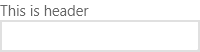
Setting the Header Property
The following code snippet demonstrates how to set a simple header text for a label of the control. You just have to set text for the Header property:
<telerikInput:RadAutoCompleteBox Header="This is a header" />
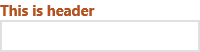
Setting the HeaderStyle Property
If you want to set a custom header style, you can set the HeaderStyle property. This example sets a custom foreground and font-weight of the header text:
<telerikInput:RadAutoCompleteBox Header="This is a header">
    <telerikInput:RadAutoCompleteBox.HeaderStyle>
        <Style TargetType="ContentControl">
            <Setter Property="FontWeight" Value="ExtraBold" />
            <Setter Property="Foreground" Value="#B45121" />
        </Style>
    </telerikInput:RadAutoCompleteBox.HeaderStyle>
</telerikInput:RadAutoCompleteBox>
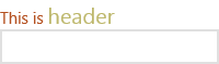
Setting the HeaderTemplate property
You can also set a custom header template,such as using two font sizes by setting the HeaderTemplate property:
<telerikInput:RadAutoCompleteBox >
    <telerikInput:RadAutoCompleteBox.HeaderTemplate>
        <DataTemplate>
            <TextBlock>
                    <Run Foreground="#B45121" Text="This is a" />
                    <Run Foreground="#BDB76B" FontSize="20" Text="header" />
            </TextBlock>
        </DataTemplate>
    </telerikInput:RadAutoCompleteBox.HeaderTemplate>
</telerikInput:RadAutoCompleteBox>