Office2013 Theme
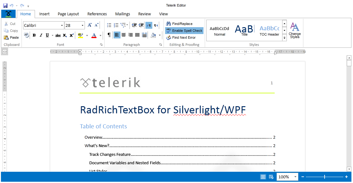
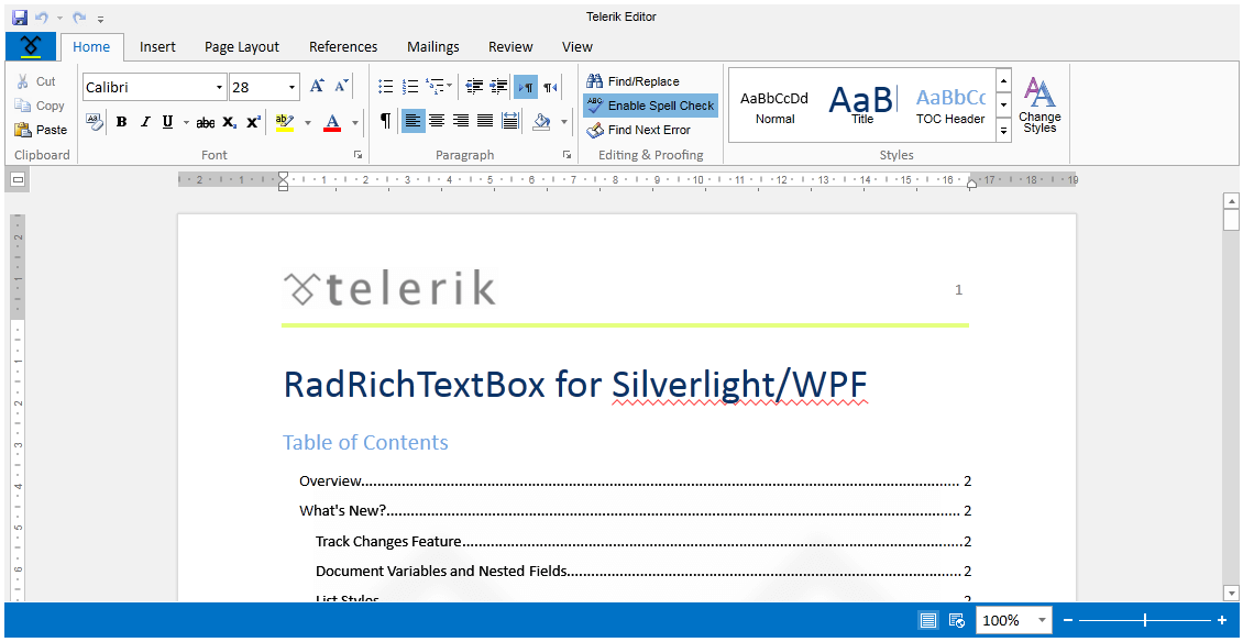
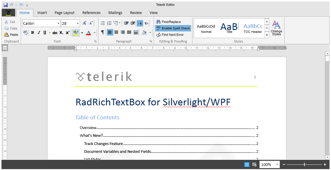
The Office2013 theme delivers a flat modern UI and three built-in color variations – White, Light Gray, Dark Gray.
Jump to the following topics to learn about the specifics of the theme's palette and features.
- Default Theme Colors
- Changing Palette Colors
- Changing Theme Variation
- Changing Font Properties
- Changing Opacity
Default Theme Colors
| Color name | White | Light Gray | Dark Gray | |||
|---|---|---|---|---|---|---|
| AccentMainColor | FF0072C6 | FF0072C6 | FF0072C6 | |||
| AccentColor | FF0072C6 | FF0072C6 | FF444444 | |||
| MainColor | FFFFFFFF | FFFFFFFF | FFFFFFFF | |||
| InvertedColor | FF000000 | FF000000 | FF000000 | |||
| BasicColor | FFFDFDFD | FFFDFDFD | FFFDFDFD | |||
| StrongColor | FF767676 | FF767676 | FF767676 | |||
| ValidationColor | FFFF0000 | FFFF0000 | FFFF0000 | |||
| LowLightMainColor | FFF1F1F1 | FFF1F1F1 | FFF1F1F1 | |||
| LowLightColor | FFFFFFFF | FFF1F1F1 | FFE5E5E5 | |||
| LowDarkColor | FFFFFFFF | FFFAFAFA | FFF3F3F3 | |||
| MediumLightColor | FFE1E1E1 | FFE1E1E1 | FFE1E1E1 | |||
| MediumDarkColor | FFC6C6C6 | FFC6C6C6 | FFC6C6C6 | |||
| HighLightColor | FFD4D4D4 | FFC6C6C6 | FFABABAB | |||
| HighDarkColor | FFABABAB | FFABABAB | FFABABAB | |||
| EffectLowColor | 33FFFFFF | 33FFFFFF | FF0072C6 | |||
| EffectHighColor | 33000000 | 33000000 | 800072C6 | |||
| EffectAccentLowColor | 330072C6 | 330072C6 | 330072C6 | |||
| EffectAccentHighColor | 800072C6 | 800072C6 | 800072C6 |
Changing Palette Colors
Office2013 provides dynamic change of the palette colors responsible for the brushes used in our controls. Their defaults are stated above. This mechanism is used to modify the color variation of the theme.
The general naming convention is: Office2013Palette.Palette.[name]Color is responsible for [name]Brush – e.g. Office2013Palette.Palette.AccentColor sets the color for telerik:Offie2013Resource ResourceKey=AccentBrush
Changing the colors can be achieved in code behind.
Setting palette colors
Office2013Palette.Palette.AccentColor = Color.FromRgb(255, 0, 0);
Changing Theme Variation
The following are the supported color variations of the Office2013 theme:
White—White color theme palette. This is also the default variation of the theme.
LightGray—Light gray theme palette.
DarkGray—Dark gray theme palette.
This is how the ColorVariation enumeration looks:
/// <summary>
/// Represents theme color variations.
/// </summary>
public enum ColorVariation
{
    /// <summary>
    /// Represents Dark Gray Office2013 theme palette.
    /// </summary>
    DarkGray,

    /// <summary>
    /// Represents Light Gray Office2013 theme palette.
    /// </summary>
    LightGray,

    /// <summary>
    /// Represents the default White Office2013 theme palette.
    /// </summary>
    White
}
Office2013 theme offers a very intuitive and easy way to change its color variation. You can change the variation by using the LoadPreset method of Office2013Palette in the entry point of your application. You just have to pass to the method the desired color variation as a parameter.
For example, if you want to set the DarkGray color variation, you should have the following code-block in your application:
public UserControl()
{
    Office2013Palette.LoadPreset(Office2013Palette.ColorVariation.DarkGray);

    InitializeComponent();
}
The
DarkGrayvariation of the theme is designed with a dark background in mind and it is recommended to use such a background in your application when choosing it.
Changing Font Properties
When using the Office2013 theme you can dynamically change the FontSize and FontFamily properties of all components in the application the same way as you do in all other Available Themes which support ThemePalette.
These properties are public so you can easily modify the theme resources at one single point. The most commonly used FontSize in the theme is named FontSizeL and its default value is 15. The bigger font sizes are used for headers and footers while smaller ones are used inside complex controls such as RadRibbonView, RadGauge, RadGanttView, etc. As for the FontFamily - there is only one FontFamily resource which is named FontFamily and it is set to Calibri.
Please note that for complex scenarios we strongly recommend setting font size only initially before the application is initialized. We recommend font sizes between 11px and 19px for the FontSize property.
All the available FontSizes and FontFamily as well as their default values:
Office2013Palette.Palette.FontSizeXXS = 10;
Office2013Palette.Palette.FontSizeXS = 12;
Office2013Palette.Palette.FontSizeS = 13;
Office2013Palette.Palette.FontSize = 14;
Office2013Palette.Palette.FontSizeL = 15;
Office2013Palette.Palette.FontSizeXL = 16;
Office2013Palette.Palette.FontFamily = new FontFamily("Calibri");
-
Office2013Palette.Palette.FontSizeXXSis used:- GridViewNewRow in Telerik.Windows.Controls.GridView
-
Office2013Palette.Palette.FontSizeXLis used:- ExpressionEditor in Telerik.Windows.Controls.Expressions
- WizzardPage in Telerik.Windows.Controls.Navigation
- ScheduleView's MonthView items in Telerik.Windows.Controls.ScheduleView
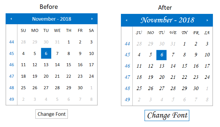
As the following example shows, you can change the default FontFamily from "Calibri" to "MonoType Corsiva" and the FontSize from 15 to 16 on a click of a button:
<StackPanel>
    <telerik:RadCalendar x:Name="Calendar" Width="250" Height="250" Margin="4 10"/>
    <telerik:RadButton HorizontalAlignment="Center" Content="Change Font" Click="OnButtonChangeFontSizeClick" />
</StackPanel>
private void OnButtonChangeFontSizeClick(object sender, RoutedEventArgs e)
{
    Office2013Palette.Palette.FontSizeL = 24;
    Office2013Palette.Palette.FontSizeS = 16;
    Office2013Palette.Palette.FontFamily = new FontFamily("MonoType Corsiva");
}

Changing Opacity
If you need to change the opacity of the disabled elements, you can now easily do so by using the DisabledOpacity property of the Office2013Palette. Its default value is 0.3.
Changing the opacity
Office2013Palette.Palette.DisabledOpacity = 0.5;
Office2013Palette.Palette.DisabledOpacity = 0.5
Merging Modified Palette Resources With StyleManager Theming Approach
When modifying fonts, colors, or other resources from the Office2013Palette and StyleManager is used as theming mechanism, the theme's ResourceDictionary needs to be merged in App.xaml file to apply the changes.
Merging the theme's ResourceDictionary in App.xaml
<Application.Resources>
    <ResourceDictionary>
        <ResourceDictionary.MergedDictionaries>
            <telerik:Office2013ResourceDictionary/>
        </ResourceDictionary.MergedDictionaries>
    </ResourceDictionary>
</Application.Resources>