Windows8 and Windows8Touch Themes
This article will show you how to easily modify Windows8 and Windows8Touch themes and how to change the font of your application at runtime.
Jump to the following topics to learn about the specifics of the theme's palette and features.
- Windows8 and Windows8Touch Default Theme Colors
- Changing Palette Colors
- Changing Font Properties
- Changing Opacity
Windows8 and Windows8Touch Default Theme Colors
The Windows8 has one color variation, but it is designed to be easily modified via the exposed colors in the theme palette. The default values of the brushes in the theme are listed below:
| Color name | Hex code | |
|---|---|---|
| MainColor | #FFFFFFFF | |
| BasicColor | #FFD6D4D4 | |
| MarkerColor | #FF000000 | |
| ValidationColor | #FFDE3914 | |
| AccentColor | #FF25A0DA | |
| StrongColor | #FF767676 |
The same is with Windows8Touch:
| Color name | Hex code | |
|---|---|---|
| MainColor | #FFFFFFFF | |
| ValidationColor | #FFE23907 | |
| AccentColor | #FF26A0DA | |
| EffectHighColor | #FFFFFFFF | |
| EffectLowColor | #FFE1E1E1 | |
| HighColor | #FF767676 | |
| InvertedColor | #FF000000 | |
| InvertedForegroundColor | #FFFFFFFF | |
| LowColor | #FFE9E9E9 | |
| MainForegroundColor | #FF000000 | |
| MediumColor | #FFCCCCCC |
Changing Palette Colors
The Windows8 and Windows8Touch themes provide dynamic change of the palette colors responsible for the brushes used in our controls. Their defaults are stated above. This mechanism is used to modify the color variation of the theme.
The general naming convention is: Windows8Palette.Palette.[name]Color is responsible for [name]Brush – e.g. Windows8Palette.Palette.AccentColor sets the color for telerik:Windows8Resource ResourceKey=AccentBrush. The same is applicable for the Windows8Touch theme as well.
Changing the colors can be achieved in code behind.
Changing the palette's default colors in code-behind
Windows8Palette.Palette.MainColor = Colors.Black;
Windows8Palette.Palette.AccentColor = Colors.Orange;
Windows8Palette.Palette.BasicColor = Colors.DarkGray;
Windows8Palette.Palette.StrongColor = Colors.Gray;
Windows8Palette.Palette.MarkerColor = Colors.LightGray;
Windows8Palette.Palette.ValidationColor = Colors.Red;
...

Windows8TouchPalette.Palette.MainColor = Colors.Black;
Windows8TouchPalette.Palette.AccentColor = Colors.Orange;
Windows8TouchPalette.Palette.ValidationColor = Colors.Red;
Windows8TouchPalette.Palette.EffectHighColor = Colors.Yellow;
Windows8TouchPalette.Palette.EffectLowColor = Colors.Orange;
...

Using the brush resources in XAML
<UserControl x:Class="Windows8ThemeColors.MainPage"
xmlns="http://schemas.microsoft.com/winfx/2006/xaml/presentation"
xmlns:x="http://schemas.microsoft.com/winfx/2006/xaml"
xmlns:telerik="http://schemas.telerik.com/2008/xaml/presentation">
<Grid x:Name="LayoutRoot" Background="{telerik:Windows8Resource ResourceKey=AccentBrush}">
<Grid.RowDefinitions>
<RowDefinition Height=""/>
<RowDefinition Height=""/>
</Grid.RowDefinitions>
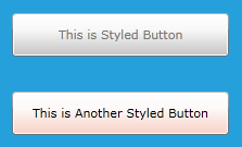
<Button Width="200" Height="40"
Background="{telerik:Windows8Resource ResourceKey=MarkerBrush}"
Foreground="{telerik:Windows8Resource ResourceKey=StrongBrush}"
Content="This is Styled Button"/>
<Button Grid.Row="1" Width="200" Height="40"
Background="{telerik:Windows8TouchResource ResourceKey=ValidationBrush}"
Foreground="{telerik:Windows8TouchResource ResourceKey=InvertedBrush}"
Content="This is Another Styled Button"/>
</Grid>
</UserControl>
Changing Font Properties
When using any of these themes you can dynamically change the FontSize and FontFamily properties of all components in the application the same way as you do in all other Available Themes which support ThemePalette.
Those properties are public so you can easily modify them at one single point. The property for the most commonly used FontSize in both themes is named FontSize and the property for most commonly used FontFamily resource is named FontFamily and it is set to Segoe UI. Bigger FontSizes are used for headers and footers while smaller FontSizes are used for complex controls such as RibbonView, Gauge, etc.
The following example, shown after the note below, shows these resources and their default values for the Windows8Theme. You can modify each of them based on your needs.
Setting the FontSize and FontFamily properties of the themes' palettes
//Windows8 Resources
Windows8Palette.Palette.FontSizeXS = 10;
Windows8Palette.Palette.FontSizeS = 11;
Windows8Palette.Palette.FontSize = 12;
Windows8Palette.Palette.FontSizeL = 14;
Windows8Palette.Palette.FontSizeXL = 16;
Windows8Palette.Palette.FontSizeXXL = 19;
Windows8Palette.Palette.FontSizeXXXL = 24;
Windows8Palette.Palette.FontFamily = new FontFamily("Segoe UI");
Windows8Palette.Palette.FontFamilyLight = new FontFamily("Segoe UI Light");
Windows8Palette.Palette.FontFamilyStrong = new FontFamily("Segoe UI Semibold");

//Windows8Touch resources
Windows8TouchPalette.Palette.FontSizeS = 10;
Windows8TouchPalette.Palette.FontSize = 12;
Windows8TouchPalette.Palette.FontSizeL = 15;
Windows8TouchPalette.Palette.FontSizeXL = 20;
Windows8TouchPalette.Palette.FontSizeXXL = 24;
Windows8TouchPalette.Palette.FontFamily = new FontFamily("Segoe UI");
Windows8TouchPalette.Palette.FontFamilyLight = new FontFamily("Segoe UI Light");
Windows8TouchPalette.Palette.FontFamilyStrong = new FontFamily("Segoe UI Semibold");
<Grid>
    <Grid.RowDefinitions>
        <RowDefinition Height="*"/>
        <RowDefinition Height="60"/>
    </Grid.RowDefinitions>
    <telerik:RadCalendar x:Name="Calendar" Width="300" Height="250"/>
    <telerik:RadButton x:Name="BtnChangeFontSize" Grid.Row="1" Height="30" HorizontalAlignment="Center" Content="Change Font" Click="BtnChangeFontSize_Click_1"/>
</Grid>
public MainPage()
{
StyleManager.ApplicationTheme = new Windows8Theme();
InitializeComponent();
}
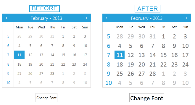
private void BtnChangeFontSize_Click_1(object sender, RoutedEventArgs e)
{
Windows8Palette.Palette.FontSize = 22;
Windows8Palette.Palette.FontFamily = new FontFamily("Calibri");
}
Result of clicking the button
Changing Opacity
If you need to change the opacity of the disabled elements, you can now easily do so by using the DisabledOpacity property of the Windows8Palette. Its default value is 0.5.
Changing the opacity
Windows8Palette.Palette.DisabledOpacity = 0.2;
Windows8Palette.Palette.DisabledOpacity = 0.2