Features
The most important properties of the RadWatermarkTextBox control are:
WatermarkContent—Gets or sets the content to be shown when the TextBox is empty and not focused.WatermarkTemplate—Gets or sets the template for presenting the content, shown when the TextBox is empty and not focused.CurrentText—Gets or sets the text of the TextBox. This property is meant to be used for TwoWay binding in order to be updated on each change of the text and not when the focus is lost.IsWatermarkVisible—A read-only property indicating whether the Watermark is visible or not.-
SelectionOnFocus—Specifies the modification over the selection when the control receives focus. The values for this properties are predefined in theSelectionOnFocusenumeration, which exposes the following fields:Unchanged—Selection will not be modified.SelectAll—The whole text will be selected.CaretToBeginning—The caret will be moved at the start of the text.CaretToEnd—The caret will be moved at the end of the text.
AdditionalContent—Gets or sets an object which is rendered in ContentPresenter in the right part of the control.AdditionalContentTemplate—Gets or sets the System.Windows.DataTemplate used for the AdditionalContent object.
The
RadWatermarkTextBoxcontrol is part of the Telerik.Windows.Controls.dll assembly.
Using the WatermarkContent Property
In scenarios, where you want to show custom content, when an empty string is entered, you need to use the WatermarkContent property.
In the following example, the user is asked to enter four digits:
Setting the WatermarkContent property
<telerik:RadWatermarkTextBox x:Name="radWatermarkTextBox" WatermarkContent="Please Enter Four Digits:" />
RadWatermarkTextBox with watermark text

The WatermarkContent property is of type object, which means that you can set a value of any type. For example:
Defining custom content for the WatermarkContent property
<telerik:RadWatermarkTextBox x:Name="radWatermarkTextBox1">
    <telerik:RadWatermarkTextBox.WatermarkContent>
        <StackPanel Orientation="Horizontal">
            <Image Source="/Silverlight.Help.RadMaskedTextBox;component/Images/EURFlag.png" />
            <TextBlock Margin="3,0,0,0" Text="Please Enter Four Digits" />
        </StackPanel>
    </telerik:RadWatermarkTextBox.WatermarkContent>
</telerik:RadWatermarkTextBox>
RadWatermarkTextBox with custom watermark content

Using WatermarkTemplate Property
Similarly, you can use the WatermarkTemplate property for the same sort of scenarios. Note that in this case you should define a new DataTemplate for the WatermarkTemplate property.
Defining the WatermarkTemplate
<telerik:RadWatermarkTextBox x:Name="radWatermarkTextBox2">
    <telerik:RadWatermarkTextBox.WatermarkTemplate>
        <DataTemplate>
            <StackPanel Orientation="Horizontal">
                <Image Source="/Silverlight.Help.RadMaskedTextBox;component/Images/EURFlag.png" />
                <TextBlock Margin="3,0,0,0" Text="Please Enter Four Digits" />
            </StackPanel>
        </DataTemplate>
    </telerik:RadWatermarkTextBox.WatermarkTemplate>
</telerik:RadWatermarkTextBox>
RadWatermarkTextBox with custom WatermarkTemplate

Setting the SelectionOnFocus Property
The SelectionOnFocus property of RadWatermarkTextBox allows you to specify what will happen with the cursor when the control gets focus. In the following example the SelectionOnFocus property is set to SelectAll. Once the RadWatermarkTextBox gets focused, it will select its whole text.
Setting the SelectionOnFocus property
<telerik:RadWatermarkTextBox x:Name="radWatermarkTextBox3"
                             SelectionOnFocus="SelectAll"
                             WatermarkContent="Please Enter Four Digits:" />
WatermarkBehavior
WatermarkBehavior is an enumeration property which specifies when the watermark content of RadWatermarkTextBox will be hidden. It could receive the following values:
-
HiddenWhenFocused—The watermark will be hidden when the RadWatermarkTextBox receives focus -
HideOnClick—The watermark will be hidden when the the user clicks on the RadWatermarkTextBox -
HideOnTextEntered—The watermark will be hidden when the the user writes text into the RadWatermarkTextBox
The default value is HiddenWhenFocused.
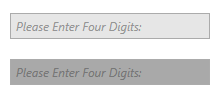
ReadOnlyBackground and DisabledBackground
RadWatermarkTextBox control exposes two properties to set its background when it's in a disabled or in read-only state. The properties are named DisabledBackground and ReadOnlyBackground respectively.
Setting the DisabledBackground property
<telerik:RadWatermarkTextBox WatermarkContent="Please Enter Four Digits:" IsEnabled="False" DisabledBackground="DarkGray" />
Disabled RadWatermarkTextBox with and without DisabledBackground
Setting the ReadOnlyBackground property
<telerik:RadWatermarkTextBox WatermarkContent="Please Enter Four Digits:" IsReadOnly="True" ReadOnlyBackground="DarkGray" />
Read-only RadWatermarkTextBox with and without ReadOnlyBackground
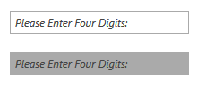
Please note that the read-only visual is drawn over the disabled visual so the ReadOnlyBackground will take precedence over the DisabledBackground if the control is in both the disabled and read-only states.
Clear Command
The RadWatermarkTextBoxCommands class, exposes the Clear command which clears the content of the textbox.
Using the Clear Command
<StackPanel>
<telerik:RadWatermarkTextBox x:Name="watermarkTextBox" />
<telerik:RadButton Command="telerik:RadWatermarkTextBoxCommands.Clear"
CommandTarget="{Binding ElementName=watermarkTextBox}">
<telerik:RadGlyph Glyph="" />
</telerik:RadButton>
</StackPanel>
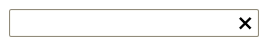
AdditionalContent and AdditionalContentTemplate
The RadWatermarkTextBox control exposes two properties, which allow for displaying additional content on its right side. Those are AdditionalContent and AdditionalContentTemplate.
The following example demonstrates the AdditionalContent and AdditionalContentTemplate properties along with the Clear command.
Setting the AdditionalContent and AdditionalContentTemplate properties
<Grid>
<Grid.Resources>
<DataTemplate x:Key="ClearWatermarkTextBoxAdditionalContentTemplate">
<telerik:RadButton Focusable="False"
IsBackgroundVisible="False"
Command="telerik:RadWatermarkTextBoxCommands.Clear"
CommandTarget="{Binding ElementName=watermarkTextBox}">
<telerik:RadGlyph Glyph="{Binding}"/>
</telerik:RadButton>
</DataTemplate>
</Grid.Resources>
<telerik:RadWatermarkTextBox Name="watermarkTextBox"
AdditionalContent=""
AdditionalContentTemplate="{StaticResource ClearWatermarkTextBoxAdditionalContentTemplate}"/>
</Grid>
RadWatermarkTextBox with custom AdditionalContent and AdditionalContentTemplate properties